Modules General Information
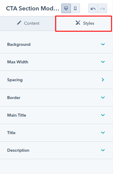
In the page editor you will see that all modules have two parts — Content and Styles:
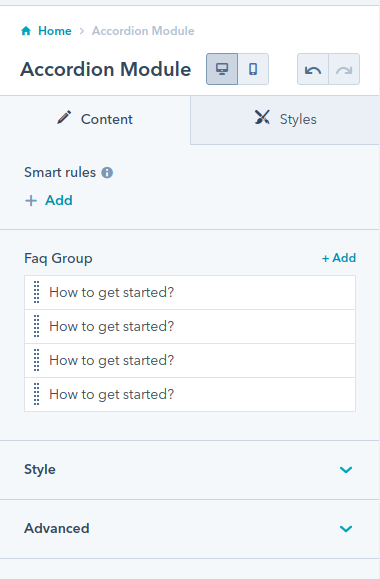
Content:
The Content Part contains the content repeating fields, layout options and advanced.
Some modules does not have repeating fields.

Most of our theme modules have the common options of layout:-
The Scheme White Color option, if you check this checkbox the color of the module will
become white, This options is used for dark edition section.
Slider column selector or Grid column selector is the dropdown for selecting a number of
elements or items in a slider or row.
Heading Level dropdown is used for selecting the title heading tag from h1 to h6.
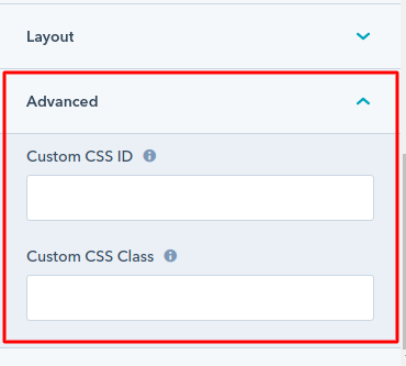
Advanced:-
We have also included two fields where you can specify an unique ID or a custom class
that will apply to this module wrapper. This may be useful to developers that want to
apply custom styles to a specific module, or if you want to add an anchor that will
scroll to your module:
Style:
The Style Part contains the various types of style options such as background layout,
spacing, border, box-shadow and font size, color, etc.
In TwentyOne theme the style have the options as per module content.
Accordion/FAQ
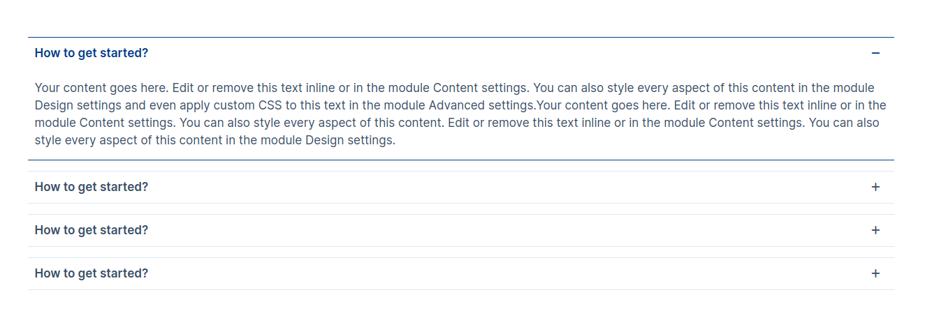
The accordion module can e.g. be used for frequently asked questions (FAQ).
Content Section:
- Question: the “questions” of the accordion element
- Detail: the “answer” of the accordion element
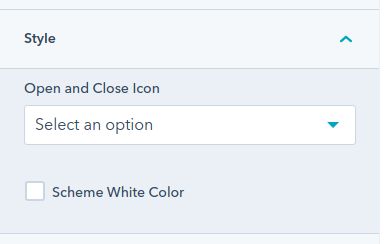
In style the open and close icon dropdown have the option values Plus-Minus, Arrow and Caret.
Select the values as per your requirement.
Style Section: (This all options are optional)
- Width:
- Custom Module Width: Enable this option to apply a custom width to
the module.
- Container Width: Once the Custom Module Width option is enabled, a
Container Width field will appear. You can use this field to specify a
custom container width (in pixels) for the
module.
- Box Alignment:
- Accordion box Alignment: Choose the content alignment options from
left, center and
right
- Border:
- Border: Apply the Border style, color and width and also the sides
of border
- Active Border Color:
- Color: select the optin global ya custome Apply the active
border color
- Border Color: Apply the active border color if color is cutome
- Corner Radius:
- Corner Radius: Apply the corner radius of all the direction
- Spacing:
- Spacing: Apply the spacing for each elements
- Accordion Question:
- Background Color: Set the background color in the question
- Spacing: Set the margin and padding for the question
- Font: Set the various font style, size, color, weight and
decoration for the question
- Active:
- Background Color: Set the active background color in the
question
- Color: Set the active color for the question
- Accordion Answer:
- Spacing: Set the margin and padding for the answer
- Background Color: Set the background color in the answer
- Font: Set the various font style, size, color, weight and
decoration for the answer
- Icon:
- Icon Width: Set the Icon width of the open and close icon
Examples
Note
Our Preview page of the module is Click here.
Client Logo
The Client Logo Module can e.g. be used for showcase the partners, brands, etc.
Content Section:
- Brand Logo: Select the image for element
- Logo Link: Optional, Add the Logo link for redirect to the Any page
Layout:
- Slider Required: Enable for using the slider in the module
- Slider Column Selector: Choose from multiple options from one column to
six column, display on slider only
- Grid Column Selector: Choose from multiple options from one column to
six column, display on without slider only
Style Section:
- Image:
- Image Width: Set the custom image width
- Background:
- Color: Set the custom solid color background for logo.
- Spacing:
- Spacing: Set the custom padding and margin for element
- Border:
- Border: Set the border style, border width and border color for
element
- Corner Radius: Set the corner radius of all the direction
- Box Shadow:
- Box Shadow: Enable for using the box shadow in element, after the
enable all other options will display in this group
- Horizontal Offset: The horizontal offset of the shadow. A positive
value puts the shadow on the right side of the box, a negative value puts the shadow
on the left side of the box. Note:- If not require then set as 0
- Vertical Offset: The vertical offset of the shadow. A positive
value puts the shadow below the box, a negative value puts the shadow above the box
Note:- If not required then set to 0
- Blur: Optional, The blur radius. The higher the number, the more
blurred the shadow will be
- Spread: Optional, The spread radius. A positive value increases the
size of the shadow, a negative value decreases the size of the shadow.
- Color: Set the color of box shadow
- Image Filter:
- Filter Required ?: Enable using the Filter on image, after the
enable all other options will display in this group.
- Blur: Adds a blurring effect to the image. The higher the value,
the more blurred the image becomes.
- Brightness: Adjusts the brightness of the image. Values above 100%
make the image brighter, while values below 100% make it darker.
- Contrast: Modifies the contrast of the image. A value of 100% means
no change, less than 100% reduces contrast, and more than 100% increases contrast.
- Grayscale: Converts the image to grayscale. A value of 100%
completely removes color, making the image black and white.
- Hue-Rotate: Rotates the colors around the color wheel. The value is
specified in degrees, affecting the overall hue of the image.
- Invert: Inverts the colors of the image. A value of 100% inverts
all colors completely, while 0% leaves the image unchanged.
- Saturate: Controls the saturation of the colors. Values above 100%
increase saturation, making colors more vibrant, while values below 100% desaturate
the image.
- Sepia: Applies a sepia tone to the image, giving it a warm,
brownish color reminiscent of old photographs. A value of 100% gives a full sepia
effect.
- Opacity: Adjusts the transparency of the image. A value of 100% is
fully opaque, while 0% is fully transparent.
Examples

Note
Our Preview page of the module is Click here.
Counter Number
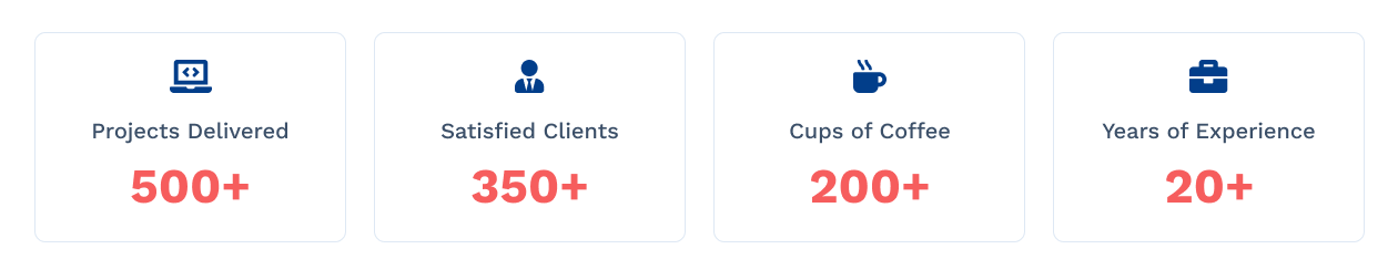
The Counter Module can be used for e.g the number of interests, completed project, number of
clients, etc.
Content Section:
- Icon: Iconpicker for icon show in box, (Note: The Icon
field will display if you have selected the Icon in layout Image/Icon?)
- Image: Select the image (Note: The Image field will
display if you have selected the Image in layout Image/Icon?)
- Title: Title of element
- Counter Number: Counter number of element
- Text after CounterThis text is used to add a plus sign, K for thousand
and M for Million
Layout:
- Image/Icon?: Choose the options between Image and Icon
- Scheme Light Color: Switch between light and dark color scheme
- Grid Column Selector: Choose from multiple options from One Column to
Four Column to display element in a row
Style Section:
- Alignment:
- Alignment: Set the content alignment in the box
- Background:
- Background?: Choose the background option from solid color and
gradient color
- Color: Set the custom solid color background for module, the color
will display if you selected the solid color in background
- Gradient:
Set the custom gradient color, direction of color in
background for module, the gradient color will display if you selected the gradient
color in background
- Border:
- Border: Set the border styles, width and color for element
- Corner Radius: Set the corner radius in px for element
- Box Shadow:
- Use Box Shadow?: Enable for using the box shadow in element, after
the
enable all other options will display in this group
- Horizontal Offset: The horizontal offset of the shadow. A positive
value puts the shadow on the right side of the box, a negative value puts the shadow
on the left side of the box. Note:- If not require then set as 0
- Vertical Offset: The vertical offset of the shadow. A positive
value puts the shadow below the box, a negative value puts the shadow above the box
Note:- If not required then set to 0
- Blur: Optional, The blur radius. The higher the number, the more
blurred the shadow will be
- Spread: Optional, The spread radius. A positive value increases the
size of the shadow, a negative value decreases the size of the shadow.
- Color: Set the color of box shadow
- Spacing:
- Spacing: Set the custom padding and margin for element
- Image:
- Height: Set the custom image height in px as per your requirement
- Icon:
- Height: Set the custom icon height in px as per your requirement
- Image/Icon Spacing:
- Spacing: Set the custom padding and margin for image and
icon in element
- Title:
- Font: Set the font style, font size, color, weight, text-decoration
of title
- Spacing: Set the custom padding and margin for title
- Counter Number:
- Font: Set the font style, font size, color, weight, text-decoration
of counter number
- Spacing: Set the custom padding and margin for Counter Number.
Examples
Note
Our Preview page of the module is Click here.
Advance Pricing Card
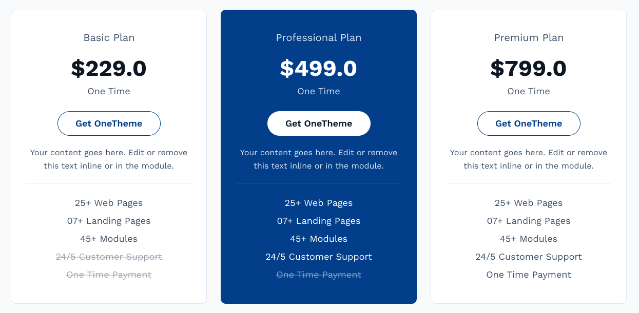
The Pricing module e.g can be used for pricing plan of the products or services.
Content Section:
- Plan: Add the plan of your pricing for e.g, basic plan, professional
plan and premium plan, etc
- Price: Add the price in your local currency
- Monthly Pricing: Add Monthly price in your local currency
(Note:- This field will display if you have enable the checkbox slide
toggleShow pricing toggle)
- Yearly Pricing: Add Yearly price in your local currency
(Note:- This field will display if you have enable the checkbox slide
toggleShow pricing toggle)
- Timeframe: Enter the timeframe of your plan. For example :- Per Year,
Per Month, OneTIme, etc.
- Button Text: Text or Label of button
- Button Link: Button Link of pricing
- Product Description: Short description of product
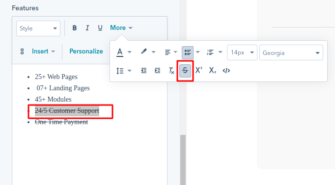
- Features: Add the features of the plan or product, if you want to set
the particular sentence or word in strikethrough set this way in rich text module,
example given below
Layout:
- Background Color: Set the custom solid background color for each
Pricing Card
- Separator Color: Set the custom solid color for each Pricing Card
Separator
- Scheme White Color: Switch between light and dark color scheme
- Badge Text: If you want to add a badge tag to the top left corner of
the pricing card, you can enable this checkbox.
Slide toggle:
- Show Pricing toggle: If you want to add monthly and yearly pricing
toggle on top of the pricing card. you can enable the show pricing toggle checkbox.
Style Section:
- Pricing Toggle:
- Toggle Alignment: Choose the Toggle alignment options from left,
center and right
- Toggle Background Color: Set the toggle background color.
- Toggle text Color: Set the toggle text color.
- Toggle Icon Color: Set the toggle icon color.
- Tooltip Style:
- Tooltip Bg Color: Set the Tooltip background color.
- Tooltip Font: Set the font style, font size, color, weight,
text-decoration
of Tooltip.
- Pricing Card:
- Text Alignment: Choose the Text alignment options from left,
center and right
- Spacing:
- Spacing In Desktop: set the custom padding and margin in
desktop view.
- Spacing In Mobile: set the custom padding and margin in
Mobilr view.
- Height
- Max-Height: Set the custom image height in px as per your
requirement
- Border:
- Border: Set the border style, border width and border color for
element
- Corner Radius: Set the corner radius of all the direction
- Pricing Box Shadow:
- Use Box Shadow?: Enable for using the box shadow in element,
after
the
enable all other options will display in this group
- Horizontal Offset: The horizontal offset of the shadow. A
positive
value puts the shadow on the right side of the box, a negative value puts the
shadow
on the left side of the box. Note:- If not require then set as 0
- Vertical Offset: The vertical offset of the shadow. A positive
value puts the shadow below the box, a negative value puts the shadow above the
box
Note:- If not required then set to 0
- Blur: Optional, The blur radius. The higher the number, the
more
blurred the shadow will be
- Spread: Optional, The spread radius. A positive value increases
the
size of the shadow, a negative value decreases the size of the shadow.
- Color: Set the color of box shadow
- Plan:
- Font: Set the font style, font size, color, weight, text-decoration
of plan
- Price:
- Font: Set the font style, font size, color, weight, text-decoration
of price
- Timeframe:
- Font: Set the font style, font size, color, weight, text-decoration
of timeframe
- Description:
- Font: Set the font style, font size, color, weight, text-decoration
of description
- Features:
- Font: Set the font style, font size, color, weight, text-decoration
of features
- Strikethrough: Strikethrough is a typographical presentation of
words with a horizontal line through their center, resulting in text like this
Strikethrough
- Font: Set the font style, font size, color, weight,
text-decoration of strikethrough features
- Separator:
- Use Separator: Check the fields to display seperator below the
product description, All below style option will display if you check this use
overlay checkbox
- Height: Set the height in px of overlay
- Badge style:
- Background Color:Set the toggle background color of Badge.
- Font:Set the font style, font size, color, weight, text-decoration
of Badge text.
- Buttons:
- Button style:
- Button Alignment: Choose the button alignment options from
left, center and right
- Button width: To create a full-width button, simply set the
button width to 100%.
- Background color: Set the button background Color.
- Corner radius: set the button corner radius
- Border: Set the border styles, width, and color.
- Spacing: set the custom padding and margin.
- Font: Set the font style, font size, color, weight,
text-decoration of Button text.
- Hover Button style:
- Background color: Set the button Hover background Color.
- Border: Set the border hover color.
- Font: Set the font hover color of Button text.
- Icon/Image Style
- Image
- Spacing: Set the custom padding and margin for image element
- Width: Set the custom image width in px as per your
requirement
- Height: Set the custom image height in px as per your
requirement
- Icon
- Spacing: Set the custom padding and margin for Icon element
- Box Width/Height: Set the custom Icon Box width/Height in px as
per your
requirement
- Background color: Set the Icon box background Color.
- Border: Set the border styles, width, and color.
- Border radius: set the Icon Box corner radius
- Icon Width/Height: Set the custom Icon width/Height in px
as per your
requirement
- Icon color: Set the Icon Color.
- Icon Hover:
- Background color: Set the Icon Box Hover background Color.
- Icon Color: Set the Icon hover color.
- Border Color: Set the border hover color.
Examples
Note
This Module does not have the repeating items. If you want to use three items drag
these module 3 times in a different column
Our Preview page of the module is Click here.
Multiple Progress Bar
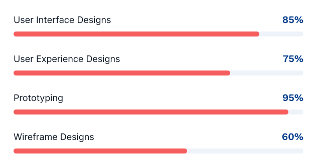
The Progress Bar Module can be used for e.g showing the progress of task
Content Section:
- Progeress: Set the progress of the element
- Title: Add the title of the element
Layout:
- Heading Tag: Choose from h1 to h6 for the title.
- Scheme Color Light: Switch between light and dark color scheme
Style Section:
- Background Color: Set the custom solid color background for element
- Border: Set the border styles, width and color for element
- Spacing: Set the custom padding and margin for the element
- Corner Radius: Set the corner radius in px for element
- Height: Set the custom height in px for element
- Progress:
- Background?: Choose the background option from solid color and
gradient color
- Background Color: Set the custom solid color background for
progress, the color will display if you selected the solid color in background
- Gradient: Set the custom gradient color, direction of color in
background for progress, the color will display if you selected the gradient color
in background
- Transition Speed: Set the transition speed of progress from 1 to 9
second
- Percentage Text:
- Font: Set the font style, font size, color, weight, text-decoration
of percentage text
- Spacing:
- Spacing: Set the custom padding and margin of percentage text
- Title:
- Font: Set the font style, font size, color, weight, text-decoration
of title
- Spacing:
- Spacing: Set the custom padding and margin of title text
- Image Box Group:
- Background color: Set the Image background Color.
- Corner radius: set the image corner radius
- Spacing: set the custom padding and margin.
- Box Shadow: Enable for using the box shadow in element, after
the
enable all other options will display in this group
- Horizontal Offset: The horizontal offset of the shadow. A positive
value puts the shadow on the right side of the box, a negative value puts the shadow
on the left side of the box. Note:- If not require then set as 0
- Vertical Offset: The vertical offset of the shadow. A positive
value puts the shadow below the box, a negative value puts the shadow above the box
Note:- If not required then set to 0
- Blur: Optional, The blur radius. The higher the number, the more
blurred the shadow will be
- Spread: Optional, The spread radius. A positive value increases the
size of the shadow, a negative value decreases the size of the shadow.
- Shadow Color: Set the color of box shadow
Examples
Note
Our Preview page of the mini module is Click here.
Steps Process
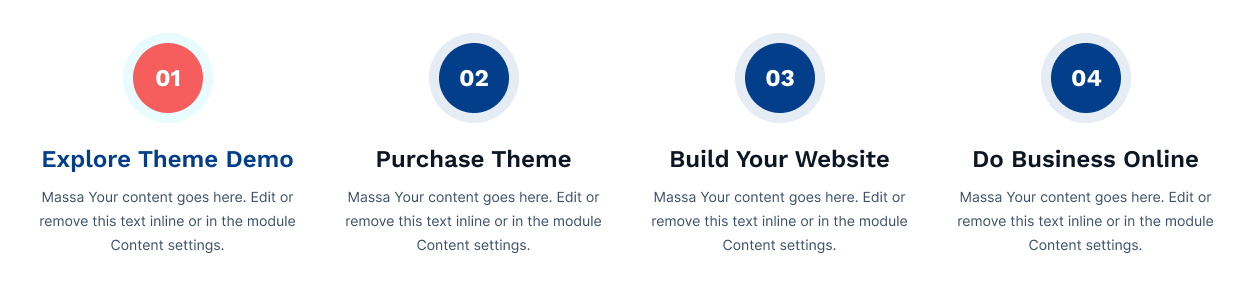
The Steps Process Module can be used for e.g building knowledge and organizing information.
Content Section:
- Icon: Iconpicker for icon show in box, (Note: The Icon
field will display if you have selected the Icon in layout Image/Icon)
- Image: Select the image (Note: The Image field will
display if you have selected the Image in layout Image/Icon)
- Step Text: Add the Step Text for e.g, A, 01 (Note:
This field will display if you have selected the Text in layout Image/Icon)
- Title: Title of element (note:- If you want to add a gradient color in
some of the words in title then start the some words)
- Description: Description of element
Layout:
- Image/Icon?: Choose the options between Image, Icon and Text to display
in the content of the element
- Image/Icon/Text Placement: Choose the options between top, left and
right
- Vertical Align Center: Enable the checkbox if you want to set the
vertical align center in the element for step box
- Column Grid Selector: Choose from multiple options from Column 1 to
Column 4 to display element in a row
- Scheme Light Color: Switch between light and dark color scheme
- Heading Level: Choose from h1 to h6 for the title.
Style Section:
- Text Alignment:
- Text Alignment: Set the text alignment of the element
- Box:
- Background color: Set the Box background Color.
- border: Set the border styles, width and color for box
- Corner radius: set the box corner radius
- Box Hover:
- Background color: Set the Box background Color On Hover.
- Border color: Set the Box Border Color On Hover.
- Spacing:
- Spacing: Set the custom padding and margin for element
- Step Style:
- Background:
- Background?: Choose the background option from solid color and
gradient color for step box
- Color: Set the custom solid color background for step box, the
color will display if you selected the solid color in background
- Gradient: Set the custom gradient color, direction of color in
background for step box, the gradient color will display if you selected the
gradient color in background
- Border:
- Border: Set the custom border styles, width and color for step
box
- Corner Radius: Set the custom corner radius in px for step box
- Spacing:
- Spacing: Set the custom padding and margin for step box
- Spacing in Mobile:
- Spacing: Set the custom padding and margin in mobile view
for step box
- Box Shadow:
- Use Box Shadow: Enable for using the box shadow in step box,
after
the enable all other options will display in this group
- Horizontal Offset: The horizontal offset of the shadow. A
positive value puts the shadow on the right side of the box, a negative value
puts the shadow on the left side of the box. Note:- If not require then set as 0
- Vertical Offset: The vertical offset of the shadow. A positive
value puts the shadow below the box, a negative value puts the shadow above the
box Note:- If not required then set to 0
- Blur: Optional, The blur radius. The higher the number, the
more blurred the shadow will be
- Spread: Optional, The spread radius. A positive value increases
the size of the shadow, a negative value decreases the size of the shadow.
- Color: Set the color of box shadow
- Height/Width:
- Width: Set the custom width
- Step Hover:
- Background:
- Background?: Choose the background option from solid color and
gradient color for step box on hover of element
- Color: Set the custom solid color background for step box, the
color will display if you selected the solid color in background
- Gradient: Set the custom gradient color, direction of color in
background for step box, the gradient color will display if you selected the
gradient color in background
- Border Color:
- Color: Set the custom border color for step box on hover of
element
- Image:
- Image Width: Set the custom image width in px as per your
requirement
- Icon:
- Icon Width: Set the custom icon width in px as per your requirement
- Color: Set the custom icon color in px as per your requirement
- Hover:
- Color: Set the custom icon color on hover of element
- Step Text:
- Font: Set the font style, font size, color, weight, text-decoration
of step text
- Hover:
- Color: Set the custom step text color on hover of element
- Title:
- Font: Set the font style, font size, color, weight, text-decoration
of title
- Hover:
- Color: Set the custom title color on hover of element
- Gradient color:
- Use Gradient: Enable the checkbox to use Gradient color
- Gradient: Choose the directions from dropdown and add as much
color you want
- Spacing:
- Spacing: Set the custom padding and margin for title
- Description:
- Font: Set the font style, font size, color, weight, text-decoration
of description
Examples
Note
Our Preview page of the module is Click here.
Tab Content
The Tab Content Module is used for showing the text, image in a separated tab. It can be used
for ex. explaining the services in brief.
Content Section:
- Tab Title: Add the tab title
- Tab Short Description: Add the short description of tab
- Tab Icon: Select the icon from iconpicker to use in the tab
- Tab Image: Select or upload the image from imagepicker to use in the
tab
- Content:
- Content Title: Add the title of the content (note:- If you want to
add a gradient color in some of the words in title then start the some words)
- Rich Text: Description of the content, You can add image,
button,etc from the rich text to use in the content
Style:
- Image/Icon Required: Enable the checkbox if you want to use the
image/icon in tab
- Tab Image/Icon: Choose the options between image and icon to add in the
tab, these field will display if you checked the Image/Icon Required
- Scheme White Color: Switch between light and dark color scheme
Layout:
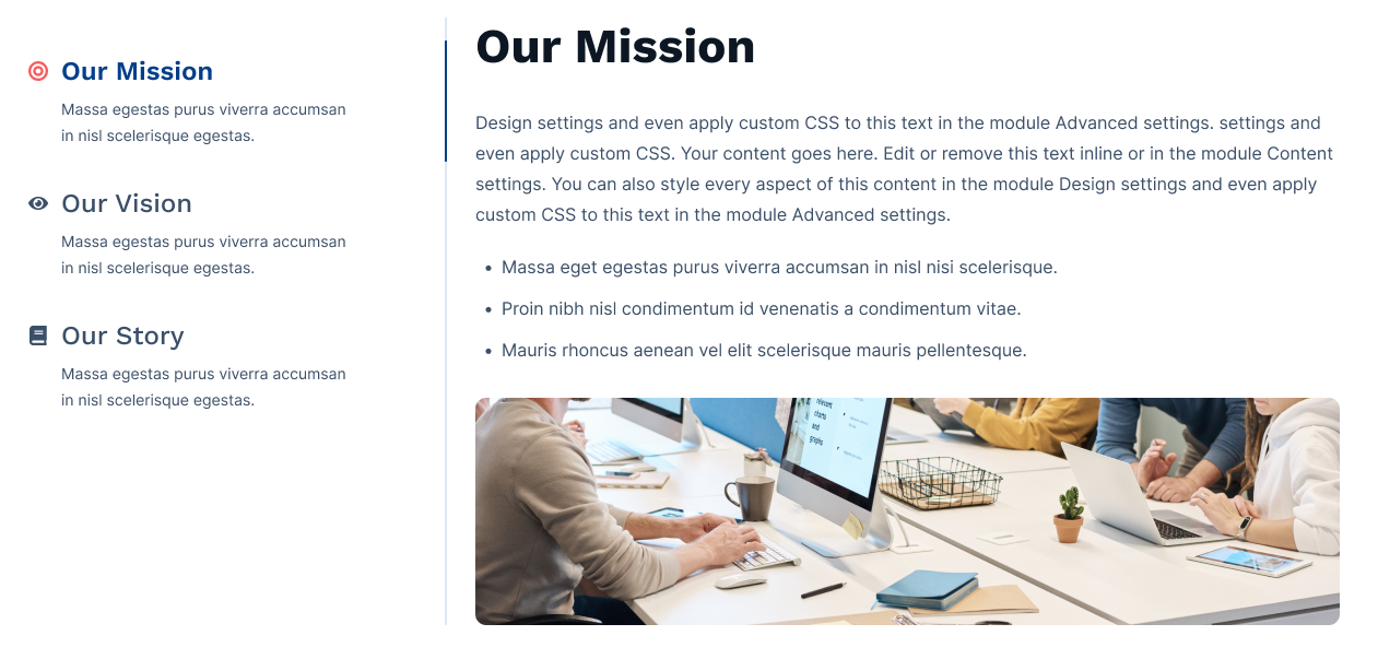
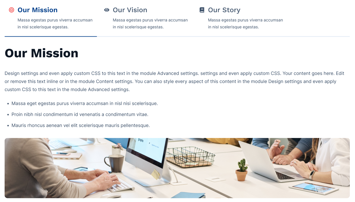
- Alignment: Choose the options between horizontal tab and vertical tab,
for e.g, given below
Style Section:
- Tab:
- Background?: Choose the background option between solid color and
gradient color
- Color: Set the custom solid color background for tab item, the
color will display if you selected the solid color in background
- Gradient: Set the custom gradient color, direction of color in
background for tab item, the gradient color will display if you selected the
gradient color in background
- Border: Set the border styles, width and color for tab
- Content Align: Choose the options between horizontal tab and
vertical tab,
for e.g, given below
- Gap Between Tabs: Set gap between tabs.
- Gap Between Title and icon: Set gap between Title and icon.
- Spacing: Set the custom padding and margin of the tab item
- Corner Radius:
- Top Left: The value applies to Top-Left corner of the
tab.
- Top Right: The value applies to Top-Right corner of the
tab.
- Bottom Left: The value applies to Bottom-Left corner of
the tab.
- Bottom Right: The value applies to Bottom-Right corner
of the tab.
- Active Tab:
- Background?: Choose the background option between solid color and
gradient color for active tab item
- Background Color: Set the custom solid color background for active
tab item, the color will display if you selected the solid color in background
- Gradient: Set the custom gradient color, direction of color in
background for active tab item, the gradient color will display if you selected the
gradient color in background
- Border: Set the border styles, width and color for active tab
- Shadow: Enable for using the box shadow in active tab, after
the enable all below options will display in this group
- Position: Added shadow position options —
outline or
inset.
- H Offset: The horizontal offset of the shadow. A positive
value puts the shadow on the right side of the box, a negative value puts the shadow
on the left side of the box. Note:- If not require then set as 0
- V Offset: The vertical offset of the shadow. A positive
value puts the shadow below the box, a negative value puts the shadow above the box
Note:- If not required then set to 0
- Blur: Optional, The blur radius. The higher the number, the more
blurred the shadow will be
- Spread: Optional, The spread radius. A positive value increases the
size of the shadow, a negative value decreases the size of the shadow.
- Color: Set the color of box shadow
- Content:
- Backround Color: Set the custom solid color background for content.
- Spacing: Set the custom padding and margin of the content
- Tab Seperator:
- Tab Separator: Enable the checkbox if you want to use the
separator in tab
- Height or width: Set the custom height in px of separator
- Color: Set the custom color of separator
- Active Separator Color: Set the custom color of active tab item
separator
- Icon:
- Width: Set the custom width of tab icon
- Height: Set the custom height of tab icon
- Color: Set the custom color of tab icon
- Active Color: Set the custom active color of tab icon
- Tab Title:
- Font: Set the font style, font size, color, weight, text-decoration
of tab title
- Alignment: Choose the options between left, center and right of the
tab title alignment
- Spacing: Set the custom padding and margin of the title
- Active Tab:
- Color: Set the custom active color of tab title
- Tab Description:
- Font: Set the font style, font size, color, weight, text-decoration
of tab description
- Alignment: Choose the options between left, center and right of the
tab description alignment
- Active Tab:
- Color: Set the custom active color of tab description
- Content Title:
- Font: Set the font style, font size, color, weight, text-decoration
of content title
- Spacing: Set the custom padding and margin for content title
- Gradient color:
- Use Gradient: Enable the checkbox to use Gradient color
- Gradient: Choose the directions from dropdown and add as much
color you want
- Content Description:
- Font: Set the font style, font size, color, weight, text-decoration
of content description
Layout :-
We have provided multiple layouts.
1. Horizontal
2. Vertical Layout :-
Note
Our Preview page of the module is Click here.
Event Listing
The Event Listing Module is designed to efficiently manage and display a list of events,
such as conferences, seminars, workshops, or social gatherings on a website.
It allows users to easily browse, search, and access information about upcoming events,
including dates, times, descriptions and details.
Content Section:
- Title: Add the event title
- Date: Add the event date
- Time: Add the event time
- Speaker Name: Add the speaker or organizer name
- Description: Add the description about the event
- Featured Image: Add the thumbnail image for your event
- Button Label: Add the Button label such as Read more, Learn more
- Button Link: Add the Button link that will redirect to the Event detail
page
Layout:
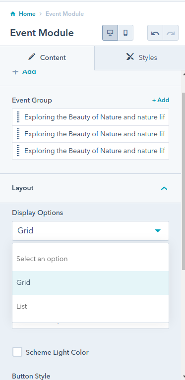
- Display Options: Choose the options between grid and list style
- Grid Column: Choose the number of cards that do you want to show in
Single row. The grid column option will display if you have selected the grid
- Heading Level: Choose the event title heading level from H1 to H6
- Scheme White Color: Switch between light and dark color scheme
Style Section:
- Background:
- Background?: Choose the background option between solid color and
gradient color
- Background Color: Set the custom solid color background for event
card, the color will display if you selected the solid color in background
- Gradient: Set the custom gradient color, direction of color in
background for event card, the gradient color will display if you selected the
gradient color in background
- Box Spacing:
- Spacing: Set the custom padding and margin of the box
- Content Spacing:
- Spacing: Set the custom padding and margin of the content
- Spacing in Mobile:
- Spacing: Set the custom padding and margin of the content
for mobile display
- Border:
- border: Set the border styles, width and color for box
- Corner Radius: Set the custom corner radius of all directions in px
for box
- Box shadow:
- Use box shadow: Enable for using the box shadow in event card,
after the enable all below options will display in this group
- Horizontal Offset: The horizontal offset of the shadow. A positive
value puts the shadow on the right side of the box, a negative value puts the shadow
on the left side of the box. Note:- If not require then set as 0
- Vertical Offset: The vertical offset of the shadow. A positive
value puts the shadow below the box, a negative value puts the shadow above the box
Note:- If not required then set to 0
- Blur: Optional, The blur radius. The higher the number, the more
blurred the shadow will be
- Spread: Optional, The spread radius. A positive value increases the
size of the shadow, a negative value decreases the size of the shadow
- Color: Set the color of box shadow
- Title:
- Font:
- Font: Set the font style, font size, color, weight,
text-decoration
of event title
- Spacing:
- Spacing: Set the custom padding and margin of the title
- Gradient color:
- Use Gradient: Enable for using the gradient color in event
title
- Gradient: Choose the directions from dropdown and add as much
color you want
- Date:
- Font:
- Font: Set the font style, font size, color, weight,
text-decoration
of event date
- Spacing:
- Spacing: Set the custom padding and margin of the event date
- Background Color:
- Color: Set the custom background color of event date
- Border:
- border: Set the border styles, width and color for date area
- Corner Radius: Set the custom corner radius of all directions
in px for date area
- Box shadow:
- Use box shadow: Enable for using the box shadow in date, after
the enable all below options will display in this group
- Horizontal Offset: The horizontal offset of the shadow. A
positive value puts the shadow on the right side of the box, a negative value
puts the shadow on the left side of the box. Note:- If not require then set as 0
- Vertical Offset: The vertical offset of the shadow. A positive
value puts the shadow below the box, a negative value puts the shadow above the
box Note:- If not required then set to 0
- Blur: Optional, The blur radius. The higher the number, the
more blurred the shadow will be
- Spread: Optional, The spread radius. A positive value increases
the size of the shadow, a negative value decreases the size of the shadow
- Color: Set the color of box shadow
- Time:
- Font:
- Font: Set the font style, font size, color, weight,
text-decoration
of event time
- Spacing:
- Spacing: Set the custom padding and margin of the event
time
- Speaker:
- Font:
- Font: Set the font style, font size, color, weight,
text-decoration
of speaker or organizer name
- Spacing:
- Spacing: Set the custom padding and margin of speaker or
organizer
name
- Discription:
- Font:
- Font: Set the font style, font size, color, weight,
text-decoration
of event description
- Spacing:
- Spacing: Set the custom padding and margin of event description
- Image:
- Image Height:
- Height: Set the custom height of thumbnail image
- Corner Radius:
- Corner Radius: Set the custom corner radius of all directions
in px
for thumbnail image
- Button:
- Background Color: Set the custom background color of button
- Font: Set the font style, font size, color, weight, text-decoration
of button
- Spacing: Set the custom padding and margin of button
- border: Set the border styles, width and color for button
- border Radius: Set the custom corner radius of all directions in px
for button
- Hover:
- Background Color: Set the custom background color of button on
hover
- Color: Set the custom text color of button on hover
- Border color: Set the custom border color of button on hover
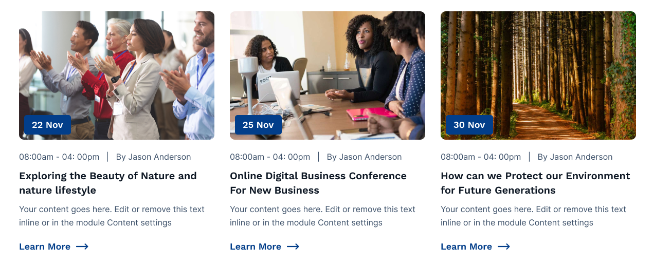
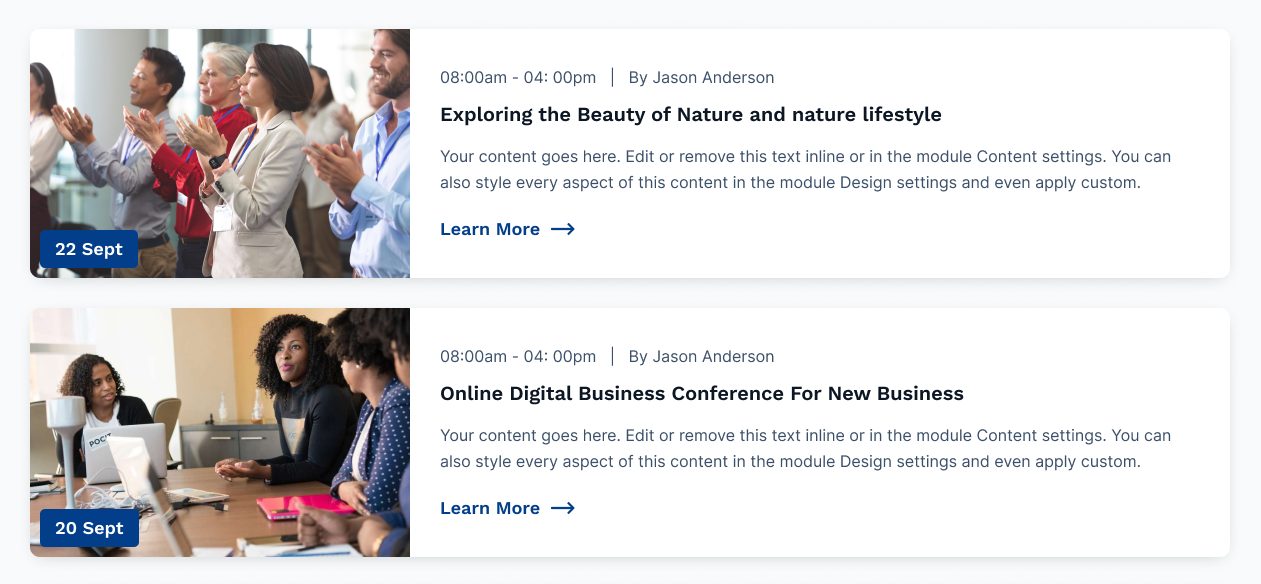
Layout :-
We have provided multiple Event layouts. Of course, each of the layouts can be customized by
changing the color theme and the background options.
1. Grid
2. List
For selecting a different layout in the event module select the layout as show
below in figure.
Note
Our Preview page of the module is Click here.
Multiple Days Timeline
The Multiple Days Timeline module provides a concise visual representation of events, tasks,
or activities scheduled over multiple days. It simplifies complex scheduling
by displaying chronological information in an easy-to-follow timeline format,
enabling users to track events and plan their activities efficiently across extended time
periods.
Content Section:
- Multiple Days: Note:- This group will display if you check the
checkbox of Multiple Days
- Tab Title: Add the title of tab for ex., Day 1. If not require then
leave the empty
- Date: Add the date in text format. for ex., 03 November 2022
- Group:
- Featured Image: Set the featured image if required.
- Time: Add the time of event in text format for ex., 09:00am -
11ion:30am
- Title: Add the title of event
- Description: Add the description of event
- Speaker:
- Speaker Image: Add the speaker image of the speaker
- Speaker Name: Add the speaker name
- Speaker Position: Add the position of the speaker
- Location: Add the location of the event
- Address: Add the detailed address of the event
- Single Day: Note:- This group will display if you uncheck the
checkbox of Multiple Days
- Featured Image: Set the featured image if required.
- Time: Add the time of event in text format for ex., 09:00am -
11ion:30am
- Title: Add the title of event
- Description: Add the description of event
- Speaker:
- Speaker Image: Add the speaker image of the speaker
- Speaker Name: Add the speaker name
- Speaker Position: Add the position of the speaker
- Location: Add the location of the event
- Address: Add the detailed address of the event
Layout:
- Use Multiple Days: Enable the checkbox to use the timeline in more than
1 days
- Scheme White Color: Switch between light and dark color scheme
- Heading Level: Choose from h1 to h6 for the title
Style Section:
- Alignment:
- Tab Alignment: Choose the options between left, center and right of
the tab alignment
- Text Alignment: Set the text alignment property of tab item.
- Tab:
- Separator:
- Use Separator: Enable the checkbox to use the sparator in tab
item, After the enabled all other options in these group will display.
- Color: Set the custom color for the separator
- Height: Set the custom height of the separator
- Background:
- Background?: Choose the background option between solid color
and gradient color
- Color: Set the custom solid color background for tab item, the
color will display if you selected the solid color in background
- Gradient: Set the custom gradient color, direction of color in
background for tab item, the gradient color will display if you selected the
gradient color in background
- Spacing:
- Spacing: Set the custom padding and margin of the tab item
- Border:
- Border: Set the border styles, width and color for tab
- Corner Radius:
- Corner Radius: Set the custom corner radius of all
directions in px for tab
- Tab Title:
- Font: Set the custom font style, size, color and decoration of
the tab title
- Tab Date:
- Font: Set the custom font style, size, color and decoration of
the tab date
- Active Tab:
- Separator:
- Color: Set the custom active color for the separator
- Background:
- Background?: Choose the background option between solid color
and gradient color
- Color: Set the custom solid color background for active tab
item, the color will display if you selected the solid color in background
- Gradient: Set the custom gradient color, direction of color in
background for active tab item, the gradient color will display if you selected
the gradient color in background
- Border Color:
- Color: Set the custom active border color for tab
- Tab Title:
- Color: Set the custom active colsor of active tab title
- Tab Date:
- Color: Set the custom active color of active tab date
- Content:
- Background:
- Background?: Choose the background option between solid color
and gradient color
- Color: Set the custom solid color background for content item,
the color will display if you selected the solid color in background
- Gradient: Set the custom gradient color, direction of color in
background for content item, the gradient color will display if you selected the
gradient color in background
- Spacing:
- Spacing: Set the custom padding and margin of the content item
- Border:
- Border: Set the border styles, width and color for content item
- Corner Radius: Set the custom corner radius of all directions
in px for content item
- Shadow:
- Use Box Shadow: Enable for using the box shadow in element,
after the enable all other options will display in this group
- Horizontal Offset: The horizontal offset of the shadow. A
positive value puts the shadow on the right side of the box, a negative value
puts the shadow on the left side of the box. Note:- If not require then set as 0
- Vertical Offset: The vertical offset of the shadow. A positive
value puts the shadow below the box, a negative value puts the shadow above the
box Note:- If not required then set to 0
- Blur: Optional, The blur radius. The higher the number, the
more blurred the shadow will be
- Spread: Optional, The spread radius. A positive value increases
the size of the shadow, a negative value decreases the size of the shadow.
- Color: Set the color of box shadow
- Image:
- Custom Width:
- Height: Set the custom height of featured image
- Border:
- Border: Set the border styles, width and color for featured
image
- Corner Radius: Set the custom corner radius of all directions
in px for featured image
- Date:
- Font: Set the font style, font size, color, weight, text-decoration
of date
- Spacing:
- Spacing: Set the custom padding and margin date
- Title:
- Font: Set the font style, font size, color, weight, text-decoration
of title
- Spacing:
- Spacing: Set the custom padding and margin of title
- Description:
- Font: Set the font style, font size, color, weight, text-decoration
of description
- Spacing:
- Spacing: Set the custom padding and margin of title
- Speaker:
- Background:
- Background?: Choose the background option between solid color
and gradient color
- Color: Set the custom solid color background for speaker
element, the color will display if you selected the solid color in background
- Gradient: Set the custom gradient color, direction of color in
background for speaker element, the gradient color will display if you selected
the gradient color in background
- Spacing:
- Spacing: Set the custom padding and margin of the speaker
element
- Border:
- Border: Set the border styles, width and color for speaker
element
- Corner Radius: Set the custom corner radius of all directions
in px for speaker element
- Shadow:
- Use Box Shadow: Enable for using the box shadow in element,
after the enable all other options will display in this group
- Horizontal Offset: The horizontal offset of the shadow. A
positive value puts the shadow on the right side of the box, a negative value
puts the shadow on the left side of the box. Note:- If not require then set as 0
- Vertical Offset: The vertical offset of the shadow. A positive
value puts the shadow below the box, a negative value puts the shadow above the
box Note:- If not required then set to 0
- Blur: Optional, The blur radius. The higher the number, the
more blurred the shadow will be
- Spread: Optional, The spread radius. A positive value increases
the size of the shadow, a negative value decreases the size of the shadow.
- Color: Set the color of box shadow
- Speaker Name:
- Font:
- Font: Set the custom font style, size, color and decoration
of the speaker name
- Spacing:
- Spacing: Set the custom padding and margin of the speaker
name
- Speaker Position:
- Font:
- Font: Set the custom font style, size, color and decoration
of the speaker name
- Location:
- Font:
- Font: Set the font style, font size, color, weight,
text-decoration of location
- Spacing:
- Spacing: Set the custom padding and margin of location
- Icon:
- Color: Set the custom color of location icon
- Background Color: Set the custom background color of location
icon
- Border Color: Set the custom border color of location icon
- Address:
- Font:
- Font: Set the font style, font size, color, weight,
text-decoration of address
- Responsive Tab:
- Backround Color: Set the custom background color of tab in mobile
view
- Border:
- Border: Set the border styles, width and color of tab in mobile
view
- Corner Radius: Set the custom corner radius of all directions
in px for tab in mobile view
- Tab Title:
- Font: Set the custom font style, size, color and decoration of
the tab title in mobile view
- Tab Date:
- Font: Set the custom font style, size, color and decoration of
the tab datein mobile view
- Icon Color: Set the custom background color of tab Plus-Minus icon
in mobile view
Note
Our Preview page of the module is Click here.
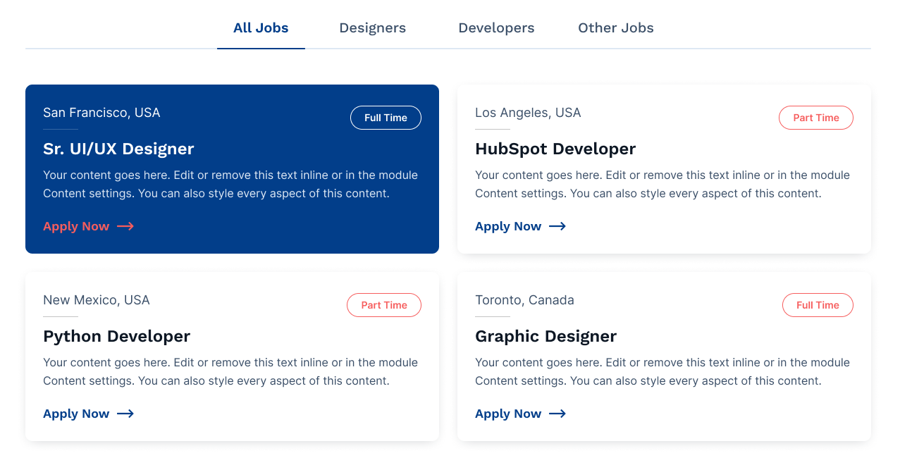
Job Post
The Job Post Module streamlines the process of posting job openings
on a website or application. It allows employers to easily create, manage,
and display job listings, including details such as job titles, descriptions, requirements,
and application instructions. Job seekers can efficiently search and apply for positions,
enhancing the recruitment and job-seeking experience.
Content Section:
- Tab Title: Tab Title of job post, This textfield will display if you
enable the checkbox of use tab in layout
- Job Post:
- Address: Add the city and country name of job post
- Job Type: Add the job type of job post, In this text field add the
job duration or working facilities i.e., remote work or office work, full time of
part time.
- Position: Add the job position
- Description: Description of job post
- Button Label: Text or Label of button
- Button Link: Button Link of job post
Layout:
- Use Tab: Enable the checkbox for using the tab in the module
- Scheme Light Color: Switch between light and dark color scheme
- Column Grid Selector: Choose from multiple options Column 1 to Column 3
- Heading Level: Choose from h1 to h6 for the title
Style Section:
- Tab Alignment:
- Alignment: Choose the options between left, center and right of the
tab alignment
- Tab:
- Font:
- Font: Set the font style, font size, color, weight,
text-decoration of page header
- Seperator:
- Color: Set the custom color of separator
- Height: Set the height in px of separator
- Spacing:
- Spacing: Set the custom padding and margin of the tab
- Active Tab:
- Tab Font Color:
- Color: Set the custom color of active tab
- Seperator:
- Color: Set the custom separator color of active tab
- Content:
- Background:
- Background?: Choose the background option between solid color
and gradient color
- Backround Color: Set the custom solid color background for box,
the color will display if you selected the solid color in background
- Gradient: Set the custom gradient color, direction of color in
background for box, the gradient color will display if you selected the gradient
color in background
- Spacing:
- Spacing: Set the custom padding and margin of the box
- Border:
- Border: Set the border styles, width and color for element
- Corner Radius: Set the corner radius in px for element
- Shadow:
- Use Box Shadow: Enable for using the box shadow in element,
after the enable all other options will display in this group
- Horizontal Offset: The horizontal offset of the shadow. A
positive value puts the shadow on the right side of the box, a negative value
puts the shadow on the left side of the box. Note:- If not require then set as 0
- Vertical Offset: The vertical offset of the shadow. A positive
value puts the shadow below the box, a negative value puts the shadow above the
box Note:- If not required then set to 0
- Blur: Optional, The blur radius. The higher the number, the
more blurred the shadow will be
- Spread: Optional, The spread radius. A positive value increases
the size of the shadow, a negative value decreases the size of the shadow.
- Color: Set the color of box shadow
- Content Hover:
- Background:
- Background?: Choose the hover background option between solid
color and gradient color
- Backround Color: Set the custom hover solid color background
for box, the color will display if you selected the solid color in background
- Gradient: Set the custom hover gradient color, direction of
color in background for box, the gradient color will display if you selected the
gradient color in background
- Border:
- Border: Set the custom hover border styles, width and color for
element, make sure to add the width is same as the border width of content
- Shadow:
- Use Box Shadow: Enable for using the box shadow in the hover of
element, after the enable all other options will display in this group
- Horizontal Offset: The horizontal offset of the shadow. A
positive value puts the shadow on the right side of the box, a negative value
puts the shadow on the left side of the box. Note:- If not require then set as 0
- Vertical Offset: The vertical offset of the shadow. A positive
value puts the shadow below the box, a negative value puts the shadow above the
box Note:- If not required then set to 0
- Blur: Optional, The blur radius. The higher the number, the
more blurred the shadow will be
- Spread: Optional, The spread radius. A positive value increases
the size of the shadow, a negative value decreases the size of the shadow.
- Color: Set the color of box shadow
- Address:
- Font: Set the font style, font size, color, weight, text-decoration
of address
- Hover:
- Color: Set the custom color of address on hover of box/element
- Job Type:
- Font: Set the font style, font size, color, weight, text-decoration
of job type
- Background:
- Color: Set the custom background color of job type
- Spacing:
- Spacing: Set the custom padding and margin of the job type
- Border:
- Border: Set the custom border styles, width and color for job
type
- Corner Radius:
- Radius: Set the custom corner radius of all
directions in px for tab
- Hover Style:
- Background:
- Color: Set the custom background color of job type on the
hover of element/box
- Color:
- Color: Set the custom font color of job type on the hover
of element/box
- Border Color:
- Color: Set the custom border color of job type on the hover
of element/box
- Position:
- Font: Set the font style, font size, color, weight, text-decoration
of position
- Spacing:
- Spacing: Set the custom padding and margin for position
- Hover:
- Color: Set the custom color of position on hover of box/element
- Gradient color:
- Use Gradient: Enable the checkbox to use Gradient color
- Gradient: Choose the directions from dropdown and add as much
color you want
- Date and Time:
- Date Format: Defines how the date and time will appear (e.g.,
DD/MM/YYYY, MM-DD-YYYY, etc.).
- Font: Choose a clear and readable font style for the date and time
display.
- Spacing: Adjust padding or margin to ensure proper alignment and
readability.
- Hover:
- Color: Customize the color change when a user hovers over
the date/time element.
- Description:
- Font: Set the font style, font size, color, weight, text-decoration
of description
- Hover:
- Color: Set the custom color of address on description of
box/element
- Button:
- Background Color: Set the custom background color of button
- Font: Set the font style, font size, color, weight,
text-decoration of button
- Spacing: Set the custom padding and margin of button
- border: Set the border styles, width and color for button
- border Radius: Set the custom corner radius of all directions
in px for button
- Hover:
- Background Color: Set the custom background color of button
on hover
- Color: Set the custom text color of button on hover
- Border color: Set the custom border color of button on
hover
- Responsive Tab:
- Backround Color: Set the custom background color of tab in mobile
view
Examples
Note
Our Preview page of the module is Click here.
Testimonial
Display one or more quotes in multiple columns and rows, or a slider.
Great for testimonials or quotes from your business partners, key employees, etc.
Content Section:
- Client Image: Select or upload the image from image picker for client
image
- Client Review: Add the review or quote
- Client Name: Add the name of the user or client
- Client Designation: Add the designation of client or user
Elements:
- Show Quote Icon: Enable to add the quote icon above the client review
- Show Arrows: Enable to use the arrow in the slider
- Show Controls: Enable to add the dot navigation or control in the
slider
Layout:
- Use Slider: Enable to use the slider in the module
- Slider Column Selector: Choose the options between One Slider and Two
Slider (Note:- This options will only display if use slider checkbox is
checked in Layout. )
- Grid Column Selector: Choose from multiple options One Column to Three
Column (Note:- This options will only display if use slider checkbox is
unchecked in Layout. )
- Content Layout: Choose the options between Vertical Image, Title
Designation and Horizontal Image, Title Designation
- Scheme Light Color: Switch between light and dark color scheme
- Quote Image/Icon
- Quote Image/Icon Selector: Choose the options between Icon and
Image
- Icon: Choose the icon from icon picker for quote icon
- Quote Image: Select or upload the image from image picker for quote
image
Style Section:
- Text Alignment:
- Text Alignment: Select the alignment of text
- Alignment:
- Content Alignment: Choose the options between left, center and
right of the content alignment
- Max Width:
- Slide Max Width: Set the custom max width in percentage of slider
- Spacing:
- Spacing: Set the custom padding and margin of the element
- Quote Icon:
- Color:
- Color: Set the custom color for quote icon
- Width:
- Width: Set the custom width of quote icon
- Spacing:
- Spacing: Set the custom margin top and bottom of the quote
icon.
- Quote Image:
- Spacing:
- Spacing: Set the custom margin top and bottom of the quote
image.
- Client Image:
- Corner Radius: Set the custom corner radius of user/client image
- Review:
- Font: Set the font style, font size, color, weight, text-decoration
of review
- Spacing: Set the custom padding and margin of review
- Star Rating:
- Size: Set the size of Star Rating
- Color: Set the custom color for Star Rating
- Spacing: Set the custom padding and margin of Star Rating
- Separator:
- Show Separator After Image: Check the fields to display seperator
below the image, All below style options of group will display if you checked this
checkbox
- Width: Set the width in percentage of seperator
- Color: Set the color of separator
- Client Name:
- Font: Set the font style, font size, color, weight, text-decoration
of name
- Spacing: Set the custom padding and margin of name
- Designation:
- Font: Set the font style, font size, color, weight, text-decoration
of designation
- Spacing: Set the custom padding and margin of designation
- Arrow left/right:
- Arrows color: Set the Left/Right Arrow Color of the testimonial
slider.
- Arrows size: Set the Left/Right Arrow size of the testimonial
slider.
- Controls:
- Color: Set the Controls Color of the testimonial slider.
- Active Color: Set the Active Controls Color of the testimonial
slider.
- Spacing: Set the custom margin top and bottom of the Controls.
Examples

Note
Our Preview page of the module is Click here.
Portfolio
The Portfolio Module enables users to showcase their work, skills,
and accomplishments in a visually appealing and organized manner.
It serves as a digital portfolio or gallery where individuals can display projects, artwork,
or achievements, making it easier for others to explore and appreciate their talents and
capabilities.
Content Section:
- Tab Title: Tab Title of portfolio, This textfield will display if you
enable the checkbox of use tab in layout
- Portfolio:
- Category: Add the category of portfolio
- Image: Select or upload the image
- Content Title: Add the title of the element
- Rich Text: Description of the element
- Button Label: Text or Label of button
- Button Link: Button Link of portfolio
Layout:
- Use Tab: Enable the checkbox for using the tab in the module
- Scheme White Color: Switch between light and dark color scheme
- Column Grid Selector: Choose from multiple options Column 1 to Column 4
- Heading Level: Choose from h1 to h6 for the title
Style Section:
- Alignment:
- Text Alignment: Select the alignment of text
- Tab Alignment: Choose the options between left, center and right of
the tab alignment
- Tab:
- Font:
- Font: Set the font style, font size, color, weight,
text-decoration of tab
- Seperator:
- Use Separator: Enable the checkbox if you want to use the
separator in tab item
- Color: Set the custom color of separator
- Height: Set the height in px of separator
- Background:
- Background?: Choose the background option between solid color
and gradient color
- Backround Color: Set the custom solid color background for tab
item, the color will display if you selected the solid color in background
- Gradient: Set the custom gradient color, direction of color in
background for tab item, the gradient color will display if you selected the
gradient color in background
- Spacing:
- Spacing: Set the custom padding and margin of the tab item
- Border:
- Border: Set the border styles, width and color for tab
- Corner Radius:
- Radius: Set the corner radius in px for tab
- Active Tab:
- Tab Font Color:
- Color: Set the custom color of active tab
- Seperator:
- Color: Set the custom separator color of active tab
- Background:
- Background?: Choose the background option between solid color
and gradient color for active tab item
- Backround Color: Set the custom solid color background for
active tab item, the color will display if you selected the solid color in
background
- Gradient: Set the custom gradient color, direction of color in
background for active tab item, the gradient color will display if you selected
the gradient color in background
- Border Color:
- Color: Set the border color for active tab item
- Content:
- Background:
- Background?: Choose the background option between solid color
and gradient color
- Color: Set the custom solid color background for box, the color
will display if you selected the solid color in background
- Gradient: Set the custom gradient color, direction of color in
background for box, the gradient color will display if you selected the gradient
color in background
- Spacing:
- Spacing: Set the custom padding and margin of the element
- Border:
- Border: Set the border styles, width and color for element
- Corner Radius: Set the corner radius in px for element
- Shadow:
- Use Box Shadow: Enable for using the box shadow in element,
after the enable all other options will display in this group
- Horizontal Offset: The horizontal offset of the shadow. A
positive value puts the shadow on the right side of the box, a negative value
puts the shadow on the left side of the box. Note:- If not require then set as 0
- Vertical Offset: The vertical offset of the shadow. A positive
value puts the shadow below the box, a negative value puts the shadow above the
box Note:- If not required then set to 0
- Blur: Optional, The blur radius. The higher the number, the
more blurred the shadow will be
- Spread: Optional, The spread radius. A positive value increases
the size of the shadow, a negative value decreases the size of the shadow.
- Color: Set the color of box shadow
- Image:
- Custom Height:
- Height: Set the custom height for image
- Border:
- Border: Set the border style, border width and border color for
image
- Corner Radius: Set the corner radius of all the direction
- Title:
- Font: Set the font style, font size, color, weight, text-decoration
of title
- Spacing:
- Spacing: Set the custom padding and margin for title
- Gradient color:
- Use Gradient: Enable for using the gradient color in title
- Gradient: Choose the directions from dropdown and add as much
color you want
- Description:
- Font: Set the font style, font size, color, weight, text-decoration
of description
- Button:
- Background Color: Set the custom background color of button
- Font: Set the font style, font size, color, weight, text-decoration
of button
- Spacing: Set the custom padding and margin of button
- border: Set the border styles, width and color for button
- border Radius: Set the custom corner radius of all directions in px
for button
- Hover:
- Background Color: Set the custom background color of button on
hover
- Color: Set the custom text color of button on hover
- Border color: Set the custom border color of button on hover
- Category:
- Position: Choose the options from top left, top right, bottom right
and bottom left on the image
- Background:
- Background?: Choose the background option between solid color
and gradient color
- Color: Set the custom solid color background for category, the
color will display if you selected the solid color in background
- Gradient: Set the custom gradient color, direction of color in
background for category, the gradient color will display if you selected the
gradient color in background
- Spacing:
- Spacing: Set the custom padding and margin of the category
- Border:
- Border: Set the custom border styles, width and color for job
type
- Corner Radius: Set the custom corner radius of all the
direction of the category
- Font:
- Font: Set the font style, font size, color, weight,
text-decoration of category
- Box Shadow:
- Use Box Shadow: Enable for using the box shadow in category,
after the enable all other options will display in this group
- Horizontal Offset: The horizontal offset of the shadow. A
positive value puts the shadow on the right side of the box, a negative value
puts the shadow on the left side of the box. Note:- If not require then set as 0
- Vertical Offset: The vertical offset of the shadow. A positive
value puts the shadow below the box, a negative value puts the shadow above the
box Note:- If not required then set to 0
- Blur: Optional, The blur radius. The higher the number, the
more blurred the shadow will be
- Spread: Optional, The spread radius. A positive value increases
the size of the shadow, a negative value decreases the size of the shadow.
- Color: Set the color of box shadow
- Responsive Tab:
- Backround Color: Set the custom background color of tab in mobile
view
- Border: Set the border styles, width and color of tab in mobile
view
- Corner Radius: Set the custom corner radius of all directions in px
for tab in mobile view
- Font: Set the custom font style, size, color and decoration of the
tab text in mobile view
- Icon Color: Set the custom background color of tab Plus-Minus icon
in mobile view
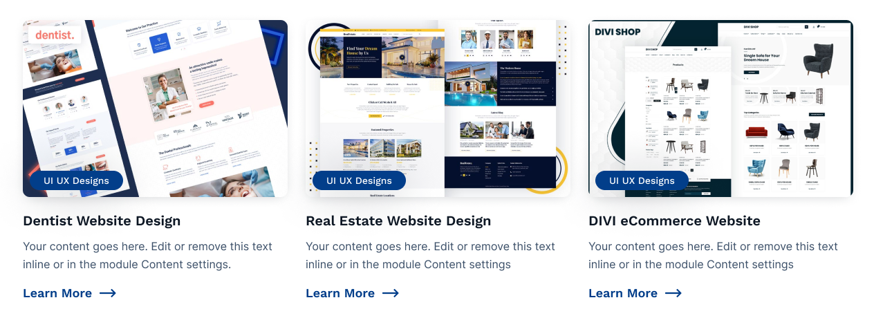
Examples
Note
Our Preview page of the module is Click here.
Map Content
The Map Content Module is used for adding the location of your company, contact information
and contact form.
This module is used to show Google maps, optionally with additional information.
This module is based on using a Google maps embed code or preferably using an embed code
generated with “Snazzy Maps”.
snazzymaps.com
We recommend Snazzy Maps because you can easily configure your map, add custom styling,
markers, etc.
To be able to generate your specific embed code, follow these steps:
1. Visit the snazzy maps website: snazzymaps.com
2. Create an account on snazzy maps.
3. Click on “Build a map” in the main navigation and follow the steps there.
4. Once you are done click on “View Code”
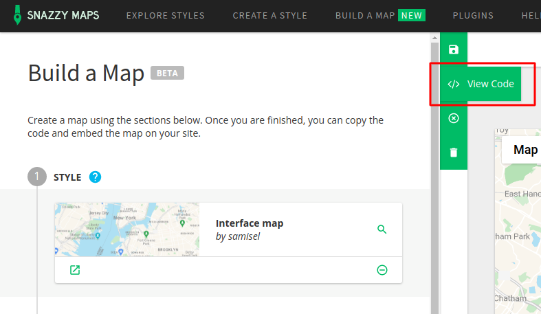
5. You will be asked to enter a map name and a google maps API key. Follow the instructions
here: API KEY to create your own API key. This is always needed to embed a
Google Map on your own website. If your API is not valid Google will block the rendering on
your website.
6. Once you finish entering the needed information, you can copy the embed code and paste it
in the module settings.
Content Section:
- Map Embed Code: Paste the code which you have copied from snazzy map
- Title: Title of the Map Content
- Description: Description of the Map Content
- Contact Information:
- Contact Number: Add the contact number
- Landline Number: Add the landline number
- Email Address: Add the email address
- Social Media:
- Facebook: Enter the url of your facebook id
- Instagram: Enter the url of your instagram id
- Twitter: Enter the url of your twitter id
- Linkedin: Enter the url of your linkedin id
- Business Hours: Add the timing of business hours in proper format (for
ex. 10:00 to 18:00, closed)
- Monday: Monday time of company/office
- Tuesday: Tuesday time of company/office
- Wednesday: Wednesday time of company/office
- Thursday: Thursday time of company/office
- Friday: Friday time of company/office
- Saturday: Saturday time of company/office
- Sunday: Sunday time of company/office
- Form:
- Choose a form: Choose or create a new form
Layout:
- Heading Level: Choose from h1 to h6 for the title
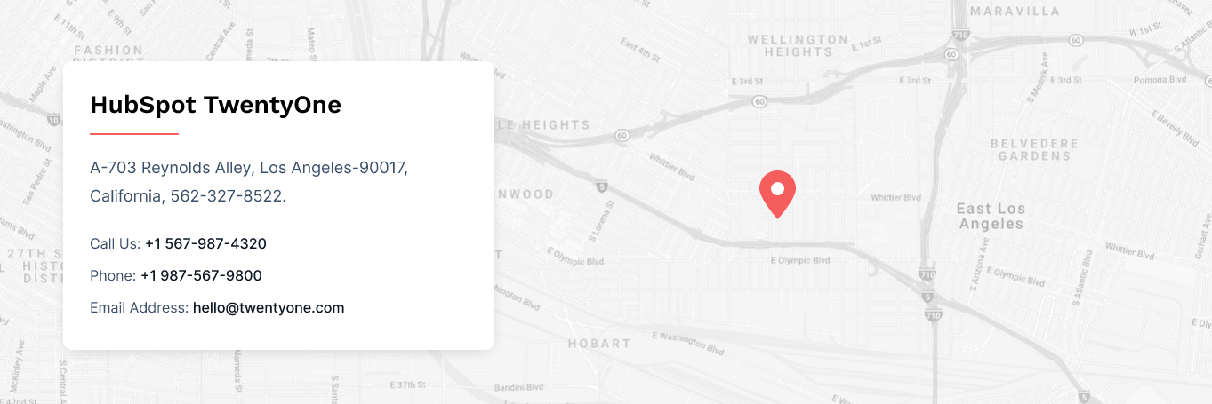
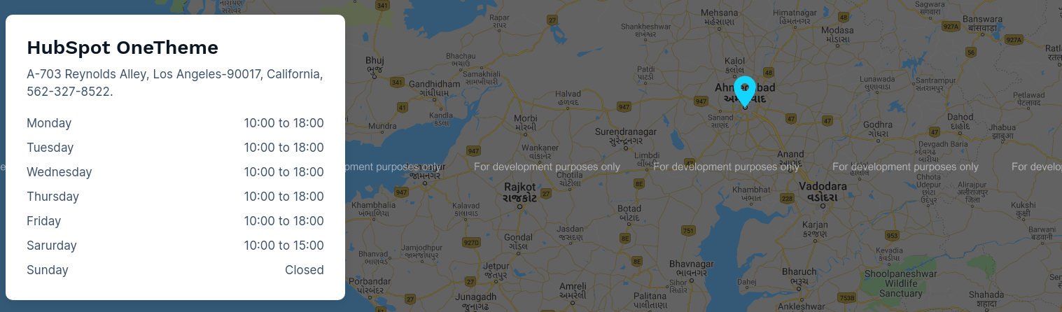
- Content Layout: Choose from multiple options Contact Info, Opening
Hours and Contact Form (examples see below)
- Hide All Contents: Switch between hide or display content on the map
- Add social media: Switch between add social media or not in the contact
info layout
- Scheme White Color: Switch between dark and light color scheme
- Content Position: Choose between left and right horizontal alignment of
the content
Style Section:
- Content:
- Background:
- Background? : Choose the background option from solid color and
gradient color
- Color: Set the custom solid color background for content,
the color will display if you selected the solid color in background
- Gradient: Set the custom gradient color, direction of color
in background for content, the gradient color will display if you selected
the gradient color in background
- Spacing:
- Spacing: Set the custom padding and margin of the content
- Border:
- Border: Set the custom border style of content
- Corner Radius: Set the custom corner radius of all the
direction of the content background
- Box Shadow:
- Use Box Shadow: Enable for using the box shadow in content,
after the enable all other options will display in this group
- Horizontal Offset: The horizontal offset of the shadow. A
positive value puts the shadow on the right side of the box, a negative value
puts the shadow on the left side of the box. Note:- If not require then set as 0
- Vertical Offset: The vertical offset of the shadow. A positive
value puts the shadow below the box, a negative value puts the shadow above the
box Note:- If not required then set to 0
- Blur: Optional, The blur radius. The higher the number, the
more blurred the shadow will be
- Spread: Optional, The spread radius. A positive value increases
the size of the shadow, a negative value decreases the size of the shadow.
- Color: Set the color of box shadow
- Max Width:
- Width: Set the custom width of content
- Map:
- Border
- Border: Set the custom border style,color and width of Map
- Corner Radius: Set the custom corner radius of all the
direction of the map
- Box Shadow:
- Use Box Shadow: Enable for using the box shadow in map, after
the enable all other options will display in this group
- Horizontal Offset: The horizontal offset of the shadow. A
positive value puts the shadow on the right side of the box, a negative value
puts the shadow on the left side of the box. Note:- If not require then set as 0
- Vertical Offset: The vertical offset of the shadow. A positive
value puts the shadow below the box, a negative value puts the shadow above the
box Note:- If not required then set to 0
- Blur: Optional, The blur radius. The higher the number, the
more blurred the shadow will be
- Spread: Optional, The spread radius. A positive value increases
the size of the shadow, a negative value decreases the size of the shadow.
- Color: Set the color of box shadow
- Title:
- Font: Set the font style, font size, color, weight, text-decoration
of title
- Gradient color:
- Use Gradient: Enable for using the gradient color in title
- Gradient: Choose the directions from dropdown and add as much
color you want
- Desc:
- Font: Set the font style, font size, color, weight, text-decoration
of description
- Contact Information:
- Icon:
- Color: Set the color of contact icon
- Width: Set the width of contact icon
- Link:
- Font: Set the font style, font size, color, weight,
text-decoration of link
- Social Media Icon:
- Color: Set the color of social media icon
- Width: Set the width of social media icon
- Spacing:
- Spacing: Set the custom padding and margin of the icon
- Social Media Hover:
- Color: Set the custom hover color of icon
- Opening Hours:
- Day:
- Font: Set the font style, font size, color, weight,
text-decoration of day
- Time:
- Font: Set the font style, font size, color, weight,
text-decoration of time
- Contact Form:
- Title:
- Font: Set the font style, font size, color, weight,
text-decoration of title
- Spacing: Set the custom padding and margin of the title
- Description:
- Font: Set the font style, font size, color, weight,
text-decoration of description
- Spacing: Set the custom padding and margin of the description
- Input Field:
- Spacing: Set the custom padding and margin of the Input field
- Font: Set the font style, font size, color, weight,
text-decoration of Input field
- Border: Set the custom border of the Input field
- Border Radius: Set the custom border radius of all the
direction of the input field
- Backround Color: Set the custom background color of input field
- Input Label:
- Font: Set the font style, font size, color, weight,
text-decoration of input label
- Spacing: Set the custom padding and margin of the input label
- Button:
- Background Color: Set the custom background color of button
- Font: Set the font style, font size, color, weight,
text-decoration of button
- Spacing: Set the custom padding and margin of button
- border: Set the border styles, width and color for button
- border Radius: Set the custom corner radius of all directions
in px for button
- Hover:
- Background Color: Set the custom background color of button
on hover
- Color: Set the custom text color of button on hover
- Border color: Set the custom border color of button on
hover
- Alignment: Select the alignment of button
Layout :-
We have provided multiple layouts.
1. Contact Info
2. Opening Hours
3. Contact Form
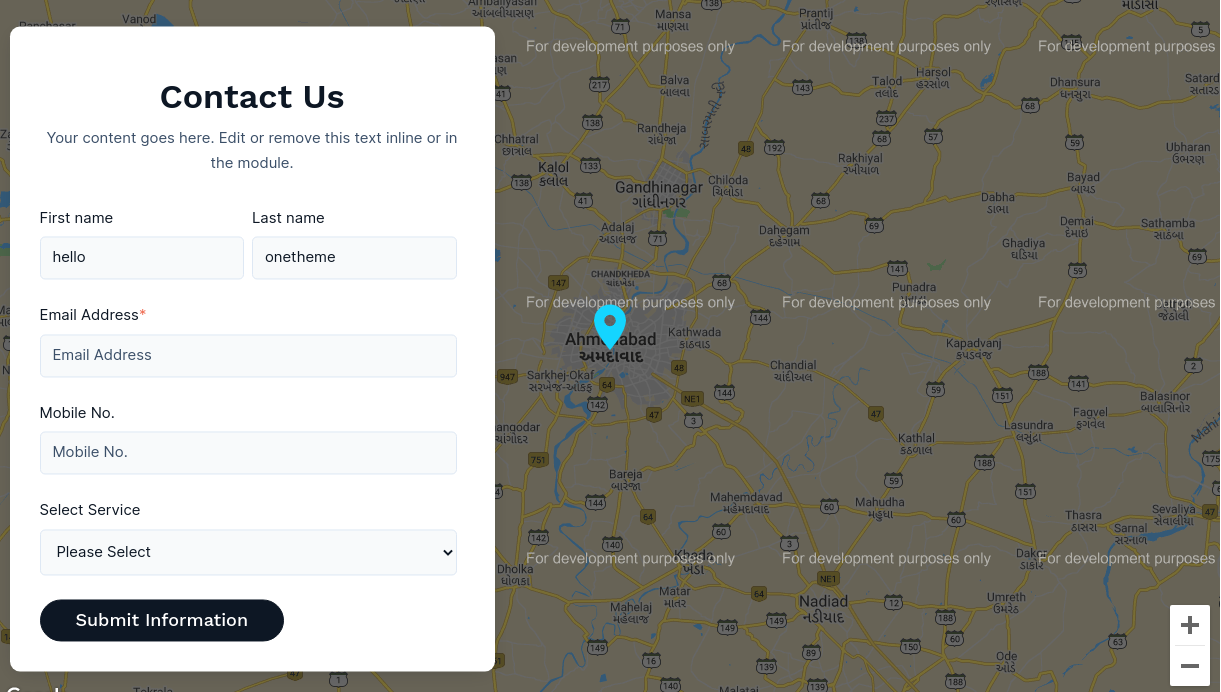
Note
Our Preview page of the module is Click here.
Hero Banner Section
The Hero Banner Section Module is used in the Banner Section of the Page. It Contains the
Image,Text and Button
The background options are Image, Video, Solid color and Gradient color.
Content Section:
- Page Header: Page header of the page
- Title: Title of the header section
- Description: Description of the header section
- Logo Image: Select or upload the image, the logo image will display
above the page header
- Header Image: Select or upload the image
- Button1 Label: Text or Label of button1, If you do not want a button
leave the textbox empty
- Button1 Link: Link of button1, If you leave the empty space in button1
label, the button1 link field does not display
- Button2 Label: Text or Label of button2, If you do not want a button
leave the textbox empty
- Button2 Link: Link of button2, If you leave the empty space in button2
label, the button1 link field does not display
Layout:
- Content Alignment: Choose the content alignment options from left,
center and right
- Animation: Select the various animations for content of the section
- Video: Select the video file from the file manager of hubspot, This
field will display if you have selected the video in Styles Layout
Background
- Scheme Light: Switch between light and dark color scheme
- Heading Level: Choose from h1 to h6 for the title
Style Section:
- Layout:
- Background?: Choose the background option from solid color, image,
video and gradient color, Note the video selection or upload field is in content
section
- Background Color: Set the custom solid color background for
section, the color will display if you selected the solid color in background
- Background Image: Choose the background image for background for
section, the background image will display if you selected the image in background
- Gradient: Set the custom gradient color, direction of color in
background for section, the gradient color will display if you selected the gradient
color in background
- Overlay: The overlay will work only on image
- Overlay Required?: Use Overlay Switch between use overlay or
not
- Overlay Color: Set the overlay color over image, this
option will display if you check overlay required
- Parallax: The Parallax efect will work only on background image
- Use Parallax: Enable to use parallax efect in background image
- Overlay For Video: The overlay will work only on video
- Overlay Required?: Use Overlay Switch between use overlay or
not
- Overlay Color: Set the overlay color over video, this
option will display if you check overlay required
- Video Play/Pause Button
-
Hide/Show: Toggle this option to show or hide the
play/pause button over the background
video.
-
Width: Set the width of the button (in pixels). Adjust
for better visual balance and
responsiveness.
-
Height: Specify the height of the button (in pixels) to
control its vertical size and
shape.
-
Icon Size: Adjust the size (in pixels) of the
play/pause icon inside the button.
-
Color: Select the icon color for better visibility
against your video background.
-
Background Color: Choose the button’s background color.
Semi-transparent colors often blend
well with videos.
-
Backdrop Filter: Add a blur effect (in pixels) behind
the button to make it pop over complex
video frames.
-
Border: Define the button border (color, width, and
style) to match your site’s
design.
-
Border Radius: Round the button corners. Larger values
create a circular button shape.
- Max Width:
- Custom Content Max Width: Enable to use the custom max width of the
section
- Container Max Width: Set the custom max width of the section
- Spacing:
- Spacing: Set the custom padding and margin of the section
- Spacing in Mobile View: Set the custom padding and margin in mobile
size of the section
- Text Alignment:
- Text Alignment: Select the alignment of text
- Logo Image:
- Width:Set the width of logo image
- Header Image:
- Width: Set the width of header image
- Image Alignment: Select the alignment of header image
- Page Header:
- Font: Set the font style, font size, color, weight, text-decoration
of page header
- Spacing: Set the custom padding and margin for page header
- Title:
- Font: Set the font style, font size, color, weight, text-decoration
of title
- Line height : Set the line height of title
- Spacing: Set the custom padding and margin for title
- Gradient color:
- Use Gradient: Enable for using the gradient color in title
- Gradient: Choose the directions from dropdown and add as much
color you want
- Description:
- Font: Set the font style, font size, color, weight, text-decoration
of description
- Spacing: Set the custom padding and margin for description
- Button
- Button 1:
- Background Color: Set the custom background color of button
- Font: Set the font style, font size, color, weight,
text-decoration of button
- Spacing: Set the custom padding and margin of button
- border: Set the border styles, width and color for button
- border Radius: Set the custom corner radius of all directions
in px for button
- Hover:
- Background Color: Set the custom background color of button
on hover
- Color: Set the custom text color of button on hover
- Border color: Set the custom border color of button on
hover
- Button 2:
- Background Color: Set the custom background color of button
- Font: Set the font style, font size, color, weight,
text-decoration of button
- Spacing: Set the custom padding and margin of button
- border: Set the border styles, width and color for button
- border Radius: Set the custom corner radius of all directions
in px for button
- Hover:
- Background Color: Set the custom background color of button
on hover
- Color: Set the custom text color of button on hover
- Border color: Set the custom border color of button on
hover
Examples
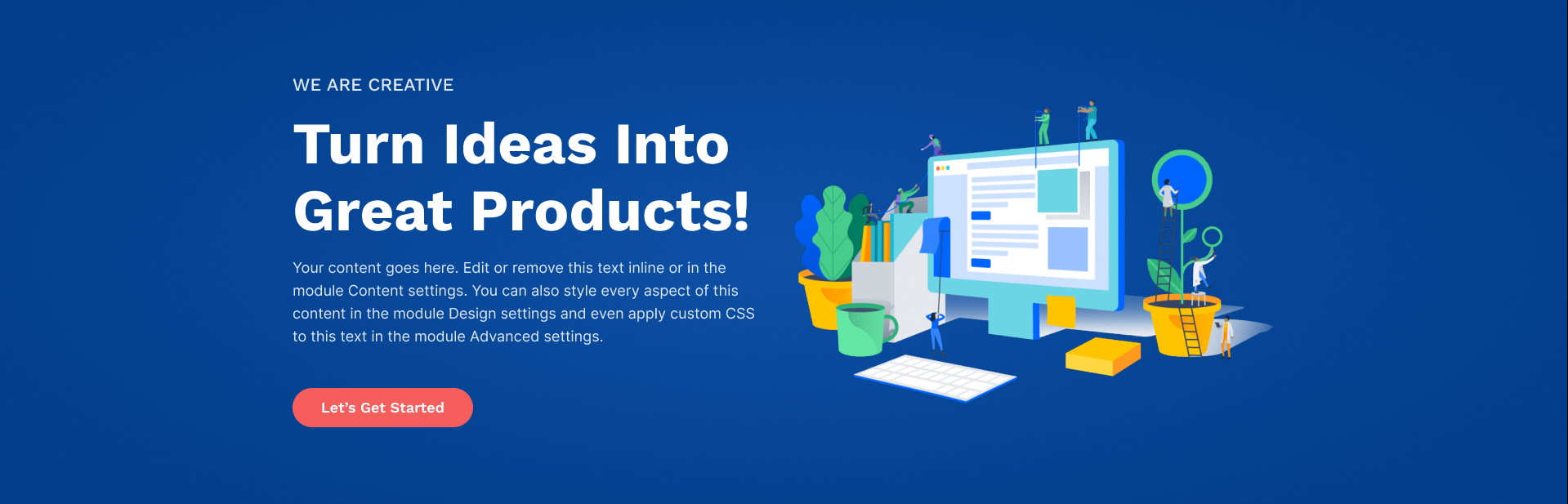
Note
In the section setting set the padding as 0 in all the
directions and also set the background as none of the section in the alignment and
spacing, in which you have used this module.
Don't Worry the Module have the options of custom max width.
Our Preview page of the module is Click here.
Hero Slider
The Hero Slider Module e.g can be used for Hero Banner. This module contains the Image,
Video, Text and Button.
This module is similar to Full Width Header Module, The difference is the module have the
video option and the module is in slider view.
Content Section:
- Small Image: Select or upload the image, the small image will display
above the page header
- Page Header: Page header of the page
- Title: Title of the hero section
- Description: Description of the hero section
- Button1 Label: Text or Label of button1, If you do not want a button
leave the textbox empty
- Button1 Link: Link of button1
- Button2 Label: Text or Label of button2, If you do not want a button
leave the textbox empty
- Button2 Link: Link of button2
- Image: Select or upload the image, This field will display if you have
selected the Image in Layout
Content Image/Video
- Video: Select the video file from the file manager of hubspot, This
field will display if you have selected the Video in Layout Content Image/Video
- Layout:
- Background?: Choose the background option from color and image
- Background Color: Set the custom solid color background for
element, the background color will display if you selected the color in background
- Background Image: Choose the background image for element, the
background image will display if you selected the image in background
- Overlay: This group will display if you select the image in
background dropdown
- Custom Overlay: Use Overlay Switch between use overlay or not
- Overlay Color: Set the overlay color, this option will display
if you check the custom overlay
- Image/Video Required: Enable to use image or video in the element
- Content Image/Video? :Choose between Image and Video in the content
of element, This field will display if you check the Image/Video Required checkbox
- Image/Video Position: Choose between Left, Center and Right of the
position of Image/Video, This field will display if you check the Image/Video
Required checkbox
- Image/Video Alignment: Choose between Left, Center and Right of the
alignment of Image/Video, This field will display if you check the Image/Video
Required checkbox
- Custom Max Width: Enable to use custom max width of the element
- Max Width: Enable to use custom max width in px of the element
- Content Alignment: Choose the content alignment options from left,
center and right
- Scheme Light: Switch between light and dark color scheme
Layout:
- Animation Required in Content: Enable the checkbox to add the animation
in content
- Content Animation Selector: Select the various animations from dropdown
for content of the module
- Autoplay Duration: Add slider autoplay duration
- Animation in Slider Autoplay: Enable the checkbox to add animation in
slider
- Slider AnimateIn: Add slider in animation
- Slider AnimateOut: Add slider out animation
- Animation Duration: Add slider animation duration
Style Section:
- Layout Style:
- Custom Content Max Width: Enable the checkbox for using the custom
content max width of entire module
- Content Max Width: Enable to use content max width in px of the
module
- Spacing: Set the custom padding and margin of the module
- Spacing in Mobile:
- Spacing: Set the custom padding and margin in mobile size
of the module
- Content Style:
- Use Text Overlay: Enable the checkbox for using the overlay
background in text content
- Text Background Overlay Color: Set the background overlay color of
the text content, This field will display if you check the above checkbox
- Spacing: Set the custom padding and margin of the text content of
the module
- Corner Radius: Set the corner radius of all the direction of the
background of text content
- Video Width: Set the custom width of video in px
- Image Max Width: Set the custom width of image in px
- Navigation:
- Arrow:
- Show Arrows: Check the checkbox for using the arrow in the
slider, If this checkbox will checked the other style options will display in
these group
- Color: Set the custom color for arrow of the slider
- Hover Color: Set the custom hover color for arrow of the slider
- Arrow Font Size: Set the custom arrow size in px
- Dot Navigation:
- Show Dot Navigation: Check the checkbox for using the dot
navigation in the slider, If this checkbox will checked the other style options
will display in these group
- Background Color: Set the custom background color for dot
navigation of the slider
- Hover Background Color: Set the custom hover background color
for dot navigation of the slider
- Active Background Color: Set the custom active background color
for dot navigation of the slider
- Corner Radius: Set the custom corner radius in px of all the
direction of the dot navigation
- Spacing: Set the custom padding and margin of the dot
navigation
- Border: Set the custom border style of dot navigation
- Hover Border: Set the custom hover border style of dot
navigation, make sure the width of the border have the same size as used in
border of dot navigation
- Page Header:
- Font:
- Font: Set the font style, font size, color, weight,
text-decoration
of page header
- Spacing:
- Spacing: Set the custom padding and margin for page header
- Title:
- Heading Level: Choose from h1 to h6 for the title
- Font:
- Font: Set the font style, font size, color, weight,
text-decoration
of title
- Spacing:
- Spacing: Set the custom padding and margin for page title
- Gradient color:
- Use Gradient: Enable for using the gradient color in title
- Gradient: Choose the directions from dropdown and add as much
color you want
- Description:
- Font:
- Font: Set the font style, font size, color, weight,
text-decoration
of description
- Spacing:
- Spacing: Set the custom padding and margin for description
- Small Image:
- Width:
- Image Width: Set the custom width of small image
- Spacing:
- Spacing: Set the custom padding and margin for small image
- Button
- Button 1:
- Background Color: Set the custom background color of button
- Font: Set the font style, font size, color, weight,
text-decoration of button
- Spacing: Set the custom padding and margin of button
- border: Set the border styles, width and color for button
- border Radius: Set the custom corner radius of all directions
in px for button
- Hover:
- Background Color: Set the custom background color of button
on hover
- Color: Set the custom text color of button on hover
- Border color: Set the custom border color of button on
hover
- Button 2:
- Background Color: Set the custom background color of button
- Font: Set the font style, font size, color, weight,
text-decoration of button
- Spacing: Set the custom padding and margin of button
- border: Set the border styles, width and color for button
- border Radius: Set the custom corner radius of all directions
in px for button
- Hover:
- Background Color: Set the custom background color of button
on hover
- Color: Set the custom text color of button on hover
- Border color: Set the custom border color of button on
hover
Examples

Note
In the section setting set the padding as 0 in all the directions and also set the
background as none of the section in the alignment and spacing, in which you have
used this module.
Don't Worry the Module have the options of custom max width.
Our Preview page of the module is Click here.
Multiple Timeline
The Timeline Module e.g can be used for highlight your company's significant achievements and
milestones with an excellent timeline design.
Content Section:
- Title: Add the title of timeline
- Main Title: Add the Main Title of timeline
- Description: Add the description of timeline
- Date: Add the date of timeline
Style Section:
- Max Width:
- Width: Set the custom max width of the module
- Base Line:
- Line Color: Set the color of Line
- Circle Color: Set the color of Circle
- Top & Bottom Circle color: Set the color of Top & Bottom Circle
- Date/Time:
- Font: Set the font style, font size, color, weight,
text-decoration
of date
- Title:
- Font: Set the font style, font size, color, weight,
text-decoration
of title
- Spacing: Set the custom padding and margin for title
- Gradient Color:
- Use Gradient: Enable the checkbox to use Gradient color
- Gradient: Choose the directions from dropdown and add as
much
color you want
- Main Title:
- Font: Set the font style, font size, color, weight,
text-decoration
of Main title
- Spacing: Set the custom padding and margin for Main title
- Description:
- Font: Set the font style, font size, color, weight,
text-decoration
of description
- Spacing: Set the custom padding and margin for description
Examples
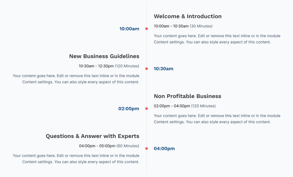
Note
Our Preview page of the Mini module is Click here.
Team
The Team Module e.g can be used for showing the team of the brand.
Content Section:
- Tab Title: Tab Title of team module, This textfield will display if you
enable the checkbox of use tab in layout
- Team Group:
- Member Image: Select or upload the image of team member of element
- Member Name: Add the name of member of element
- Member Designation: Add the designation of member of element
- Member Description: Description of member of element, if you
does'nt require this field leave the empty space
- Linkedin: Add the linkedin account id url, if you does'nt require
this field leave the empty space
- Twitter: Add the twitter account id url, if you does'nt require
this field leave the empty space
- Facebook: Add the facebook account id url, if you does'nt require
this field leave the empty space
- Instagram: Add the account account id url, if you does'nt require
this field leave the empty space
- Email: Add the id of the email, if you does'nt require this field
leave the empty space
- Youtube: Add the youtube account id url, if you does'nt require
this field leave the empty space
- Skype: Add the skype account id url, if you does'nt require this
field leave the empty space
- Phone: Add the contact number, if you does'nt require this field
leave the empty space
Layout:
- Layout style: Choose from multiple options basic layout and overlay
card layout
- Grid Column Selector: Choose from multiple options One Column to Four
Column
- Use Tab: Enable the checkbox for using the tab in the module
- Scheme White Color: Switch between light and dark color scheme
- Header Tag: Choose from h1 to h6 for the title
- Use Button: Enable the checkbox for using the button in card
Style Section:
- Card:
- Backround Color: Set the custom solid color background for card
- Border: Set the border styles, width and color for card
- Corner Radius: Set the corner radius in px for card
- Card Hover:
- Backround Color: Set the custom solid color background for card
hover
- Border: Set the border styles, width and color for card hover
- Box Shadow: Enable for using the box shadow in element
- Use box shadow: Enable for using the box shadow in team card,
after the enable all below options will display in this group
- Horizontal Offset: The horizontal offset of the shadow. A
positive
value puts the shadow on the right side of the box, a negative value puts the
shadow
on the left side of the box. Note:- If not require then set as 0
- Vertical Offset: The vertical offset of the shadow. A positive
value puts the shadow below the box, a negative value puts the shadow above the
box
Note:- If not required then set to 0
- Blur: Optional, The blur radius. The higher the number, the
more
blurred the shadow will be
- Spread: Optional, The spread radius. A positive value increases
the
size of the shadow, a negative value decreases the size of the shadow
- Color: Set the color of box shadow
- Member Image:
- Height: Set the custom height in px for member image
- Corner Radius:
- Top Left: The value applies to Top-Left corner of the member
image
- Top Right: The value applies to Top-Right corner of the member
image
- Bottom Right: The value applies to Bottom-Right corner of the
member image
- Bottom Left: The value applies to Bottom-Left corner of the
member image
- Member Name:
- Font: Set the font style, font size, color, weight, text-decoration
of member name
- Spacing: Set the custom padding and margin of member name
- Card Hover:
- Text Hover Color: Set the font hover color of member member
name
- Member Designation:
- Font: Set the font style, font size, color, weight, text-decoration
of member designation
- Spacing: Set the custom padding and margin of member designation
- Card Hover:
- Color: Set the font hover color of member designation
- Member Description:
- Font: Set the font style, font size, color, weight, text-decoration
of member description
- Spacing: Set the custom padding and margin of member description
- Card Hover:
- Color: Set the font hover color of member description
- Social Icon:
- Spacing:
- Spacing: Set the custom padding and margin of the icon
- Background:
- Background Color: Set the custom background color of icon
- Hover Background:
- Background Color: Set the custom hover background color of icon
- Icon Color:
- Color: Set the custom color of icon
- Icon Hover Color:
- Color: Set the custom hover color of icon
- Icon Size:
- Size: Set the custom font size in px of icon
- Border:
- Border: Set the custom border styles, width and color of icon
- Hover Border Color:
- Border Color: Set the custom border color of icon on hover
- Corner Radius:
- Corner Radius: Apply the corner radius of all the direction for
the icon
- Box Height
- Height: Set the custom height in px of the icon box
- Box Width
- Width: Set the custom width in px of the icon box
- Alignment:
- Content Alignment: Choose the options between left, center and
right of the content alignment
- Buttons
- Button Style:
- Background Color: Set the custom background color of button
- Font: Set the font style, font size, color, weight,
text-decoration of button
- Spacing: Set the custom padding and margin of button
- border: Set the border styles, width and color for button
- border Radius: Set the custom corner radius of all directions
in px for button
- Hover Button Style:
- Font Color: Set the custom text color of button on hover
- Background Color: Set the custom background color of button
on hover
- Border color: Set the custom border color of button on
hover
- Tab:
- Tab Alignment:
- Alignment: Select the alignment of tab
- Border:
- Border: Set the border styles, width and color for tab
- Font:
- Font: Set the various font style, size, color, weight and
decoration for the Tab
- Active:
- Text Color: Set the custom color of active tab item
- Border Color: Set the custom border color of active tab item
- Spacing:
- Spacing: Set the custom padding and margin of tab item
- Responsive Tab Dropdown:
- Background Color: Set the custom background color of dropdown
- Border: Set the border styles, width and color of dropdown
- Corner Radius: set the corner radius of dropdown
- Font: Set the various font style, size, color, weight and
decoration of dropdown
- Spacing: Set the custom padding and margin of dropdown
- Popup Style:
- Box:
- Width: Set the popup box width (in pixels). Adjust this to
control
the popup’s overall size.
- Flex Item Alignment: Align content within the popup box (top,
center, bottom, etc.) for better
layout control.
- Background Color: Choose a background color for the popup box.
- Spacing: Control the internal padding and margin to manage the
spacing inside the popup
box.
- Border: Customize the border width, color, and style to enhance
popup visibility and
structure.
- Corner Radius: Round the edges of the popup box. Higher values
create a softer, modern
look.
- Member Image:
- Height: Set the display height of the member image (in
pixels).
- Corner Radius: Round the member image corners.
- Content Alignment:
- Text Alignment: Set the text alignment of the element
- Member Name:
- Font: Set the font style, font size, color, weight,
text-decoration
of member name
- Spacing: Set the custom padding and margin of member name
- Member Designation:
- Font: Set the font style, font size, color, weight,
text-decoration
of member designation
- Spacing: Set the custom padding and margin of member
designation
- Member Description:
- Font: Set the font style, font size, color, weight,
text-decoration
of member description
- Spacing: Set the custom padding and margin of member
description
- Social Icon:
- Spacing: Set the custom padding and margin of the icon
- Width: Set the custom width in px of the icon box
- Height: Set the custom height in px of the icon box
- Background Color: Set the custom background color of icon box
- Border: Set the custom border styles, width and color of icon
box
- Corner Radius: Apply the corner radius of all the direction for
the icon box
- Color: Set the custom color of icon
- Icon Size: Set the custom font size in px of icon
- On Hover:
- Background Color: Set the custom hover background color of
icon box
- Icon Color: Set the custom hover color of icon
- Border Color: Set the custom border color of icon box on
hover
- Close Button:
- Width: Set the custom width in px of the Close Button
- Height: Set the custom height in px of the Close Button
- Background Color: Set the custom background color of Close
Button
- Font: Set the font style, font size, color, weight,
text-decoration of Close Button
- border: Set the border styles, width and color for Close Button
- border Radius: Set the custom corner radius of all directions
in px for Close Button
- On Hover:
- Background Color: Set the custom background color of Close
Button
on hover
- Color: Set the custom text color of Close Button on hover
- Border color: Set the custom border color of Close Button
on
hover
Examples

Note
This Module have the options whether to use tab or not.
Our Preview page of the module is Click here.
Video Pop-Up
The video pop-up Module e.g can be used for showing Single video and multiple video in
website page, blog post page, and blog listing page.
Content Section:
- Layout: Choose the options between Single video and
Video Boxes
- Single Video Options: Choose the options between
Video Pop-Up and Button with title. (Note: The
Single Video Options field will display if you have selected the Layout in single video
options)
- Single Video (Note: The
Single Video Options field will display if you have selected the Layout in single video
options)
- Video Title: Add the title of video(Note: The
video title field will display if you have selected the Button with titl in single
video
options)
- Video Thumbnail: Select the image (Note: The
Video Thumbnail field will display if you have selected the Video Pop-Up in single
video options)
- Video Url: Enter the URL of HubSpot File / YouTube / Vimeo
- Video Boxes Layout: Choose the options between Grid and Slider
- Video Boxes: (Note: The
Video Boxes Options field will display if you have selected the video
Boxes in Layout)
- Video Title: Add the title of video
- Video Video: Add the description of video
- Video Thumbnail: Select the image
- Video Url: Enter the URL of HubSpot File / YouTube / Vimeo
- Grid Selector:
- Column Grid Selector:Choose from multiple options from Column 2 to
Column-4 to display element in a row. (Note: The
Column Grid Selector Options field will display if you have selected the grid in
Video Boxes Layout)
- Slider Grid Selector:Choose from multiple options from Column 1 to
Column-3 to display element in a row. (Note: The
Column Grid Selector Options field will display if you have selected the Slider in
Video Boxes Layout)
- Heading Level: Choose from h1 to h6 for the title.
Style Section:
- Box Style
- Background Color: Set the custom background color of box
- Border: Set the border style, border width and border color for box
- Corner Radius Set the corner radius of all direction
- Spacing: Set the custom padding and margin for box
- Box Content
- Text Alignment: Select the alignment of text
- Image
- Corner Radius:
- Top Left: Set the corner radius of Top Left direction
- Top Right: Set the corner radius of Top Right direction
- Bottom Left: Set the corner radius of Bottom Left direction
- Bottom Right: Set the corner radius of Bottom Right
direction
- Video Title
- Font: Set the font style, font size, color, weight,
text-decoration of title
- Spacing: Set the custom padding and margin for title
- Video Description
- Font: Set the font style, font size, color, weight,
text-decoration of title
- Spacing: Set the custom padding and margin for description
- Content Spacing: Set the custom padding for content
- Play Button
- Play Button Background: Set the custom background color of button
- Play Button Color: Set the custom color of button
- Play Button Width
- Desktop: Set the custom width of button
- Mobile: Set the custom width of button
- Play Button Icon Width
- Desktop: Set the custom width of button Icon
- Mobile: Set the custom width of button Icon
- Single Video Style
- Video Border: Set the border style, border width and border color
for
single video
- Corner Radius Set the corner radius of all direction for single
video
- Content Alignment
- Alignment: Choose the options between left, center and
right of the content alignment
- Thumbnail Overlay
- Use Overlay: Enable the checkbox to Overlay color
- Overlay Color: Set the custom color of Thumbnail Overlay Color
- Button With Title
- Title Style
- Spacing: Set the custom padding and margin for title
- Font: Set the font style, font size, color, weight,
text-decoration
of title
- Slider
- Slider navigation Color: Set the custom color for arrow of the
slider
- Slider navigation Active Color: Set the custom active color
for navigation of the slider
Examples

Note
Our Preview page of the module is Click here.
social-follow
The Social follow module is used to follow or subscribe in the social media of your brands.
Content Section:
- Social links
- Icon: Choose the icon from various social media platforms
- Social Link: Set the social follow link of that selected social
media
- Background Color: Set the background color for each icon
- Hover Background Color: Set the hover background color for each
icon
- Accessibility:
- Title: Add the accessibility title, it will display when user
hover on icon
- Icon Layout: Choose the options between Vertical and Horizontal.
Style Section:
- Alignment:
- Alignment: Choose the content alignment options from left, center,
and right.
- Icon Color:
- Color: Set the custom color of icon
- Icon Hover: Set the custom color of icon hover color.
- Size:
- Width: Set the custom width of icon.
- height: Set the custom height of icon.
- Corner Radius:
- Top Right: The value applies to Top-Right corner of the icon
- Top Left: The value applies to Top-Left corner of the icon
- Bottom Right: The value applies to Bottom-Right corner of the icon
- Bottom Left: The value applies to Bottom-Left corner of the icon
- Spacing:
- Space between icons: Set the custom space between icons in px
- Spacing: Set the custom spacing and margin of icons
- Border
- Border: Apply the Border style, color and width and also the sides
of border
- Border Hover: Set the custom icon hover color of icon
- Shadow
- Use Box Shadow: Enable for using the box shadow in element, after
the
enable all other options will display in this group
- H Offset: The horizontal offset of the shadow. A positive
value puts the shadow on the right side of the box, a negative value puts the shadow
on the left side of the icon. Note:- If not require then set as 0
- V Offset: The vertical offset of the shadow. A positive
value puts the shadow below the box, a negative value puts the shadow above the icon
Note:- If not required then set to 0
- Blur: Optional, The blur radius. The higher the number, the more
blurred the shadow will be
- Spread: Optional, The spread radius. A positive value increases the
size of the shadow, a negative value decreases the size of the shadow.
- Color: Set the color of box shadow
Examples
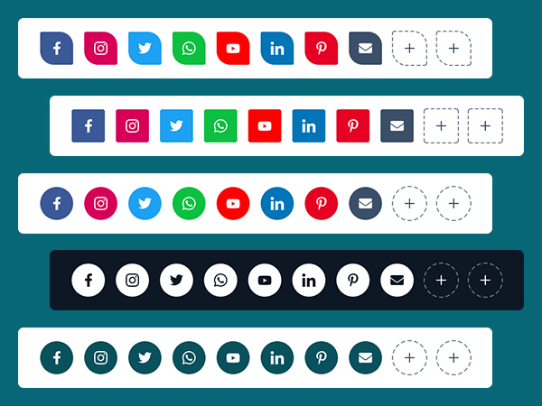
Advanced Blurb
The Blurb Module is used for adding the Image, Text and Button.
Content Section:
- Image: Select the image (Note: The Image field will
display if you have selected the Image in layout Image/Icon?)
- Icon: Select the icon (Note: The Icon field will
display if you have selected the Icon in layout Image/Icon?)
- Title: Title of Blurb
- Description: Description of Blurb in rich text field
- Button Label: Optional Button Label for blurb (Note:
This field will display if you have check the Button Required? field in the layout)
- Button Link: Optional Button Link for blurb (Note:
This field will display if you have check the Button Required? field in the layout)
- Animation
- Animation Required?: Enable the checkbox to add the animation
in content
- Animation Selector: Select the various animations from dropdown
for content of the module
- Autoplay Duration: Add animation duration
Layout:
- Content Layout: Select the grid/slider layout for your content cards
- Image/Icon?: Choose the options between Image or Icon to use in the
module
- Image/Icon Position: Choose the options between Top of Left placement
of image/icon
- Vertical Align Center: Enable the checkbox if you want to set the
vertical align center in the element for box
- Heading Level: Choose from h1 to h6 for the title
- Column Grid Selector: Choose from multiple options from One Column to
Four Column to display element in a row
- Button Required?: Check if required button in the blurb
- Scheme Light Color: Switch between light and dark color scheme
Style Section:
- Box Style
- Text Alignment: Select the alignment of text
- Corner Radius: Apply the corner radius of all the direction for the
elements
- Background Color: Set the background color for all the elements
- Border: Set the border styles, width and color
- Spacing: Add the custom padding and margin
- Box Shadow
- Use Box Shadow: Enable for using the box shadow in element,
after the
enable all other options will display in this group
- H Offset: The horizontal offset of the shadow. A
positive
value puts the shadow on the right side of the box, a negative value puts the
shadow
on the left side of the icon. Note:- If not require then set as 0
- V Offset: The vertical offset of the shadow. A positive
value puts the shadow below the box, a negative value puts the shadow above the
icon
Note:- If not required then set to 0
- Blur: Optional, The blur radius. The higher the number, the
more
blurred the shadow will be
- Spread: Optional, The spread radius. A positive value increases
the
size of the shadow, a negative value decreases the size of the shadow.
- Color: Set the color of box shadow
- Use Inset Shadow: Optional. Changes the shadow from an outer
shadow (outset) to an inner shadow
- Box Hover Style:
- Background Color: Set the hover background color for all the
elements
- Border: Set the hover border styles, width and color, select the
same border width in which you have selected in box style border
- Box Shadow
- Use Box Shadow: Enable for using the box shadow in element,
after the
enable all other options will display in this group
- H Offset: The horizontal offset of the shadow. A
positive
value puts the shadow on the right side of the box, a negative value puts the
shadow
on the left side of the icon. Note:- If not require then set as 0
- V Offset: The vertical offset of the shadow. A positive
value puts the shadow below the box, a negative value puts the shadow above the
icon
Note:- If not required then set to 0
- Blur: Optional, The blur radius. The higher the number, the
more
blurred the shadow will be
- Spread: Optional, The spread radius. A positive value increases
the
size of the shadow, a negative value decreases the size of the shadow.
- Color: Set the color of box shadow
- Use Inset Shadow: Optional. Changes the shadow from an outer
shadow (outset) to an inner shadow
- Icon
- Width: Set the custom ico height in px as per your requirement
- Height: Set the custom icon height in px as per your requirement
- Color: Set the icon color
- Hover Color: Set the icon hover color
- Spacing: Set the custom padding and margin of icon
- Image Radius:
- Top Left: The value applies to Top-Left corner of the Image
- Top Right: The value applies to Top-Right corner of the Image
- Bottom Left: The value applies to Bottom-Left corner of the Image
- Bottom Right: The value applies to Bottom-Right corner of the Image
- Title
- Title Font: Set the font style, font size, color, weight,
text-decoration
of title
- Font Hover Color: Set the font hover color of title
- Use gradiant: Enable this toggle and Set the custom gradient color,
direction of color
- Gradient: Choose the directions from dropdown and add as much
color you want
- Spacing: Set the custom padding and margin of title
- Description
- Font: Set the font style, font size, color, weight, text-decoration
of description
- Font Hover Color: Set the font hover color of description
- Spacing: Set the custom padding and margin of description
- Buttons
- Button Style:
- Background Color: Set the custom background color of button
- Font: Set the font style, font size, color, weight,
text-decoration of button
- Spacing: Set the custom padding and margin of button
- border: Set the border styles, width and color for button
- border Radius: Set the custom corner radius of all directions
in px for button
- Hover Button Style:
- Font Color: Set the custom text color of button on hover
- Background Color: Set the custom background color of button
on hover
- Border color: Set the custom border color of button on
hover
- Nav color: Set the Left/Right Arrow Color of the blurb Module
slider.
- Dot color: Set the Controls Color of the blurb Module
slider.
- Active Dot color: Set the Actve Controls Color of the blurb Module
slider.
Examples
Note
Our Preview page of the module is Click here.
Content-Gallery
The Content Gallery Module can e.g. be used for showcase the project, services, etc.
Content
- FRONT
- Image: Select image for front card
- BACK
- Icon: Iconpicker for icon show in box, (Note: The
Icon field will display if you have selected the Icon in layout Image/Icon?)
- Image: Select the image (Note: The Image field
will display if you have selected the Image in layout Image/Icon?)
- Title: Title of content
- Description: Description of content in rich text field
- Button Label: Text or Label of button for card
- Button Link: Button Link for card
- Scheme Light Color: Switch between light and dark color scheme
- Background Color: Set the background color on hover for box/element
Layout:
- Image/Icon?: Choose the options between Image or Icon to use in the
module
- Heading Level: Choose from h1 to h6 for the title
- Column Grid Selector: Choose from multiple options from Column-1 to
Column-4 to display element in a row
Style Section
- Content Visibility:
- Hide Content: Enable to hide the content in the element, only
background image will display
- Alignment:
- Text Alignment: Set the text alignment
- Front Image
- Corner Radius: Set the corner radius in px for element
- Card Height: Set the card height in px for front image
- Spacing:
- Spacing: Set the custom padding and margin for element
- Box Shadow
- Use Box Shadow: Enable for using the box shadow in element, after
the
enable all other options will display in this group
- Horizontal Offset: The horizontal offset of the shadow. A positive
value puts the shadow on the right side of the box, a negative value puts the shadow
on the left side of the icon. Note:- If not require then set as 0
- Vertical Offset: The vertical offset of the shadow. A positive
value puts the shadow below the box, a negative value puts the shadow above the icon
Note:- If not required then set to 0
- Blur: Optional, The blur radius. The higher the number, the more
blurred the shadow will be
- Spread: Optional, The spread radius. A positive value increases the
size of the shadow, a negative value decreases the size of the shadow.
- Color: Set the color of box shadow
- Use Inset Shadow: Optional. Changes the shadow from an outer shadow
(outset) to an inner shadow
- Image
- Spacing: Set the custom padding and margin for image
- Icon
- Width: Set the custom icon width in px as per your requirement
- Height: Set the custom icon height in px as per your requirement
- Color: Set the custom color of icon
- Spacing: Set the custom padding and margin for icon
- Title
- Font: Set the font style, font size, color, weight, text-decoration
of title
- Use gradiant: Enable this toggle and Set the custom gradient color,
direction of color
- Gradient: Choose the directions from dropdown and add as much
color you want
- Spacing: Set the custom padding and margin for title
- Description
- Font: Set the font style, font size, color, weight, text-decoration
of description
- Spacing: Set the custom padding and margin for title
- Buttons
- Button Style
- Background Color: Set the background color for button
- Corner Radius: Set the corner radius in px for button
- Border: Set the border styles, width and color
- Font: Set the font style, font size, color, weight,
text-decoration of button
- Spacing: Set the custom padding and margin for button
- Button Hover Style
- Background Color: Set the background hover color for button
- Border Color: Set the border hover color for button
- Font Color: Set the font hover color for button
Examples
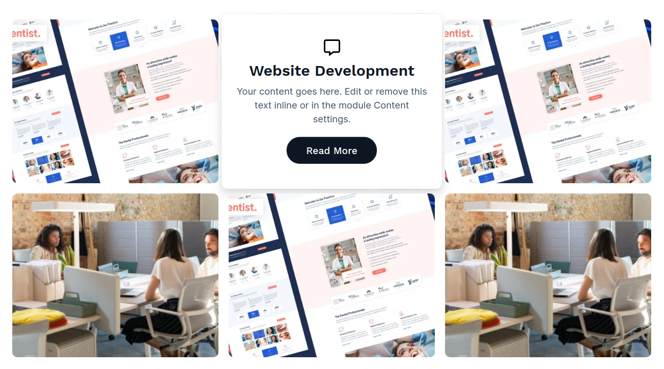
Note
Our Preview page of the module is Click here.
Advance Blog Listing
Content
- Display on each blog post: Choose whether this module should appear on
every individual blog post
or only in selected cases. Useful for controlling visibility across templates.
- Tag Filter (Field group):
- Tag Filter Required? : Enable this option if filtering by
tag should be mandatory.
When active, only posts matching selected tags will display.
- Blog : Select which HubSpot blog this listing should pull
posts from. This field connects
the module to a specific blog source.
- Display Topics : Set how many topic sections or tag groups
should be displayed within
the blog list layout. Example: entering “3” will show three main topic blocks.
- Pagination :
- Pagination Required: Enable this toggle to activate pagination for
the blog listing. When
enabled, posts will be split into multiple pages instead of showing all at once.
- Show Previous and Next Links: Enable this option to display
“Previous” and “Next” navigation
links below the listing for easier browsing between pages.
- Previous Label: Customize the text for the “Previous” button.
Example: Prev or
Older Posts.
- Next Label: Customize the text for the “Next” button. Example:
Next or Newer
Posts.
- Show First and Last Links: Toggle this on to display “First” and
“Last” page navigation links,
allowing users to quickly jump to the beginning or end of the pagination sequence.
- First Label: Customize the text label for the first-page link.
Example: First or
Start.
- Last Label: Customize the text label for the last-page link.
Example: Last or
End.
- No. of Words in Description: Control how many words from the blog post
description are displayed in
the listing. Adjust this number to shorten or expand the text preview for each post.
- Button Text: Enter the label for the call-to-action button displayed
with each blog post. Example:
Read More, Explore Now, or Continue Reading.
- Layout
- Layout Style: Choose the options between List or Grid to use in the
module
- Use Feature image as background: Enable this toggle to use feature
images background (Note: This field will display if you have
selected the layout style Grid)
- Column Grid selector: Choose from multiple options from One Column
to Four Column to display element in a row
- Header Tag Choose from h1 to h6 for the title
- Scheme Light Color: Switch between light and dark color scheme
Styles
- Box
- Spacing Set the custom padding and margin for box.
- Background Selector?: Choose the background option from solid color
and gradient color
- Solid Color: Set the custom solid color background for module, the
color will display if you selected the solid color in background
- Gradient Color: Set the custom gradient color, direction of color
in background for module, the gradient color will display if you selected the
gradient color in background
- Border: Set the border styles, width and color for box
- Corner Radius: Set the corner radius in px for box
- Box Shadow
- Use Box Shadow: Enable for using the box shadow in element,
after the
enable all other options will display in this group
- Horizontal Offset: The horizontal offset of the shadow. A
positive
value puts the shadow on the right side of the box, a negative value puts the
shadow
on the left side of the box. Note:- If not require then set as 0
- Vertical Offset: The vertical offset of the shadow. A positive
value puts the shadow below the box, a negative value puts the shadow above the
box
Note:- If not required then set to 0
- Blur: Optional, The blur radius. The higher the number, the
more
blurred the shadow will be
- Spread: Optional, The spread radius. A positive value increases
the
size of the shadow, a negative value decreases the size of the shadow.
- Color: Set the color of box shadow
- Hover
- Background
- Background Selector?: Choose the background option from
solid
color and gradient color
- Solid Color: Set the custom solid color background for
module,
the color will display if you selected the solid color in background
- Gradient Color: Set the custom gradient color, direction of
color in background for module, the gradient color will display if you
selected
the gradient color in background
- Border :
- Color: Set the custom border color for box on hover of
element
- Box Shadow
- Use Box Shadow: Enable for using the box shadow in element,
after the
enable all other options will display in this group
- Horizontal Offset: The horizontal offset of the shadow. A
positive
value puts the shadow on the right side of the box, a negative value puts
the shadow
on the left side of the box. Note:- If not require then set as 0
- Vertical Offset: The vertical offset of the shadow. A
positive
value puts the shadow below the box, a negative value puts the shadow above
the box
Note:- If not required then set to 0
- Blur: Optional, The blur radius. The higher the number, the
more
blurred the shadow will be
- Spread: Optional, The spread radius. A positive value
increases the
size of the shadow, a negative value decreases the size of the shadow.
- Color: Set the color of box shadow
- Feature Image
- Height: Set the custome height of feature image.
- Corner Radius
- Top Left: The value applies to Top-Left corner of the feature
image
- Top Right: The value applies to Top-Right corner of the feature
image
- Bottom Left: The value applies to Bottom-Left corner of the
feature image
- Bottom Right: The value applies to Bottom-Right corner of the
feature image
- Content
- Spacing: Set the custom padding for content.
- Alignment: Set the alignment of the content.
- Tags
- Use Comma Between Tags: Enable this toggle if you want multiple
blog tags to be separated by commas ( , ).
- Font: Set the font style, font size, color, weight,
text-decoration of tags
- Spacing: Set the custom padding and margin for tags
- Background Selector?: Choose the background option from solid color
and gradient color
- Color: Set the custom solid color background for module, the color
will display if you selected the solid color in background
- Gradient: Set the custom gradient color, direction of color in
background for module, the gradient color will display if you selected the gradient
color in background
- Border: Set the border styles, width and color for tags
- Corner Radius: Set the corner radius in px for tags
- Read Time
- Spacing: Set the custom margin for read time
- Font: Set the font style, font size, color, weight,
text-decoration of read time
- Title
- Spacing: Set the custom margin for title
- Font: Set the font style, font size, color, weight,
text-decoration of read title
- Author Image
- Width: Set the custom image width in px as per your requirement
- Height: Set the custom image height in px as per your requirement
- Corner Radius: Set the corner radius in px for image
- Author Name
- Font: Set the font style, font size, color, weight,
text-decoration of author name
- Date
- Font: Set the font style, font size, color, weight,
text-decoration of Date
- Description
- Spacing: Set the custom margin for description
- Font: Set the font style, font size, color, weight,
text-decoration of read description
- Buttons
- Button Style
- Background Color: Set the background color for button
- Corner Radius: Set the corner radius in px for button
- Border: Set the border styles, width and color
- Font: Set the font style, font size, color, weight,
text-decoration of button
- Spacing: Set the custom padding and margin for button
- Button Hover Style
- Background Color: Set the background hover color for button
- Border Color: Set the border hover color for button
- Font Color: Set the font hover color for button
- Filter Tag :
- Box :
- Alignment: Set how tags align within their container (left,
center, or right).
- Background Color: Choose the background color and
adjust its transparency.
- Spacing: Set inner and outer spacing (padding and margin) for
the tag box.
- Border: Customize border style, width, and color of the tag
box.
- Corner Radius: Adjust the corner roundness for smooth edges.
- Box Shadow:
- Use Box Shadow: Enable this toggle. Then the shadow options
will
appear.
- Horizontal Offset: The horizontal offset of the shadow. A
positive
value puts the shadow on the right side of the box, a negative value puts
the shadow
on the left side of the box. Note:- If not require then set as 0
- Vertical Offset: The vertical offset of the shadow. A
positive
value puts the shadow below the box, a negative value puts the shadow above
the box
Note:- If not required then set to 0
- Blur: Optional, The blur radius. The higher the number, the
more
blurred the shadow will be
- Spread: Optional, The spread radius. A positive value
increases the
size of the shadow, a negative value decreases the size of the shadow.
- Color: Set the color of shadow
- Filter Tab :
- Font: Customize the tag label’s font family, size, color, and
weight.
- Background Color: Set the background color and
transparency for each tag.
- Spacing: Adjust padding and margin between tag buttons.
- Border: Define tag border style, color, and thickness.
- Corner Radius: Round the tag edges for a softer look.
- Active Filter Tab:
- Font Color: Set text color and transparency for
the active tag.
- Background Color: Set background color and
opacity for active tags.
- Border Color: Define border color and
transparency for active tags.
- Pagination Style :
- Text Alignment: Align pagination content (left, center, or right).
- Spacing: Control space above and below pagination.
- Space Between Links: Set horizontal spacing between pagination
elements.
- Text & Icon Style:
- Text Font: Adjust pagination text font, color, size, and
weight.
- Icon Width & Height: Define the icon’s dimensions for uniform
design.
- On Hover Text/Icon Color: Change text and icon color when
hovered.
- Disabled Text Color: Define color for disabled (non-clickable)
pagination links.
- Number :
- Font: Set font type, color, and size for pagination numbers.
- Background Color: Choose background color for
pagination buttons.
- Width: Define button dimensions for number elements.
- Height: Define button dimensions for number elements.
- Border: Adjust border color, style, and thickness.
- Corner Radius: Control button roundness.
- Box Shadow:
- Use Box Shadow: Enable this toggle. Then the shadow options
will
appear.
- Horizontal Offset: The horizontal offset of the shadow. A
positive
value puts the shadow on the right side of the box, a negative value puts
the shadow
on the left side of the box. Note:- If not require then set as 0
- Vertical Offset: The vertical offset of the shadow. A
positive
value puts the shadow below the box, a negative value puts the shadow above
the box
Note:- If not required then set to 0
- Blur: Optional, The blur radius. The higher the number, the
more
blurred the shadow will be
- Spread: Optional, The spread radius. A positive value
increases the
size of the shadow, a negative value decreases the size of the shadow.
- Color: Set the color of shadow
- Active Number :
- Font Color : Set text color for the active page
number.
- Background : Choose background color for the
active number button.
- Border Color : Customize border color for active
pagination.
Examples
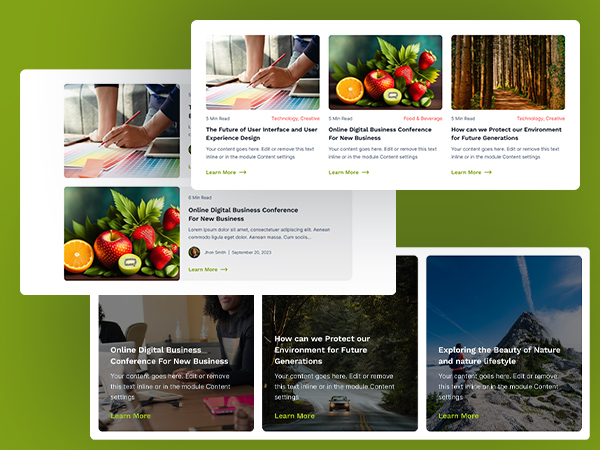
Note
Our Preview page of the module is Click
here.
Cards with Hover
The Cards with Hover Module is used to showcase the portfolio or services of your brand.
Content Section
- Content
- FRONT
- Title: Title of Front card
- Background?: Choose the background option from color and image.
- Background Color: Set the background color for front side of
card
- Background Image Choose the background image for front side of
card
- Image Overlay Color: This group will display if you select the
image in background?
- Image: Select the image (Note: The Image field
will display if you have
selected the Image in layout Image/Icon?)
- Icon: Iconpicker for icon show in box, (Note:
The Icon field will display
if you have selected the Icon in layout Image/Icon?)
- BACK
- Background?: Choose the background option from color and image.
- Background Color: Set the background color for front side of
card.
- Background Image Choose the background image for front side of
card.
- Image Overlay Color: This group will display if you select the
image in background?.
- Title: Title of Back card
- Description: Description of card in rich text field.
- Button Label: Text or Label of button for card.
- Button Link: Button Link for card.
- Layout
- Image/Icon?: Choose the options between Image or Icon to use in the
module
- Heading Level: Choose from h1 to h6 for the title
- Card Layout : Choose between Grid or Slider
layout to display the cards.
- Column Grid Selector: Choose from multiple options from Column-1 to
Column-4 to display element in a row
Style Section
- Front
- Spacing: Set the custom padding in front side of card
- Border: Set the border styles, width and color in front side of
card
- Title
- Font: Set the font style, font size, color, weight,
text-decoration of title
- Spacing: Set the margin and padding for the title.
- Separator
- Use Separator Enable this toggle fields to display seperator
below the title, All below style option will display if you enable this toggle
- Width: Set the width in percentage of separator
- Height: Set the height in px of separator
- Corner Radius: Set the corner radius in px of separator
- Color: Set the color of separator
- Spacing: Set the custom margin top and bottom of separator
- Back
- Spacing: Set the custom padding in front side of card
- Border: Set the border styles, width and color in front side of
card
- Title
- Font: Set the font style, font size, color, weight,
text-decoration of title
- Spacing: Set the margin and padding for the title.
- Separator
- Use Separator Enable this toggle fields to display seperator
below the title, All below style option will display if you enable this toggle
- Width: Set the width in percentage of separator
- Height: Set the height in px of separator
- Corner Radius: Set the corner radius in px of separator
- Color: Set the color of separator
- Spacing: Set the custom margin top and bottom of separator
- Card Height:
- Maximum Height: Here, you can easily set the custom card height
between
100px and 500px.
- Corner Radius
- Top Left: The value applies to Top-Left corner of the button
- Top Right: The value applies to Top-Right corner of the button
- Bottom Left: The value applies to Bottom-Left corner of the
button
- Bottom Right: The value applies to Bottom-Right corner of the
button
- Text Alignment:
- Alignment: Set the text alignment of the front and back card's
content.
- Button Shadow
- Use Box Shadow: Enable this toggle. Then the shadow options will
appear.
- Horizontal Offset: The horizontal offset of the shadow. A positive
value puts the shadow on the right side of the box, a negative value puts the shadow
on the left side of the box. Note:- If not require then set as 0
- Vertical Offset: The vertical offset of the shadow. A positive
value puts the shadow below the box, a negative value puts the shadow above the box
Note:- If not required then set to 0
- Blur: Optional, The blur radius. The higher the number, the more
blurred the shadow will be
- Spread: Optional, The spread radius. A positive value increases the
size of the shadow, a negative value decreases the size of the shadow.
- Color: Set the color of shadow
- Front Icon
- Width: Set the custom icon width as per your requirement
- height: Set the custom icon height as per your requirement
- Color: Set the custom color of icon
- Spacing: Set the margin and padding for the front icon.
- Description
- Font: Set the font style, font size, color, weight, text-decoration
of description
- Spacing: Set the margin top and bottom for the description.
- Buttons
- Button Style
- Background Color: Set the background color for button
- Corner Radius: Set the corner radius in px for button
- Border: Set the border styles, width and color
- Font: Set the font style, font size, color, weight,
text-decoration of button
- Spacing: Set the custom padding and margin for button
- Button Hover Style
- Background Color: Set the background hover color for button
- Border Color: Set the border hover color for button
- Font Color: Set the font hover color for button
Examples
Note
Our Preview page of the module is Click here.
Blog-Latest-Post
The Blog Latest Post Module can be used for listing your blog post in a slider view.
Content Section:
- Tags : Enable this option to display blog posts filtered
by specific tags.
- Blog ID: Select which blog source to pull the latest posts from.
- Select Tag: Choose the tag or category to filter and display
relevant blog posts.
- Post Count: Select the number of blog posts to display
- Button Text: Enter the label for the call-to-action button shown
with each blog post (e.g.,
Read More or Explore).
- Layout :
- Layout Style: Choose from multiple options Grid, List and
Slider
(examples see below)
- Grid Column Selector: Choose from multiple options from One
Column to
Four Column (Note:- This options will only display if the Grid
is
selected in Layout Style. )
- Slider Column Selector: Choose from multiple options from One
Column to
Four Column (Note:- This options will only display if the
Slider is
selected in Layout Style. )
- Scheme White Color: Switch between light and dark color scheme
- Heading Level: Choose from h1 to h6 for the title.
- Button Required?: Enable this option to display button.
- Show Icon in Button: Add the icons in button.
- Sidebar :
- Used in Sidebar: Enable the checkbox to use the module in the
sidebar
(for ex:- If you want to use this module in sidebar of the blog, example see
below)
- Scheme White Color: Switch between light and dark color scheme
Styles
- Box Style
- Background Color: Set the background color for all the elements
- Spacing Set the custom padding and margin for box.
- Border: Set the border styles, width and color for box
- Corner Radius: Set the corner radius in px for box
- Box Shadow
- Box Shadow Required: Enable for using the box shadow in
element,
after the
enable all other options will display in this group
- Horizontal Offset: The horizontal offset of the shadow. A
positive
value puts the shadow on the right side of the box, a negative value puts
the
shadow
on the left side of the box. Note:- If not require then set as 0
- Vertical Offset: The vertical offset of the shadow. A
positive
value puts the shadow below the box, a negative value puts the shadow above
the
box
Note:- If not required then set to 0
- Blur: Optional, The blur radius. The higher the number, the
more
blurred the shadow will be
- Spread: Optional, The spread radius. A positive value
increases
the
size of the shadow, a negative value decreases the size of the shadow.
- Color: Set the color of box shadow
- Box Hover Style
- Background Color: Set the hover background color for all the
elements
- Border Color: Set the custom border color for box on hover of
element
- Box Shadow
- Box Shadow Required: Enable for using the box shadow in
element,
after the
enable all other options will display in this group
- Horizontal Offset: The horizontal offset of the shadow. A
positive
value puts the shadow on the right side of the box, a negative value puts
the shadow
on the left side of the box. Note:- If not require then set as 0
- Vertical Offset: The vertical offset of the shadow. A
positive
value puts the shadow below the box, a negative value puts the shadow above
the box
Note:- If not required then set to 0
- Blur: Optional, The blur radius. The higher the number, the
more
blurred the shadow will be
- Spread: Optional, The spread radius. A positive value
increases the
size of the shadow, a negative value decreases the size of the shadow.
- Color: Set the color of box shadow
- Feature Image
- Height: Set the custome height of feature image.
- Sidebar Image Height: Set the custome height of feature image
For
sidebar
- Corner Radius: The value applies to corner of the feature
image
- Box Content
- Spacing: Set the custom padding for content
- Arrow left/right
- Background Color: Set the background color for arrow of the
slider
- Color: Set the custom color for arrow of the slider
- Size Set the custom font size for arrow of the slider
- Border: Set the border styles, width and color for arrow of the
slider
- Corner Radius: Set the corner radius in px for arrow of the
slider
- Arrow left/right On Hover
- Background Color: Set the background color for arrow of the
slider
On Hover
- Color: Set the custom color for arrow of the slider On Hover
- Border Color: Set the custom border color for arrow of the
slider
On Hover
- Title
- Font: Set the font style, font size, color, weight,
text-decoration of read title
- Spacing: Set the custom margin for title
- Description
- Font: Set the font style, font size, color, weight,
text-decoration of read description
- Spacing: Set the custom margin for description
- Tags
- Font: Set the font style, font size, color, weight,
text-decoration of tags
- Spacing: Set the custom padding and margin for tags
- Buttons
- Button Style
- Background Color: Set the background color for button
- Corner Radius: Set the corner radius in px for button
- Border: Set the border styles, width and color
- Font: Set the font style, font size, color, weight,
text-decoration of button
- Spacing: Set the custom padding and margin for button
- Button Hover Style
- Background Color: Set the background hover color for button
- Border Color: Set the border hover color for button
- Font Color: Set the font hover color for button
Slider
Grid
List
List (Used in Sidebar)
Blog Feature Banner Slider
The Blog Feature Banner Slider module can be used for header in Blog Listing Page.
Content Section:
- Blog: Select the Blog
- Tags : Enable this option to display blog posts filtered
by specific tags.
- Select Tag: Choose the tag or category to filter and display
relevant blog posts.
- Display Number of Posts: Select the number of blog posts to display
- Button Required?: Check if required button in the blog
- Button Text: Enter the label for the call-to-action button shown
with each blog post (e.g.,
Read More or Explore).
- Elements:
- Show Arrows: Enable to use the arrow in the slider
- Show Controls: Enable to add the dot navigation or control in
the
slider
Style Section
- Spacing:
- Spacing: Add the custom padding and margin
- Spacing in Mobile:
- Spacing: Add the custom padding and margin
- Category:
- border: Add the border for category
- corner radius: Add the corner radius for category
- Overlay
- Custom Overlay: Use Overlay Switch between use overlay or not
- Overlay Color: Set the overlay color, this option will display
if
you check the custom overlay
- Title
- Font: Set the font style, font size, color, weight,
text-decoration of read title
- Spacing: Set the custom margin for title
- Description
- Font: Set the font style, font size, color, weight,
text-decoration of read description
- Spacing: Set the custom margin for description
- Arrow left/right:
- Arrows color: Set the Left/Right Arrow Color of the Blog
slider.
- Arrows size: Set the Left/Right Arrow size of the Blog
slider.
- Controls:
- Color: Set the Controls Color of the Blog slider.
- Active Color: Set the Active Controls Color of the Blog
slider.
- Spacing: Set the custom margin top and bottom of the Controls.
- Buttons
- Button Style
- Background Color: Set the background color for button
- Spacing: Set the custom padding and margin for button
- Font: Set the font style, font size, color, weight,
text-decoration of button
- Border: Set the border styles, width and color
- Corner Radius: Set the corner radius in px for button
- Button Hover Style
- Background Color: Set the background hover color for button
- Border Color: Set the border hover color for button
- Font Color: Set the font hover color for button
Examples
Note
In the section setting set the padding as 0 in all the directions and also set
the
background as none of the section in the alignment and spacing, in which you
have
used this module.
Deadline Counter
The Deadline Counter Module can be used to display any special events, brand anniversary,
etc.
Content Section:
- Date and Time: Select the date from datepicker and time from
timepicker for Deadline counter
- Time zone: Add a Time zone for a Deadline counter. For example:-
GMT-5
- Layout:
- Scheme Light Color: Switch between light and dark color scheme
Style Section:
- Max Width:
- Use Custom Max Width: Enable to use the custom max width of
the
section
- Container Max Width: Set the custom max width of the section
- Content Box Alignment : Enable to use the custom max width
- Alignment: Set the text alignment of content
- Box:
- Background:
- Background?: Choose the background option from solid color
and
gradient color
- Color: Set the custom solid color background for module,
the
color will display if you selected the solid color in background
- Gradient: Set the custom gradient color, direction of color
in
background for module, the color will display if you selected the gradient
color
in background
- Border:
- Border: Set the border styles, width and color
- Corner Radius: Apply the corner radius in px of all the
direction
- Spacing:
- Spacing: Set the custom padding and margin for box
- Spacing In Mobile:
- Spacing : Set the custom padding and margin in
mobile
size for box
- Box Shadow:
- Use Box Shadow: Enable for using the box shadow in module,
after
the enable all other options will display in this group
- Horizontal Offset: The horizontal offset of the shadow. A
positive value puts the shadow on the right side of the box, a negative value
puts the shadow on the left side of the module. Note:- If not require then set
as 0
- Vertical Offset: The vertical offset of the shadow. A positive
value puts the shadow below the box, a negative value puts the shadow above the
box Note:- If not required then set to 0
- Blur: Optional, The blur radius. The higher the number, the
more blurred the shadow will be
- Spread: Optional, The spread radius. A positive value increases
the size of the shadow, a negative value decreases the size of the shadow.
- Color: Set the color of box shadow
- Box Content :
- Choice? : Choose the Box Content option from Use Separator and
Use Custom Box
- Spacing:
- Spacing: Set the custom padding and margin for Box
content
- Background :
- Background Color: Set the background color for Box
content
- Border:
- Border: Set the border styles, width and color for Box
content
- Separator: Seperator between the elements in the module
- Color: Set the color of separator
- Width: Set the width of separator
- Number:
- Font: Set the font style, font size, color, weight,
text-decoration of number
- Spacing: Set the custom padding and margin of main title
- Text:
- Font: Set the font style, font size, color, weight,
text-decoration of title
- Expired:
- Font: Set the font style, font size, color, weight,
text-decoration of Expired text
Examples
Note
Our Preview page of the Mini module is Click here.
Case Study With CTA
The Case Study Module can e.g. be used for showcase the project, services, etc. And A call to
action (CTA) is a prompt on a website that tells the user to take some specified action
Content Section:
- Select Section Layout: Choose the options between CTA and Case
Study
Section
- Main Title: Main title of case study And call to action
- Title: Title of case study And call to action
- Description: Description of case study And call to action in rich
text field
- Button Label: Text or Label of button for case study And call to
action
- Button Link: Button Link for case study And call to action
- Layout Styles:
- Case Study
- Content Right Side: Enable this option to display the case
study content on the right side of the
layout.
- Content Image/Video: Choose whether to display an
Image or a Video for the case
study section.
- Image: Select the image (Note: The
Image field
will
display if you have selected the Image in Case Study
layout Styles
Case Study
Content Image/Video)
- Video: Select the video (Note: The
Video field
will
display if you have selected the Video in Case Study
layout Styles
Case Study
Content Image/Video)
- Content Right Side Set content alignment right for the
element
- Background
- Background Color: Set the background color for the
element
- Alignment: Choose the options between Vertical and
Horizontal
directions, see the examples below
- Content Alignment
- Alignment: Choose the alignment between left, center
and
right in the
vertical layout of call to action
- Scheme Light Color: Switch between light and dark color scheme
- Heading Level:
- Heading Tag: Choose from h1 to h6 for the title
Style Section:
- Cta Background:
- Background?: Choose the background option from color, image and
gradient color
- Background Color: Set the custom solid color background for
module, the
color
will display if you selected the solid color in background
- Background Image: Choose the background image for background
for
module, the background image will display if you selected the image in
background
- Background Gradient: Set the custom gradient color, direction
of color in
background for module, the color will display if you selected the gradient color
in
background
- Use Parallax Effect: Enable to use parallax efect in background
image And The Parallax efect will work only on background image.
- Overlay: This group will display if you select the image in
background?
- Use Overlay: Use Overlay Switch between use overlay
or not
- Overlay Color: Set the overlay color over image, this
option will
display if you chech the use overlay field
- Max Width:
- Custom Max Width: Enable to use the custom max width of the
content
- Width: Set the custom max width of the content
- CTA Box:
- Spacing: Set the custom padding and margin for the CTA Box
- Spacing in Mobile:
- Spacing : Set the custom padding and margin in mobile
size
for the CTA Box
- Border:
- Border: Set the border styles, width and color for CTA Box
- Corner Radius: Set the corner radius in px for CTA Box
- Box:
- Background Gradient Color: Enable the checkbox to display
the gradient background color in all the boxes or element, if this field
will enable all other options in this group will display
- Gradient: Choose the directions from dropdown and add as
much color you want
- Border: Set the border styles, width and color in front
side of card
- Corner Radius: Apply the corner radius of all the direction
- Spacing: Set the custom padding and margin in the box
- Box Shadow:
- Use Box Shadow: Enable for using the box shadow in element,
after the
enable all other options will display in this group
- Horizontal Offset: The horizontal offset of the shadow. A
positive
value puts the shadow on the right side of the box, a negative value puts
the shadow
on the left side of the box. Note:- If not require then set as 0
- Vertical Offset: The vertical offset of the shadow. A
positive
value puts the shadow below the box, a negative value puts the shadow above
the box
Note:- If not required then set to 0
- Blur: Optional, The blur radius. The higher the number, the
more
blurred the shadow will be
- Spread: Optional, The spread radius. A positive value
increases the
size of the shadow, a negative value decreases the size of the shadow.
- Shadow Color: Set the color of box shadow
- Content Spacing:
- Spacing: Set the custom padding and margin of content
- Spacing in Mobile:
- Spacing : Set the custom padding and margin in mobile
size
for the content.
- Alignment:
- Text Alignment: Set the text alignment of content
- Image:
- Image Height: Set the custom height for image
- Corner Radius:
- Top Left: top left corner radius for image
- Top Right: top right corner radius for image
- Bottom Right: bottom right corner radius for image
- Bottom Left: bottom left corner radius for image
- Video:
- Corner Radius:
- Top Left: top left corner radius for video
- Top Right: top right corner radius for video
- Bottom Right: bottom right corner radius for video
- Bottom Left: bottom left corner radius for video
- Main Title:
- Font: Set the font style, font size, color, weight,
text-decoration of main title
- Spacing: Set the custom padding and margin of main title
- Title:
- Font: Set the font style, font size, color, weight,
text-decoration of title
- Spacing: Set the custom padding and margin of title
- Gradient Color:
- Use Gradient: Enable the checkbox to display the gradient
color for title element, if this field will enable all other options in this
group will display
(Note: The gradient color will apply on span tag, So you need to add a span
tag in title field to add a gradient color..)
- Gradient: Choose the directions from dropdown and add as
much color you want
- Description:
- Font: Set the font style, font size, color, weight,
text-decoration of description
- Spacing: Set the custom padding and margin of description
- CTA / Buttons
- Button Style
- Background Color: Set the background color for button
- Spacing: Set the custom padding and margin for button
- Font: Set the font style, font size, color, weight,
text-decoration of button
- Border: Set the border styles, width and color
- Corner Radius: Set the corner radius in px for button
- Button Hover Style
- Background Color: Set the background hover color for button
- Border Color: Set the border hover color for button
- Font Color: Set the font hover color for button
Horizontal Layout :-

Vertical Layout :-

Case Study :-
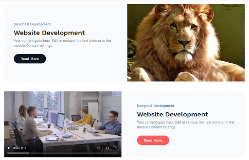
Note
If you want to use CTA Style as a full width set the padding as 0 in all the
directions and also set the background as none of the section, in which you have
used CTA Style.
Don't Worry the Module have the options of custom max width.
Our Preview page of the module is Click here.
Content Filter
Versatile Content Filter Module for Enhanced User Experience: Multi-Dropdown Filters, Search
Input, and Custom Pagination.
Content Section:
- Jquery Required?: Enable it if Jquery CDN is not exist in your
page/website
- Add Filter Options in URL Parameter: Enable this option to include
selected filter values in the
page URL for better tracking.
- Filter Layout :
- Show Field Label: Enable it if you want to show label on your
input/select field
- Filters :
- Filter Field
- Field Label: Add label for your filter field
(Note: The Label will display if you have enabled the label
in
filter layout Show
Field
Label?)
- Default Option: Add default option for your dropdown field
it
will
show on the top of all options. When you select this option it will return
all
content about that catagory
- Options:
- Option: Enter the value of your option
- Content :
- Image: Select the image
- Title: Add your content title
- Description: Add description about content
- Filterable Content:
- Content Type: Select content type. There are two
options.
(1)
List item (2) icon/text
- List Item: Add your filter catagory. this list showing
with
dots only.
(Note: The list item will display if you have selected
the
list
item in content
type.
add
this list item as option in filter field)
- Icon: Select icon for your filter catagory
(Note: The icon field will display if you have selected
the
icon/text in
content
type)
- Icon Label: Add your filter catagory
(Note: The icon field will display if you have selected
the
icon/text in
content
type.
add this label as option in filter field)
- Is Filterable: Enable it if you want to filter this
content
item
(Note: Also add this item as option in Filter Field)
- Button:
- Button Text: Add your button text
- Button Link: Add your button link
- No Result Text: Enter the message to display when no matching
results are found (e.g., No posts
available or No results found).
- Content Layout :
- List/Grid?: Select the layout for your content cards
- Heading Level: Select the heading level for content title from
h1
to h6
- Show Cards per Page: Add number of cards which you want to show
in
single pagination
- Grid Columns: Select column for cards grid.
(Note: The column field will display if you have selected the
grid
in
List/Grid?)
- Scheme Light Color: Enable if your card background is dark
- Advanced :
- Custom Id: Add custom id for module
- Custom Class: Add custom Class for module
Style Section:
- Container Width: Add container size for module
- Filters Style :
- Spacing: Adjust padding and margin around the filter area for
proper layout spacing.
- Background Color & Opacity: Set the background color and
transparency level for the filter
section.
- Label Style:
- Font : Customize the font family, size, and color for the
filter labels.
- Spacing : Customize the spacing for the filter labels.
- Input Style:
- Background Color: Add background color for filter field
- Border: Add border for filter field
- Font: Add font style for filter field
- Corner Radius: Add number of radius for filter field
- Spacing: Add spacing for filter field
- Search Icon Color: Add color for search icon in input
field
- Content Style :
- Card Style:
- Background Color: Add background color for card
- Border: Add border for card
- Corner Radius: Add number of radius for card's corner
- Spacing: Add Spacing for card
- Show Box Shadow: Enable to use box shadow for card
- Box Shadow Color: Add color for card box shadow
(Note: The Box Shadow Color will display if you have
enabled
the Show Box
Shadow)
- Card Hover Style:
- Background Color: Add hover background color for card
- Border: Add border hover color for card
- Show Box Shadow: Enable to use box shadow for card on
hover
- Box Shadow Color: Add color for card hover box shadow
(Note: The Box Shadow Color will display if you have
enabled
the Show Box
Shadow)
- Title Color: Add title color on card hover
- Description Color: Add description color on card hover
- Filterable Content Color: Add filterable content color
on
card
hover
- Button Link Color: Add button link color on card hover
- Card Content Style:
- Spacing: Add spacing around text content in card
- Image:
- Top Left Corner Radius: Add top left corner
radius
for
card image
- Top Right Corner Radius: Add top right corner
radius
for card image
- Bottom Left Corner Radius: Add bottom left
corner
radius for card image
- Bottom Right Corner Radius: Add bottom right
corner
radius for card image
- Title:
- Title Font: Add title font style for card title
- Title Spacing: Add title spacing for card title
- Description:
- Description Font: Add description font style
for
card
description
- Description Spacing: Add description spacing
for
card
description
- Filterable Content:
- Font: Add filterable content font style for
card
filterable content
- Icon Color: Add icon color card filterable content
- Button Link:
- Font: Add button font style for card button
- Hover color: Add hover color for card button
- Pagination:
- Active Color: Add active pagination background color
- Disable Color: Add disable pagination background color
- Font: Add font style for pagination text
- Corner radius: Add corner radius for pagination button
Examples
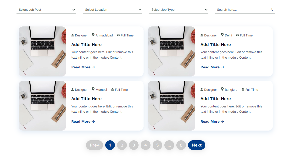
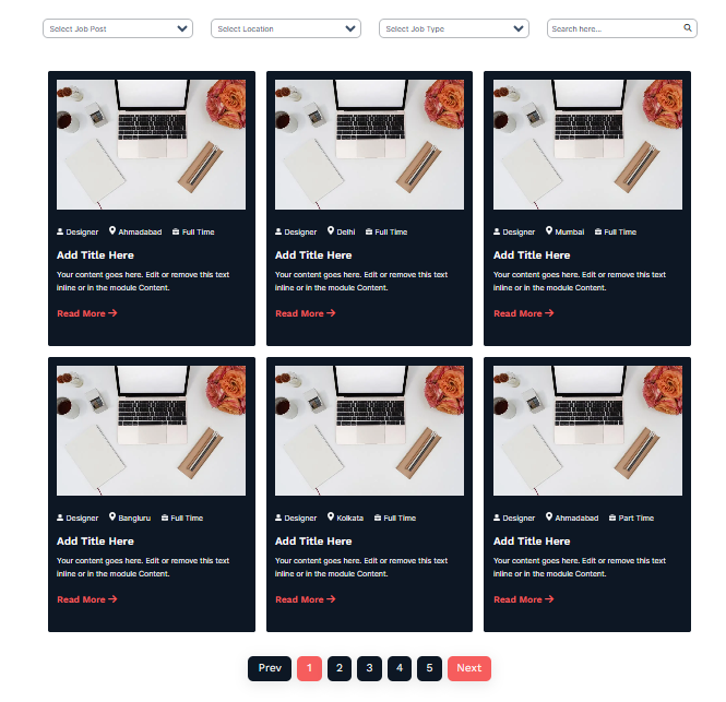
Note
Our Preview page of the module is Click
here.
Blog Author
The blog Author Module displays author information for each post, including name, bio,
profile picture, and social account links.
Content Section:
Note
The module content is coming from the blog author page and can be edited on the blog
author page. Learn more
Style Section:
- Container
- Alignment: Choose the vertical options Top, Bottom and Middel.
- Background Color: Set the background color.
- Border: Set the border styles, border width and border color.
- Corner Radius: Set the corner radius.
- Spacing: Set the custom padding and margin.
- Shadow: Enable for using the box shadow in element, after the
enable all other options will display.
- Horizontal Offset: The horizontal offset of the shadow. A
positive value puts the shadow on the right side of the box, a negative value
puts the shadow on the left side of the box. Note:- If not require then set as 0
- Vertical Offset: The vertical offset of the shadow. A positive
value puts the shadow below the box, a negative value puts the shadow above the
box Note:- If not required then set to 0
- Blur: Optional, The blur radius. The higher the number, the
more blurred the shadow will be
- Spread: Optional, The spread radius. A positive value increases
the size of the shadow, a negative value decreases the size of the shadow.
- Shadow Color: Set the color of box shadow
- Author Avatar Image
- Width: Set the custom width of image.
- Corner Radius: Set the corner radius of image.
- Content
- Spacing: Set the custom padding and margin.
- Space Between avatar and content: Set the custom spacing.
- Author Name
- Heading Level: Choose from h1 to h6 for the name.
- Font: Set the font style, font size, color, weight, text-decoration
of auther name
- Spacing: Set the custom padding and margin.
- Author Bio
- Font: Set the font style, font size, color, weight, text-decoration
of auther bio
- Spacing: Set the custom padding and margin.
- Social Icon
- Size:
- Width: Set the custom width of icon.
- height: Set the custom height of icon.
- Icon Color:
- Color: Set the custom color of icon.
- Hover Color: Set the custom color of icon hover color.
- Background Color:
- Color: Set the custom background color of icon.
- Hover Color: Set the mouse over background color of icon.
- Border
- Border: Apply the Border style, color and width and also the
sides of border
- Hover Color: Set the border hover color of icon
- Corner Radius: Set the corner radius of all the direction
- Spacing:
- Spacing: Set the custom spacing and margin of icons
- Space between icons: Set the custom space between icons.
Note
Our Preview page of the module is Click here.
Scale on Hover
Content Section:
- Items
- Background Color: Set the background color for card.
- Background Image: Set the background Image for card.
- Title: Title of card.
- Description: Description of card.
- Button Text: Button text of card.
- Button Link: Button Link of card.
- Layout
- Background Type: Choose the options between Color or Image.
- Column Gap: Set gap between columns.
- Heading Tag: Choose from h1 to h6 for the title
Style Section:
- Cards Container
- Text Alignment: Set the text alignment of content
- Card Height: Set the custom card height in px as per your
requirement
- Border: Set the border styles, border width and border color.
- Corner Radius: Set the corner radius.
- Box Shadow: Enable for using the box shadow in element, after the
enable all other options will display.
- Horizontal Offset: The horizontal offset of the shadow. A
positive value puts the shadow on the right side of the box, a negative value
puts the shadow on the left side of the box. Note:- If not require then set as 0
- Vertical Offset: The vertical offset of the shadow. A positive
value puts the shadow below the box, a negative value puts the shadow above the
box Note:- If not required then set to 0
- Blur: Optional, The blur radius. The higher the number, the
more blurred the shadow will be
- Spread: Optional, The spread radius. A positive value increases
the size of the shadow, a negative value decreases the size of the shadow.
- Color: Set the color of box shadow
- Hover
- Box Shadow: Enable for using the box shadow in element, after
the enable all other options will display.
- Horizontal Offset: The horizontal offset of the shadow. A
positive value puts the shadow on the right side of the box, a negative value
puts the shadow on the left side of the box. Note:- If not require then set as 0
- Vertical Offset: The vertical offset of the shadow. A positive
value puts the shadow below the box, a negative value puts the shadow above the
box Note:- If not required then set to 0
- Blur: Optional, The blur radius. The higher the number, the
more blurred the shadow will be
- Spread: Optional, The spread radius. A positive value increases
the size of the shadow, a negative value decreases the size of the shadow.
- Color: Set the color of box shadow
- Background Image:
- Overlay Color: Set the overlay color and its transparency
level for the background image
to enhance text readability and visual contrast.
- Content Position
- Top: Set position of top.
- Bottom: Set position of bottom.
- Left: Set position of left.
- Right: Set position of right.
- Title
- Font: Set the font style, font size, color, weight, text-decoration
of auther name
- Spacing: Set the custom padding and margin.
- Description
- Font: Set the font style, font size, color, weight, text-decoration
of auther name
- Spacing: Set the custom padding and margin.
- Button
- Background color: Set the button background Color.
- Font: Set the font style, font size, color, weight, text-decoration
of Button text.
- Border: Set the border styles, width, and color.
- Corner radius: Set the button corner radius
- Spacing: Set the custom padding and margin.
- Hover
- Background color: Set the button Hover background Color.
- Font Color: Set the font hover color of Button text.
- Border Color: Set the border hover color.
Note
Our Preview page of the module is Click here.
Cover Boxes
The Cover Boxes Module is designed to enhance user interaction by presenting content in a
visually appealing and engaging manner. The module consists of three boxes, each offering
unique features and functionalities:
Content Section:
Cover Group :
- Title: Customize the title
- Featured Image: Add the thumbnail image
- Description: Customize the description
- Button Label: Add the Button label such as Read more, Learn more
- Button Link: Add the Button link that will redirect to the detail
page
Layout :
- Column Grid Selector: Choose from multiple options from Column 2 to
Column 5 to display element in a row
- Heading Level: Choose the cover box title heading level from H1 to H6
- Scheme Light Color: Switch between light and dark color scheme
Advanced :
- Custom Css ID: Add custom id for module
- Custom Css Class: Add custom Class for module
Style Section:
- Alignment: Choose the options between left, center and right of
the Cover boxes.
- Gap Between Box: Adjust the spacing or gap between multiple boxes or
cards in the layout for better
visual balance.
- Active Box:
- Background:
- Background?: Choose the background option between solid color
and gradient color
- Background Color: Set the custom solid color background for
active cover boxes, the color will display if you selected the solid color in
background
- Gradient: Set the custom gradient color, direction of color in
background for active cover boxes, the gradient color will display if you
selected the
gradient color in background
- Corner Radius: Set the custom corner radius of all directions in px
for box
- Content:
- Spacing: Set the custom padding and margin of the content
- Spacing in Mobile View: Set the custom padding and margin of the
content
for mobile display
- Image:
- Height: Set the custom height of thumbnail image
- Corner Radius: Set the custom corner radius of all directions in px
for thumbnail image
- Active Image:
- Width : Set the custom width of Active Image.
- Title:
- Font: Set the font style, font size, color, weight, text-decoration
of cover boxes title
- Spacing: Set the custom padding and margin of the title
- Gradient color:
- Use Gradient: Enable for using the gradient color in cover
boxes
title
- Gradient: Choose the directions from dropdown and add as much
color you want
- Discription:
- Font: Set the font style, font size, color, weight, text-decoration
of cover boxes description
- Spacing: Set the custom padding and margin of cover boxes
description
- Button:
- Background Color: Set the custom background color of button
- Font: Set the font style, font size, color, weight, text-decoration
of button
- Spacing: Set the custom padding and margin of button
- border: Set the border styles, width and color for button
- border Radius: Set the custom corner radius of all directions in px
for button
- Hover:
- Background Color: Set the custom background color of button on
hover
- Color: Set the custom text color of button on hover
- Border color: Set the custom border color of button on hover
Examples
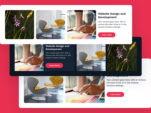
Note
Our Preview page of the module is Click
here.
Image Compare
The "Image Compare Module" allows users to compare two images by sliding between them. This
is often used to showcase
differences between a before and after state, such as in renovations, makeup
transformations, or product comparisons.
The module typically features various interaction styles, such as dragging the slider,
hovering to change the image, or
using a fade effect to transition between images. The module can include labels, overlays,
and animations to enhance
user engagement and provide a clear visual representation of the changes:
Content Section:
- Short Description: Enter a brief summary or introductory text to
display
below the title or main
heading.
- Content :
- Before Image: Add the Before image
- Before Label: Customize the before title
- After Image: Add the After image
- After Label: Customize the After title
- Layout:
- Choice Slide: Choose from multiple options from Horizontal,
Vertical, fade to display element in a row
- Move slider: Choose from Mouse Drag, and Mouse Hover to
display
elements in a row
- Setting :
- Column Grid Selector: Choose from multiple options from Column
1 to
Column 3 to display element in a row
- Before & After Label: Switch between Show and Hide Before &
After
Label
- Advanced :
- Custom Css ID: Add custom id for module
- Custom Css Class: Add custom Class for module
Style Section:
- Image:
- Height: Set the custom height of image
- Height in Mobile View: Set the custom height of image in Mobile
view
- width: Set the custom width of image on 1 column
- Corner Radius: Set the custom corner radius of all directions
in px
for thumbnail image
- Overlay: The overlay will work only on image
- Overlay Required?: Use Overlay Switch between use overlay or
not
- Color: Set the overlay color over image, this
option will display if you check overlay required
- Before & After Label:
- Font: Set the font style, font size, color, weight,
text-decoration
of Before & After Label
- Background Color: Set the custom background color of Before &
After
Label
- Spacing: Set the custom padding and margin of Before & After
Label
- border: Set the border styles, width and color for Before &
After
Label
- corner Radius: Set the custom corner radius of all directions
in px
for Before & After Label
- Drag/Hover Button:
- width: Set the custom width of Drag/Hover Button
- Height: Set the custom height of Drag/Hover Button
- Background Color: Set the custom background color of Drag/Hover
Button
- border: Set the border styles, width and color for Drag/Hover
Button
- corner Radius: Set the custom corner radius of all directions
in px
for Drag/Hover Button
- Box Shadow:
- Box Shadow: Enable for using the box shadow in element,
after
the
enable all other options will display in this group
- H Offset: The horizontal offset of the shadow. A
positive
value puts the shadow on the right side of the box, a negative value puts
the
shadow
on the left side of the box. Note:- If not require then set as 0
- V Offset: The vertical offset of the shadow. A positive
value puts the shadow below the box, a negative value puts the shadow above
the
box
Note:- If not required then set to 0
- Blur: Optional, The blur radius. The higher the number, the
more
blurred the shadow will be
- Spread: Optional, The spread radius. A positive value
increases
the
size of the shadow, a negative value decreases the size of the shadow.
- Shadow Color: Set the color of box shadow
- Left/right Arrow:
- width: Set the custom width of Left/right Arrow
- Color: Set the color height of Left/right Arrow
- Drag/Hover Button Before/After Line:
- Width/height: Set the custom width of Drag/Hover Button
Before/After Line
- Background Color: Set the color height of Drag/Hover Button
Before/After Line
- Short Description:
- Text Alignment: Select the alignment of text
- Font: Set the font style, font size, color, weight,
text-decoration
of Short Description
- Spacing: Set the custom padding and margin of Short Description
Examples
Note
Our Preview page of the module is Click
here.
Bento Grid
A Bento Grid Module is a layout design pattern inspired by the traditional
Japanese bento
box. It organizes content into
a grid of cells or boxes, often with varying sizes and shapes to create an engaging and
visually appealing structure.
Here's a short overview of its features:
- Grid Structure: Content is divided into multiple cells, arranged in
rows and columns,
similar to a grid.
- Flexible Layout: Each cell can have different sizes, allowing for both
symmetrical and
asymmetrical arrangements.
- Content Versatility: Suitable for showcasing a variety of content
types, such as
background images,
text, icon, and buttons.
- Responsive Design: Adapts to different screen sizes, making it suitable
for both desktop
and mobile views.
- Styling Options: Allows for customization, including color schemes,
font, spacing,
and backgrounds.
To set bento grid columns and rows read
the below detail:
- Setting Columns (Layout/Grid column)
- To define the columns in your grid.
- Depending on your layout requirements, you can increase the number of columns up to
a maximum of 12.
- Defining Row Height (Styles/Grid Box/Height)
- to set the minimum and maximum height for the rows.
- Each row will have a minimum height of, for example, 145 pixels and will
automatically expand to fit the content.
- Positioning Columns (Content/Setting/Column start OR Column End)
- to control the placement and span of items across columns.
- For example, grid-column: 1 / 3; places an element starting at column 1 and ending
at column 3, meaning it will span two
columns (from column 1 to column 2).
- When positioning the next element, ensure it starts where the previous one ends. For
instance, if the first element ends
at column 3, the next should start from grid-column: 3.
- Positioning Rows (Content/Setting/Row start OR Row End)
- to control the placement and span of items across rows.
- Similar to grid-column, grid-row: 1 / 5; will place the element starting at row 1
and ending at row 5, spanning four
rows.
- Ensure the placement of rows aligns properly, just like with columns. If one element
ends at row 5, the next should
start from grid-row: 5.
Content Section:
- Icon: Select the icon from the icon picker to use in the Grid Box
- Sub Title: Add the Sub title of the element
- Title: Add the title of the element
- Description: Add the Description of the element
- Button Label: Type the text you’d like the button to display here.
- Button Link: To add a button, include a link, which is typically a URL
that directs the user to a specific action or page. Depending on the button type,
additional code or parameters may not be required. Ensure the button link is properly
formatted and functional for a smooth user experience.
- Setting:
- Column start: To add a numeric value for the grid-column-start
property in CSS, you can use a specific number to define the starting
column of a grid item.
- Column End: To add a numeric value for the grid-column-end
property in CSS, you can use a specific number to define the ending
column of a grid item.
- Row start: To add a numeric value for the grid-row-start
property in CSS, you can use a specific number to define the starting
row of a grid item.
- Row End: To add a numeric value for the grid-row-end
property in CSS, you can use a specific number to define the ending
row of a grid item.
- Box Layout
- Select Background: Choose from multiple options Background
Image, Solid Color And Gradient Color.
- Bg Image: Choose the background image for background for
Grid box, the background image will display if you selected the image in Select
background.
- Image Overlay: The overlay will work only on image, the overlay
will display if you selected the image in Select background
- Overlay: Use Overlay Switch between use overlay or
not.
- Color: Set the overlay color over image, this
option will display if you check overlay.
- Bg Color: Set the custom solid color background for
Grid box, the color will display if you selected the solid color in
Select Background.
- Gradient: the Gradient will display if you selected the Gradient
Color in
Select Background.
- direction: Set the custom direction for the gradient color
background.
- Color: Set the custom gradient color of color in
background for grid box.
- Flex alignment: Choose the content alignment options from top,
center
and
bottom
- Justify alignment: Choose the content alignment options from left,
center and
right
- Text alignment: Choose the content alignment options from left,
center and
right
- Spacing
- Padding Top: Set the custom top padding of the grid box.
- Padding bottom: Set the custom bottom padding of the grid box.
- Padding left: Set the custom left padding of the grid box.
- Padding right: Set the custom right padding of the grid box.
- Corner Radius
- Top Left Radius: Set the custom top left corner radius in px
for the grid box.
- Top right Radius: Set the custom top right corner radius in px
for the grid box.
- bottom Left Radius: Set the custom bottom left corner radius in
px for the grid box.
- bottom right Radius: Set the custom bottom right corner radius
in px for the grid box.
- Icon:
- Width: Set the custom icon width in px as per your
requirement
- Height: Set the custom icon height in px as per your
requirement
- Color: Set the custom icon color as per your
requirement
- Sub Title:
- Font: Set the font style, font size, color, weight,
text-decoration
of sub title
- Margin top: Set the custom top margin for sub title
- Margin bottom: Set the custom bottom margin for sub title
- Title:
- Font: Set the font style, font size, color, weight,
text-decoration
of title
- Margin top: Set the custom top margin for title
- Margin bottom: Set the custom bottom margin for title
- Description:
- Font: Set the font style, font size, color, weight,
text-decoration
of Description
- Margin top: Set the custom top margin for Description
- Margin bottom: Set the custom bottom margin for Description
Layout :
- Grid Column: Choose from multiple options from Column 1 to
Column 12 to define the columns in your grid.
- Heading Level: Choose from h1 to h6 for the title.
- Scheme Light color: Switch between light and dark color scheme
Advanced :
- Custom Css ID: Add custom id for module
- Custom Css Class: Add custom Class for module
Style Section:
- Layout:
- Max-width: Set the use content max-width in px of the module.
- Alignment: Choose the module alignment options from left, center
and right.
- Grid Box:
- Height: to set the minimum and maximum height for the rows.
- Gap: Set gap between columns.
- Spacing In Mobile View: Set the custom padding and margin of the
grid box for mobile display.
- Title:
- Use Gradient: Enable for using the gradient color in grid box
title
- Gradient: Choose the directions from dropdown and add as much
color you want
- Button:
- Font: Set the font style, font size, color, weight, text-decoration
of button
- Background Color: Set the custom background color of button
- Spacing: Set the custom padding and margin of button
- border: Set the border styles, width and color for button
- Corner Radius: Set the custom corner radius of all directions in px
for button
- Button Hover Style:
- Background Color: Set the custom background color of button on
hover
- Font Color: Set the custom text color of button on hover
- Border color: Set the custom border color of button on hover
Examples
By following these points, you can create a flexible and visually organized Bento
Grid
layout that adapts to different
content and design needs. This approach allows for creative use of space and an
engaging
presentation of elements within
the grid.
Note
Our Preview page of the module is Click
here.
Detailed Job Posting
A comprehensive job posting and browsing feature that enables employers to list
job opportunities and allows candidates
to explore and apply for them. It includes functionalities for detailed job descriptions,
location-based filtering,
dynamic loading, and a dedicated detail page for each job listing.
Content Section:
- Job Categories Filter:
- Select Label: Add a title for the "Job Categories" filter.
- Options:
- Label: Add One and More option for the "Job Categories".
- Job Location Filter:
- Select Label: Add a title for the "Job Location" filter.
- Options:
- Label: Add One and More option for the "Job Location."
- Job Type Filter:
- Select Label: Add a title for the "Job Type" filter.
- Options:
- Label: Add One and More option for the "Job Type".
- Sorting Filter Show/hide: Enable this option to display the sorting
dropdown on the page.
- Sorting Filter:
- Select Label: Enter the label text for the sorting dropdown (e.g.,
Sort By).
- Options: Add and manage sorting options such as Newest
First, Oldest First,
or Most Popular.
- Job Post:
- Categories: Add a title for the "Job Categories."
- Type: Add a title for the "Job Type."
- Location: Add One and More locations for the "Job Location."
- Title: Add a title for the "Job Title."
- Date label: Add a Date label
- Date And Time: Add a Date and time
- Description: Add a description for the job."
- Button Label: Type the text you’d like the button to display here.
- Image: Select an image
- Description Label: Add a title for the description on the detail
page.
- Brief Label: Add a title for the Brief description on the detail
page.
- Job brief: Add a brief description for the job."
- Requirements Label: Add a title for the Requirements description on
the
detail page.
- Requirements: Add a Requirements description for the job."
- Detail form
- Form: Select or create a new form.
- Layout
- Column Grid Selector: Choose from multiple options from Column 1 to
Column 3 to define the columns in your grid.
- Heading Level: Choose from h1 to h6 for the title.
- Button Icon ?: Check if a button icon is required.
- Scheme White color: Toggle between light and dark color schemes.
- Per Page Limit: Set the number of items per page.
- Load More Button Text: Customize the text for the "Load More"
button.
- Not Found Message: Set the message to display when no results are
found.
- Back button Label : Set the Back button Label text.
- Advanced
- Custom Css ID: Add custom id for module
- Custom Css Class: Add custom Class for module
Style Section:
- Filter:
- Font: Add a font style for the selected option and the
input placeholder font.
- Background Color: Set the background color for the
selected option and the input.
- Spacing: Adjust the spacing for the selected option and
input.
- Border: Define the border style for the selected option
and input.
- Corner Radius: Set the corner radius for the selected
option and input.
- Reset Button:
- Background Color: Set the background color of the reset
button.
- Font: Choose the font style for the reset button.
- Spacing: Adjust the spacing around the reset button.
- border: Define the border style of the reset button.
- Corner Radius: Set the corner radius for the reset
button.
- Hover:
- Background Color: Set the background color on
hover.
- Font Color: Choose the font color on hover.
- Border color: Set the border color on hover.
- Box
- Background?: Choose the background option between solid
color
and gradient color.
- Color: Set the custom solid color background for box, the
color will display if you selected the solid color in background.
- Gradient: Set the custom gradient color, direction of color
in background for box, the gradient color will display if you selected
the gradient color in background.
- Spacing: Set the custom padding and margin of the box.
- Border: Set the border styles, width and color for box.
- Corner Radius: Set the corner radius in px for box.
- Shadow:
- Use Box Shadow: Enable for using the box shadow in element,
after the enable all other options will display in this group.
- Horizontal Offset: The horizontal offset of the shadow. A
positive value puts the shadow on the right side of the box, a negative
value
puts the shadow on the left side of the box. Note:- If not require then set
as 0.
- Vertical Offset: The vertical offset of the shadow. A
positive
value puts the shadow below the box, a negative value puts the shadow above
the
box Note:- If not required then set to 0.
- Blur: Optional, The blur radius. The higher the number, the
more blurred the shadow will be.
- Spread: Optional, The spread radius. A positive value
increases
the size of the shadow, a negative value decreases the size of the shadow.
- Color: Set the color of box shadow.
- Box Hover
- Background?: Choose the hover background option between solid
color
and gradient color.
- Color: Set the custom hover solid color background for box, the
color will display if you selected the solid color in background.
- Gradient: Set the custom hover gradient color, direction of
color
in background for box, the gradient color will display if you selected
the gradient color in background.
- Border: Set the hover border styles, width and color for
box.
- Shadow:
- Use Box Shadow: Enable for using the box shadow in the
hover of element,
after the enable all other options will display in this group.
- Horizontal Offset: The horizontal offset of the shadow. A
positive value puts the shadow on the right side of the box, a negative
value
puts the shadow on the left side of the box. Note:- If not require then set
as 0.
- Vertical Offset: The vertical offset of the shadow. A
positive
value puts the shadow below the box, a negative value puts the shadow above
the
box Note:- If not required then set to 0.
- Blur: Optional, The blur radius. The higher the number, the
more blurred the shadow will be.
- Spread: Optional, The spread radius. A positive value
increases
the size of the shadow, a negative value decreases the size of the shadow.
- Color: Set the color of box shadow.
- Categories:
- Font: Set the font style, font size, color, weight,
text-decoration
of job Categories.
- Spacing: Set the custom padding and margin for job Categories.
- Hover Color: Set the custom color of job Categories on hover of
box/element.
- Job Type:
- Font: Set the font style, font size, color, weight,
text-decoration
of job type.
- Background Color: Set the custom background color of job
type.
- Spacing: Set the custom padding and margin of the job type.
- Border: Set the custom border styles, width and color for
job type.
- Corner Radius: Set the corner radius in px for Job type.
- Hover Style:
- Background Color: Set the custom background color of
job type
on the
hover of element/box.
- Color: Set the custom font color of job type on the
hover
of element/box.
- Border Color: Set the custom border color of job type on
the hover
of element/box.
- Spacing In Mobile View: Set the custom padding and margin of
the job type
In Mobile View.
- Title:
- Font: Set the font style, font size, color, weight,
text-decoration
of Job Title.
- Spacing: Set the custom padding and margin for Job Title.
- Hover Color: Set the custom color of Job Title on hover of
box/element.
- Gradient color:
- Use Gradient: Enable the checkbox to use Gradient color
- Gradient: Choose the directions from dropdown and add as
much
color you want
- Date and Time :
- Date Format: Choose the format in which the date should appear
(e.g., DD/MM/YYYY or
Month DD, YYYY).
- Font: Adjust the font family, size, style, and color for the date
and time text.
- Spacing: Set the margin or padding around the date and time element
for proper alignment and
spacing.
- Hover Color: Define the color and transparency applied to
the date and time text when
hovered.
- Description:
- Font: Set the font style, font size, color, weight,
text-decoration
of job Description.
- Spacing: Set the custom padding and margin for job Description.
- Hover Color: Set the custom color of job Description on hover
of
box/element.
- Location:
- Font: Set the font style, font size, color, weight,
text-decoration
of job Location.
- Spacing: Set the custom padding and margin for job Location.
- Hover Color: Set the custom color of job Location on hover of
box/element.
- Location Icon:
- Size: Set the size of the Location icon.
- Color: Choose the color of the Location icon.
- Button:
- Background Color: Set the custom background color of button.
- Font: Set the font style, font size, color, weight,
text-decoration of button.
- Spacing: Set the custom padding and margin of button.
- border: Set the border styles, width and color for button.
- border Radius: Set the custom corner radius of all directions
in px for button.
- Hover:
- Background Color: Set the custom background color of button
on hover.
- Color: Set the custom text color of button on hover.
- Border color: Set the custom border color of button on
hover.
- Not Found Message Font:
- Font: Set the font style, font size, color, weight,
text-decoration of Not Found Message.
- Load More Button:
- Background Color: Set the custom background color of Load More
button.
- Font: Set the font style, font size, color, weight,
text-decoration of Load More button.
- Spacing: Set the custom padding and margin of Load More button.
- border: Set the border styles, width and color for Load More
button.
- border Radius: Set the custom corner radius of all directions
in px for Load More button.
- Hover:
- Background Color: Set the custom background color of Load More
button
on hover.
- Color: Set the custom text color of Load More button on hover.
- Border color: Set the custom border color of Load More button
on
hover.
- Job Details:
- Background Color: Set the custom background color of Job Details.
- Spacing: Set the custom padding and margin of Job Details.
- border: Set the border styles, width and color for Job Details.
- Corner Radius: Set the custom corner radius of all directions
in px for Job Details.
- Image
- Width: Set the custom image width in px as per your requirement
- Height: Set the custom image height in px as per your
requirement
- Corner Radius: Set the corner radius in px for image
- Categories:
- Font: Set the font style, font size, color, weight,
text-decoration
of job Categories In Detail page.
- Job Type:
- Font: Set the font style, font size, color, weight,
text-decoration
of job type In Detail page.
- Background Color: Set the custom background color of job
type In Detail page.
- Spacing: Set the custom padding and margin of the job type In
Detail page.
- Border: Set the custom border styles, width and color for
job type In Detail page.
- Corner Radius: Set the corner radius in px for Job type In
Detail page.
- Title:
- Font: Set the font style, font size, color, weight,
text-decoration
of job Title In Detail page.
- Spacing: Set the custom padding and margin of the job Title In
Detail page.
- Location:
- Font: Set the font style, font size, color, weight,
text-decoration
of job Location In
Detail page.
- Location Icon:
- Size: Set the size of the Location icon In
Detail page.
- Color: Choose the color of the Location icon In
Detail page.
- Date and Time :
- Font: Set the font style, font size, color, weight,
text-decoration
of Date and Time In Detail page.
- Spacing: Set the custom padding and margin of the job Date and
Time In
Detail page.
- Description:
- Title:
- Font: Set the font style, font size, color, weight,
text-decoration
of job Description Title In Detail page.
- Spacing: Set the custom padding and margin of the job
Description Title In
Detail page.
- Font: Set the font style, font size, color, weight,
text-decoration
of job Description In Detail page.
- Spacing: Set the custom padding and margin of the job
Description In
Detail page.
- Job Brief Description:
- Title:
- Font: Set the font style, font size, color, weight,
text-decoration
of job Brief Description Title In Detail page.
- Spacing: Set the custom padding and margin of the job Brief
Description Title In
Detail page.
- Font: Set the font style, font size, color, weight,
text-decoration
of job Brief Description In Detail page.
- Spacing: Set the custom padding and margin of the job Brief
Description In
Detail page.
- Requirements Description:
- Title:
- Font: Set the font style, font size, color, weight,
text-decoration
of job Requirements Description Title In Detail page.
- Spacing: Set the custom padding and margin of the job
Requirements Description Title In
Detail page.
- Font: Set the font style, font size, color, weight,
text-decoration
of job Requirements Description In Detail page.
- Spacing: Set the custom padding and margin of the job
Requirements Description In
Detail page.
- Back To List Button:
- Background Color: Set the custom background color of Back To
List
button.
- Font: Set the font style, font size, color, weight,
text-decoration of Back To List button.
- Spacing: Set the custom padding and margin of Back To List
button.
- border: Set the border styles, width and color for Back To List
button.
- border Radius: Set the custom corner radius of all directions
in px for Back To List button.
- Hover:
- Background Color: Set the custom background color of Back
To List
button
on hover.
- Color: Set the custom text color of Back To List button on
hover.
- Border color: Set the custom border color of Back To List
button
on
hover.
- Form:
- Background Color: Set the custom background color of Form.
- Spacing: Set the custom padding and margin of Form.
- border: Set the border styles, width and color for Form.
- border Radius: Set the custom corner radius of all directions
in px for Form.
- Shadow:
- Use Box Shadow: Enable for using the box shadow in the
hover of element,
after the enable all other options will display in this group.
- Horizontal Offset: The horizontal offset of the shadow. A
positive value puts the shadow on the right side of the box, a negative
value
puts the shadow on the left side of the box. Note:- If not require then set
as 0.
- Vertical Offset: The vertical offset of the shadow. A
positive
value puts the shadow below the box, a negative value puts the shadow above
the
box Note:- If not required then set to 0.
- Blur: Optional, The blur radius. The higher the number, the
more blurred the shadow will be.
- Spread: Optional, The spread radius. A positive value
increases
the size of the shadow, a negative value decreases the size of the shadow.
- Color: Set the color of box shadow.
- Text Alignment: Set the text alignment for the Form
- Labels Font: Set the font style, font size, color, weight,
text-decoration for form Label.
- Error Font: Set the font style, font size, color, weight,
text-decoration for form Valication Message Text.
- Input:
- Font: Set the font style, font size, color, weight,
text-decoration of Input field
- Backround Color: Set the custom background color of input
field
- Spacing: Set the custom padding and margin of the Input
field
- Border: Set the custom border of the Input field
- Border Radius: Set the custom border radius of all the
direction of the input field
- Submit Button:
- Alignment: Select the alignment of Submit Button.
- Font: Set the font style, font size, color, weight,
text-decoration of Submit Button.
- Background Color: Set the custom background color of Submit
Button.
- Spacing: Set the custom padding and margin of Submit
Button.
- border: Set the border styles, width and color for Submit
Button.
- border Radius: Set the custom corner radius of all
directions
in px for Submit Button.
- Hover Background Color: Set the custom background color of
Submit Button
on hover.
- Hover Color: Set the custom text color of Submit Button on
hover.
- HoverBorder color: Set the custom border color of Submit
Button on
hover.
Examples
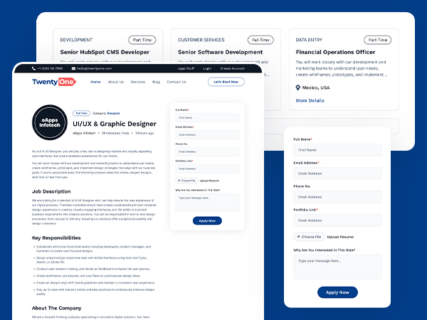
A robust job posting platform that allows employers to list job opportunities, while
enabling candidates to search,
filter, and apply easily. It offers detailed job descriptions, location-based
filters, dynamic loading, and dedicated
pages for each listing.
Note
Our Preview page of the module is Click
here.
Info Circle
Info Circle ek visually appealing interactive widget hai to display segmented content in
circular layout format.
Content Section:
- Image: Select the image (Note: The Image field will
display if you have selected the Image in layout Select
Image/Icon?)
- Icon: Select the icon (Note: The Icon field will
display if you have selected the Icon in layout Select
Image/Icon?)
- Title: Customize the main heading or name for each info item
- Description: Provide detailed text information related to the item
- Button Label: Add a label for the action button (e.g., Learn more,
Contact now)
- Button Url: Set the link for the button; supports URLs, Email, Phone,
and HubSpot CTA
- Icon Layout (Note: The Icon Layout field will
display if you have selected the Icon in layout Select
Image/Icon?)
- Color: Choose the default color of the icon
- Background Color: Set background color behind the icon
- Hover/Active Color: Define icon color on hover/active state
- Hover/Active Background Color: Define background color on
hover/active
- Layout :
- Select Image/Icon?: Choose the options between Image or Icon to use
in
the
module
- Active Style: Select how active item is triggered (on_hover,
on_click,
auto_active, all)
- Auto Switch Interval: Number of seconds to auto-switch active item
(used in auto_active/all)
- Image or Icon Center Mode: Choose whether to show icon/image in
center
when active
- Header Tag: Choose semantic tag for title (e.g., h2, h3)
- Light Color Scheme: Enable light theme styling if checked
- Advanced :
- Custom Css ID: Add custom id for module
- Custom Css Class: Add custom Class for module
Style Section:
- Circle Box
- Width && Height:
Control the overall size of the icon/image circle box
- Alignment:
Choose the options between left, center and right of the circle boxes.
- Outer Layout
- Outer Border:
Add a border around the entire circular box
- Icon: (Note: The Icon style field will
display if you have selected the Icon in layout
Select
Image/Icon?)
- Box Width: Set the custom icon box width in px as per your
requirement
- Box Height: Set the custom icon box height in px as per your
requirement
- Size: Set the custom icon size in px as per your
requirement
- Border:
Add a border around the icon box
- Corner Radius:
Adjust the roundness of the icon box corners
- Border Hover/Active Color:
Change the icon border color on hover or active
- Image: (Note: The Image field will
display if you have selected the Image in layout
Select
Image/Icon?)
- Width: Set the custom width of image
- Height: Set the custom height of image
- Image Radius: Set the custom corner radius of all directions in
px
for image
- Border:
Add a border around the image
- Hover/Active Border Color:
Change the image border color on hover or active
- Inner layout
- Text Alignment:
Set the alignment of text inside the center box (left, center, right)
- Background Color:
Set background color of the center box
- Spacing:
Add inner padding inside the center content area
- Border:
Add a border around the center box
- Corner Radius:
Adjust the roundness of the center box corners
- Responsive View
- Spacing:
Add inner padding inside the center content area in mobile view
- Corner Radius:
Adjust the roundness of the center box corners in mobile view
- Box Shadow
- Use Box Shadow: Enable for using the box shadow in element,
after the
enable all other options will display in this group
- H Offset: The horizontal offset of the shadow. A
positive
value puts the shadow on the right side of the box, a negative value puts the
shadow
on the left side of the box. Note:- If not require then set as 0
- V Offset: The vertical offset of the shadow. A positive
value puts the shadow below the box, a negative value puts the shadow above the
box
Note:- If not required then set to 0
- Blur: Optional, The blur radius. The higher the number, the
more
blurred the shadow will be
- Spread: Optional, The spread radius. A positive value increases
the
size of the shadow, a negative value decreases the size of the shadow.
- Color: Set the color of box shadow
- Inner Image/Icon (Note: The field will display if you
have selected
true in layout
Image or Icon Center Mode)
- Icon: (Note: The Icon style field will
display if you have selected the Icon in layout
Select
Image/Icon?)
- Size: Set the custom icon size in px as per your
requirement
- Color: Choose the default color of the icon
- Image: (Note: The Image field will
display if you have selected the Image in layout Select
Image/Icon?)
- Width: Set the custom width of image
- Height: Set the custom height of image
- Image Radius: Set the custom corner radius of all
directions in
px
for image
- Border:
Add a border around the image
- Title:
- Font: Set the font style, font size, color, weight, text-decoration
of title
- Spacing: Set the custom padding and margin of the title
- Use Gradient: Enable for using the gradient color in
title
- Gradient: Choose the directions from dropdown and add as much
color you want
- Discription:
- Font: Set the font style, font size, color, weight, text-decoration
of description
- Spacing: Set the custom padding and margin of description
- Button:
- Font: Set the font style, font size, color, weight, text-decoration
of button
- Background Color: Set the custom background color of button
- Spacing: Set the custom padding and margin of button
- border: Set the border styles, width and color for button
- Corner Radius: Set the custom corner radius of all directions in px
for button
- Hover/Focus Style:
- Color: Set the custom text color of button on hover
- Background Color: Set the custom background color of button on
hover
- Border color: Set the custom border color of button on hover
Examples

Note
Our Preview page of the module is Click
here.


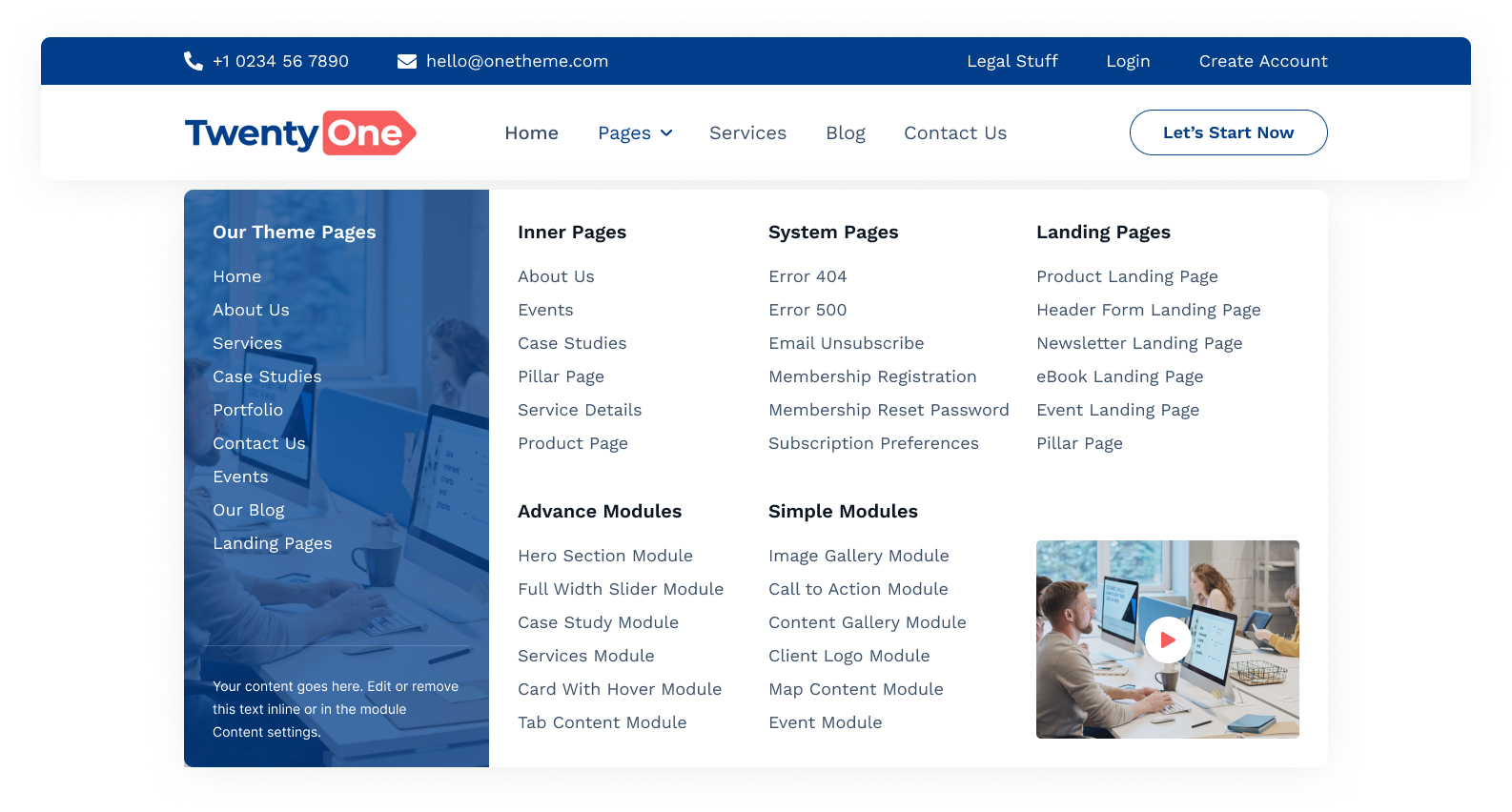
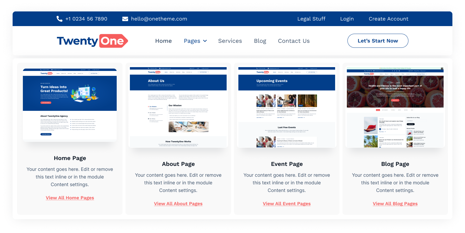

social-follow
The Social follow module is used to follow or subscribe in the social media of your brands.
Content Section:
Style Section:
Examples