Getting Started
Let’s get started with the basics. Once you successfully purchase EventOne HubSpot theme from the HubSpot marketplace, you will arrive to a confirmation screen, and after a few minutes (it can take up to 5 minutes for the theme installation to be completed), you should be able to find your new theme on the Design Tools.
You can confirm this by going to Marketing > Files and Templates > Design Tools. Once here, you should see something like this:
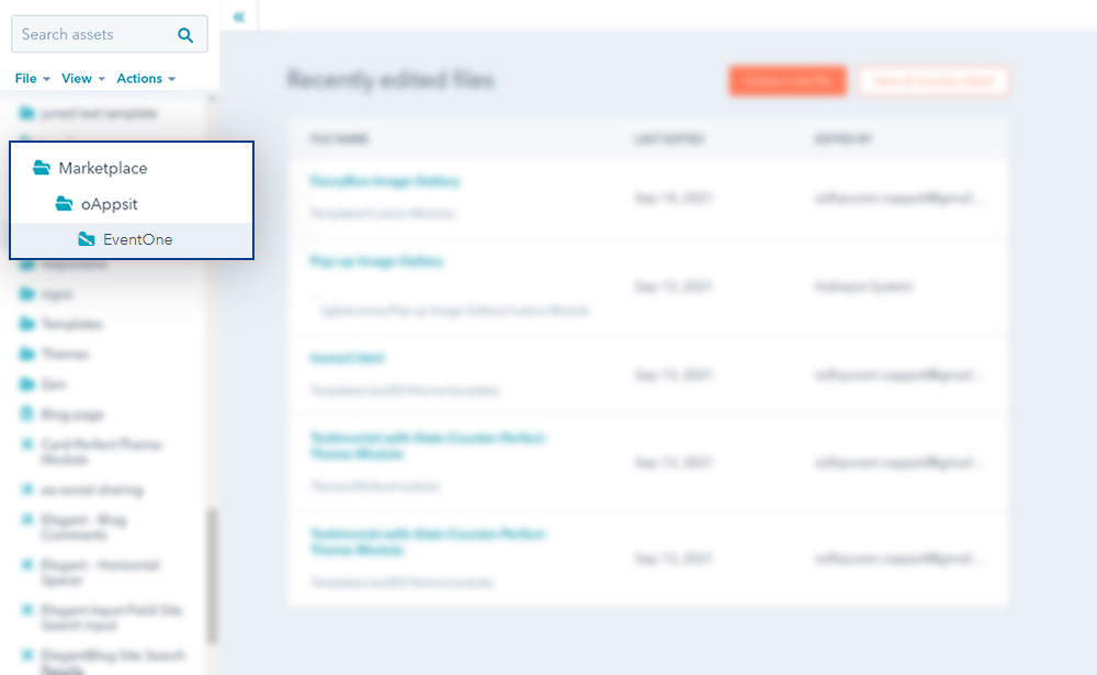
If you see the theme as you are seeing it above (note the name may vary), congratulations, the theme has successfully installed.
Reinstall Theme
In rare cases, due to a common bug on the HubSpot marketplace, your theme may not arrive successfully to your account.
If this happens to you, no worries, you just need to go to Asset Marketplace > Purchased, and then select EventOne HubSpot theme, click Actions, and then Uninstall.
It will take a few minutes, and after that, you need to click Actions again, and then Reinstall.
This will fix any issues that could have occurred. While this is a very unusual issue, in case it happens to you, the solution is simple and easy.
Create a Child Theme
Once your new HubSpot theme is ready, it’s moment to clone it.
While this is not a required step, it is highly suggested to clone the EventOne HubSpot theme before start using it.
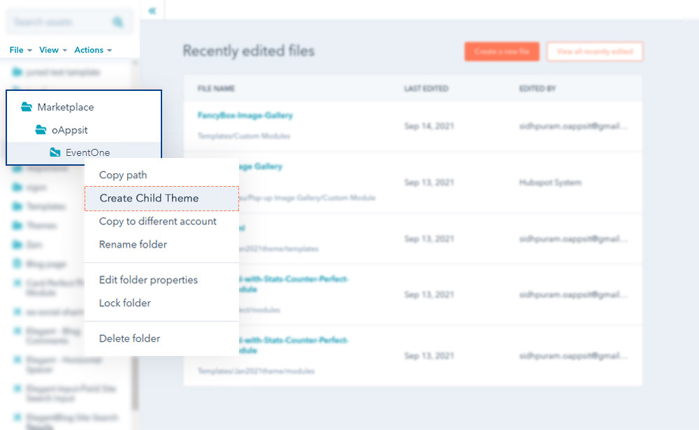
Purchased themes from the HubSpot Marketplace are not editable (read-only), so you can benefit from future updates and improvements. If you plan on making code changes, now is the time to create a
child theme
and use that instead of the purchased one for your website. Otherwise, you can use the purchased theme directly.
Global Colors
If you click Global Colors in the customization screen, you will be able to see another screen just like this:
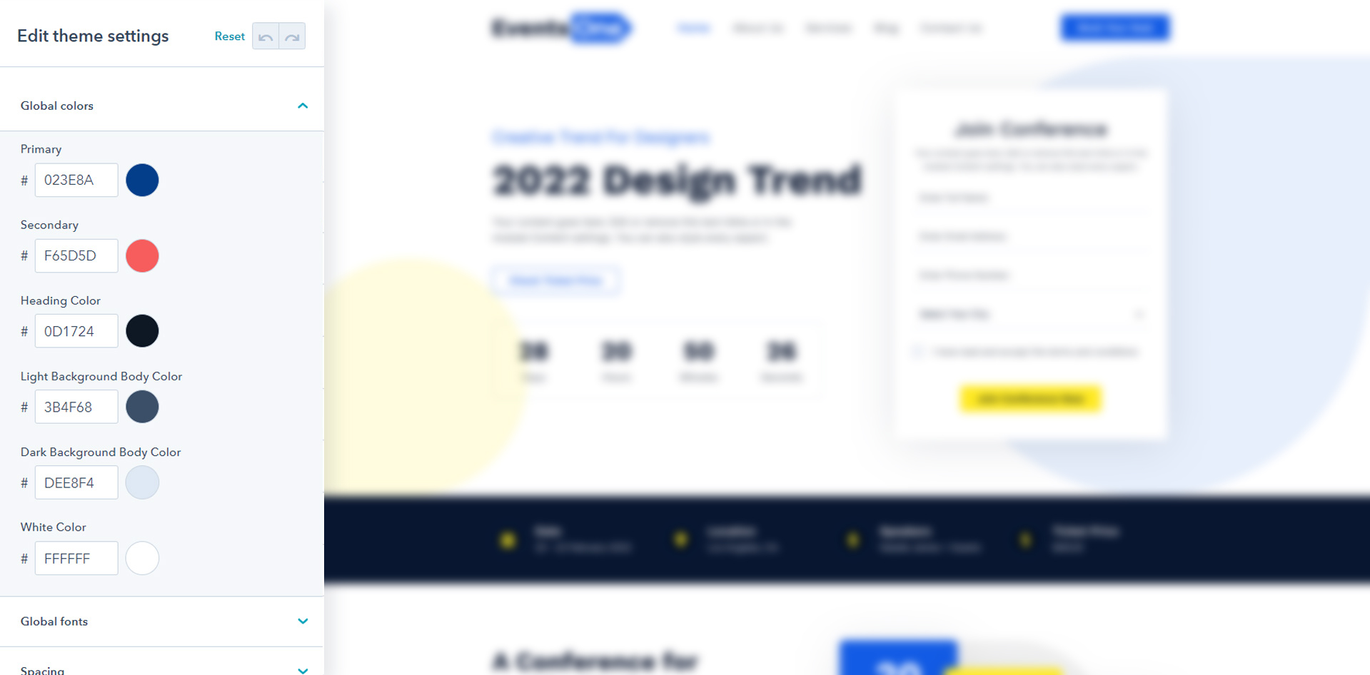
You will see the colors divided into 6 different areas.we highly recommend you to update all of the colors that match your brand style guide, so even the smallest color detail matches your company brand.
Once you finish updating the colors, just click Apply changes.
Global Fonts
If you click Global fonts in the customization screen, you will be able to see another screen just like this:
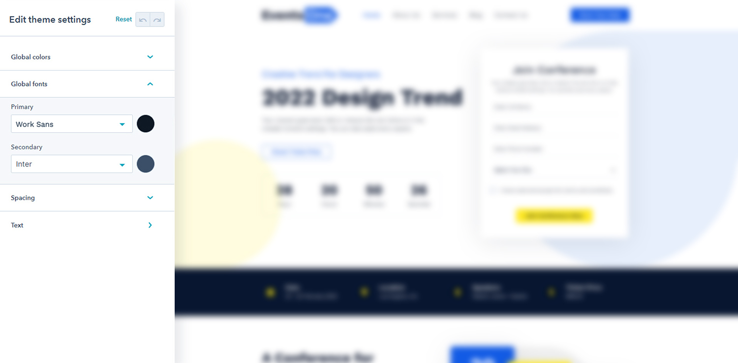
The Global Fonts contain the two parts the primary and secondary font
The primary font includes in heading
The secondary font includes in paragraph and body
Once you finish updating the fonts, just click Apply changes.
Spacing
If you click on Spacing in the customization screen, you will be able to see options:
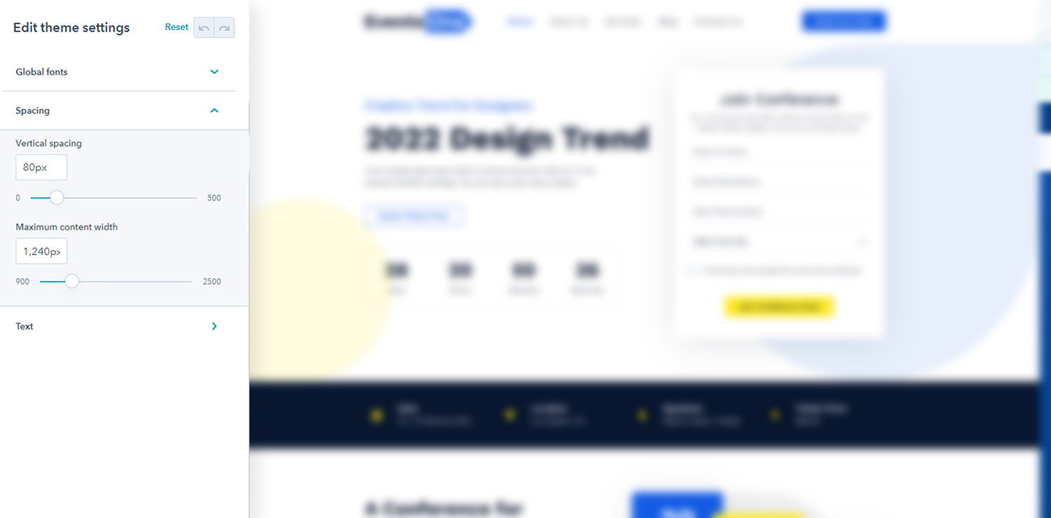
Vertical Spacing: Set the default vertical spacing of section in px
Maximum Content Width: Set the default maximum content width of section
Once you finish updating the spacing, just click Apply changes.
Note
Don't be hassle the section setting have the custom spacing and max width of the section, that will override these default spacing and content width
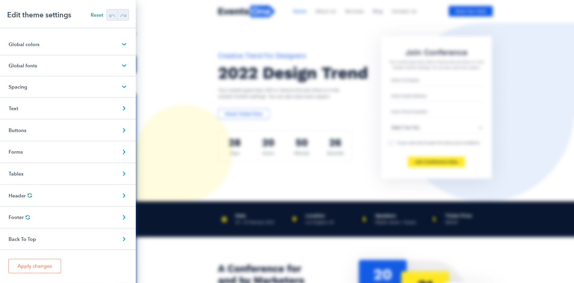
Text
Let’s change the typography now. Just as with the Colors, you just need to click Edit on the Typography option, and you will arrive this screen:
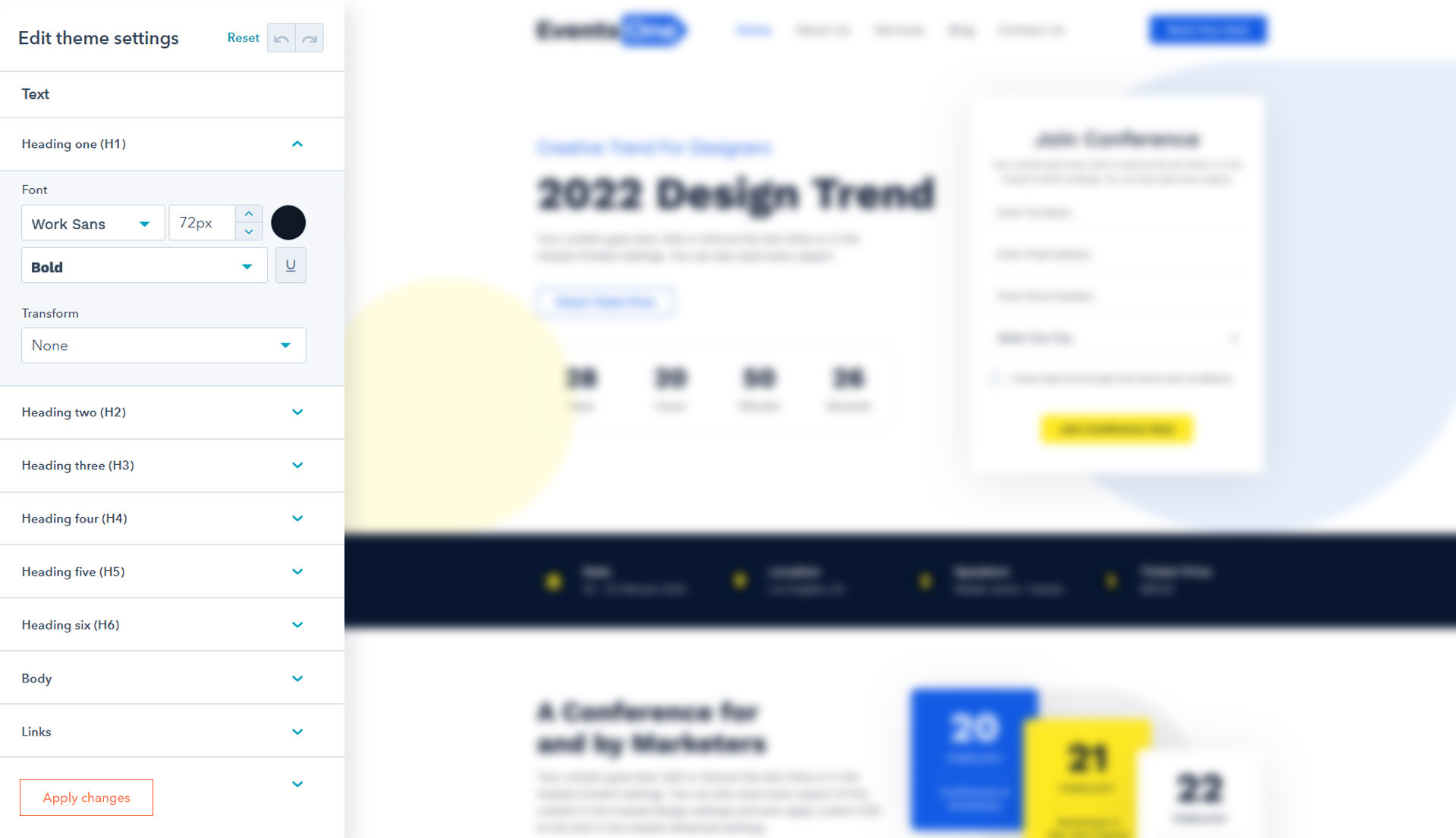
Once you arrive here, you will notice the typography is customized in detail by Heading type, Body Text and Link
This is to give you as much control as possible of the typography sizes, so your website is as consistent and scalable as possible.
You will notice that you can easily choose between 100s of Font families, and this is because EventOne HubSpot theme is integrated natively with Google Fonts, so you can use any Google font without any extra work. Just choose your preferred font, click Apply changes, and you are on the other side.
Font: Set the default font style, size, color, font weight and text decoration of text
Transform: Optional, Choose the options from Capitalize, Uppercase, Lowercase and None for text transform
Tables
Click Edit on the Tables tab, and you will arrive this screen:
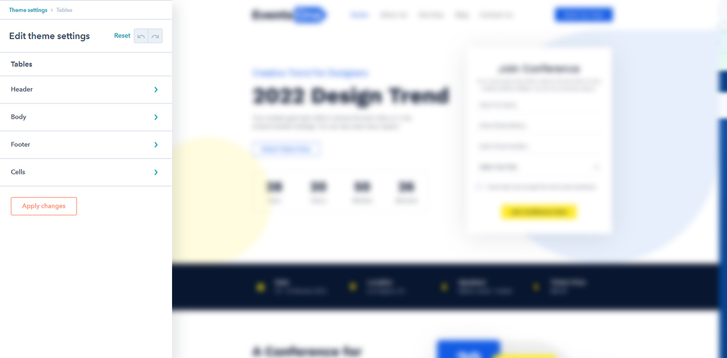
Set the default table styles from the above given options.
- Header:
- Text:
- Color: Set the default color of text
- Background:
- Color: Set the default background color of header
- Body:
- Text:
- Color: Set the default color of text
- Background:
- Color: Set the default background color of body
- Footer:
- Text:
- Color: Set the default color of text
- Background:
- Color: Set the default background color of footer
- Cells:
- Spacing:
- Padding: Set the default padding of cells
- Border:
- Border: Set the default border styles, border width and border color of cells
Back To Top
The Last one of theme settings, Click Edit on the Back To Top tab, and you will arrive this screen:
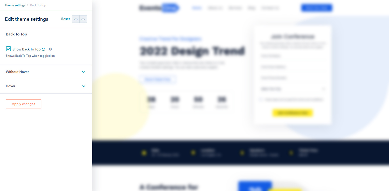
Set the back to top styles from the above given options.
- Show Back To Top: Enable to use the back to top button in your website
- Without Hover:
- Icon Color: Set the icon color of back to top
- Background Color: Set the background color of back to top
- Border: Set the border style, border color and border width of back to top
- Corner Radius: Set the corner radius of back to top
- Spacing: Set the custom padding and margin of back to top
- Hover:
- Icon Color: Set the hover icon color of back to top
- Background Color: Set the hover background color of back to top
- Border: Set the hover border style, border color and border width of back to top
Select Blog & Blog Post Template
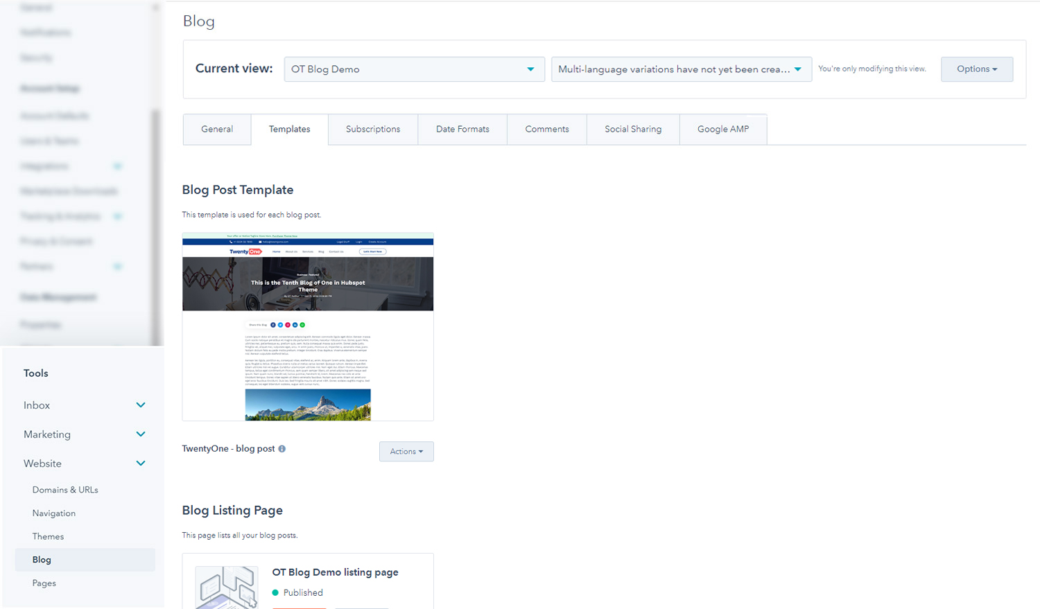
To select the Blog or Blog Post template, you just need to go to Settings > Website > Blog > Templates, and you will find 2 different drop down selectors.
One will choose the Template for blog posts, and the other one will choose the Template for listing pages (aka, the blog) and click Save.
Create a Blog Post
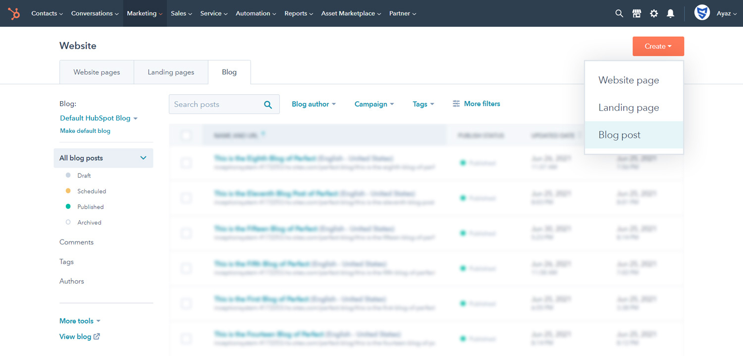
To create a Blog Post for your Blog, you just need to go to Marketing > Website > Blog and after that select your Blog from left side.
List of All System Pages
The templates available in EventOne Hubspot Theme are.
- Error 404 Page
- Error 505 Page
- Search Results
- Email Backup Unsubscribe
- Email Subscription Preferences
- Email Subscriptions Confirmation
- Membership Login
- Membership Registration
- Password Prompt
- Reset Password
- Reset Password Request
Applying a Templates
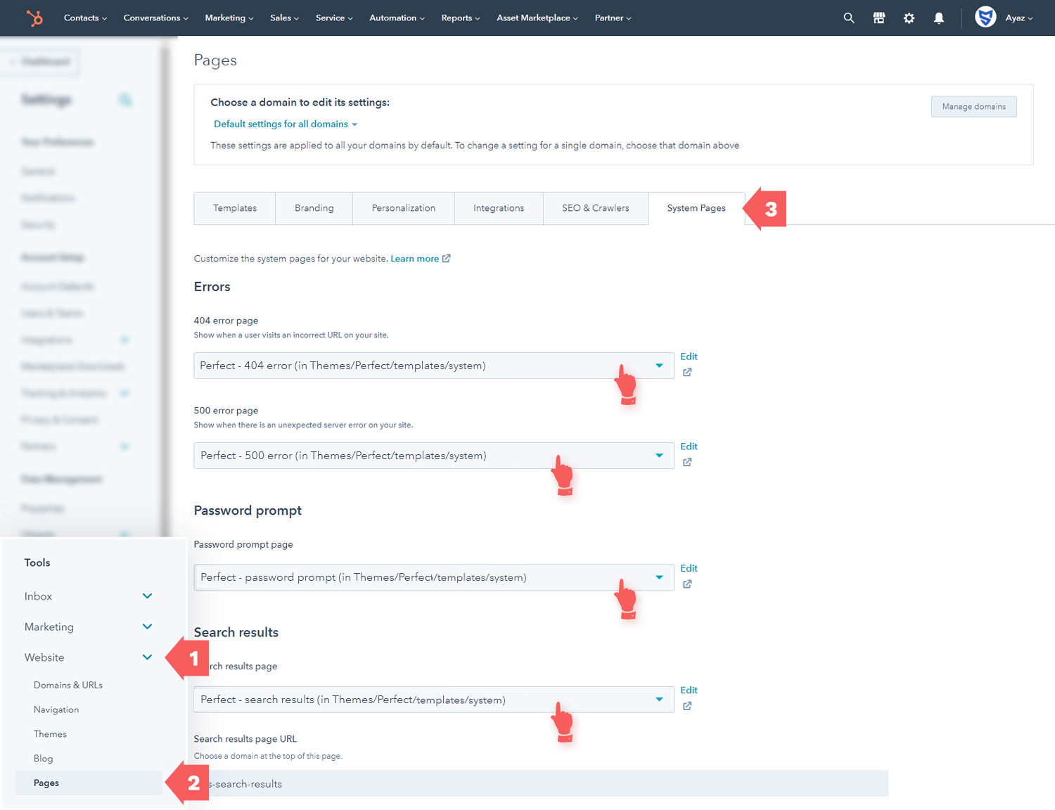
For setting a System Templates, you just need to go to Settings > Tools > Website > Pages > System Pages.
Then you have to select the templates of errors and other system pages.
For reference the figure is shown below.
Modules General Information
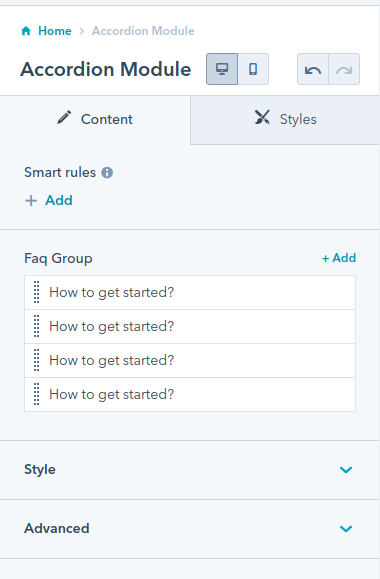
In the page editor you will see that all modules have two parts — Content and Styles:
Content:
The Content Part contains the content repeating fields, layout options and advanced.
Some modules does not have repeating fields.
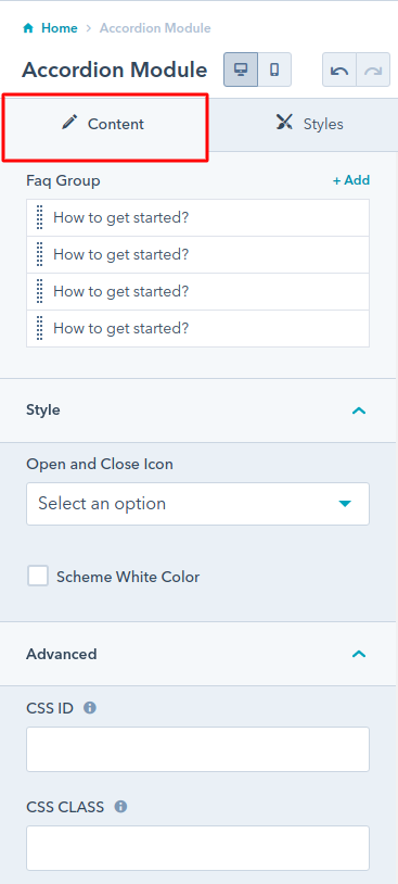
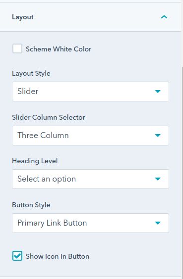
Most of our theme modules have the common options of layout:-
The Scheme White Color option, if you check this checkbox the color of the module will become white, This options is used for dark edition section.
Slider column selector or Grid column selector is the dropdown for selecting a number of elements or items in a slider or row.
Heading Level dropdown is used for selecting the title heading tag from h1 to h6.
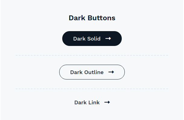
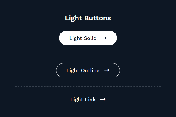
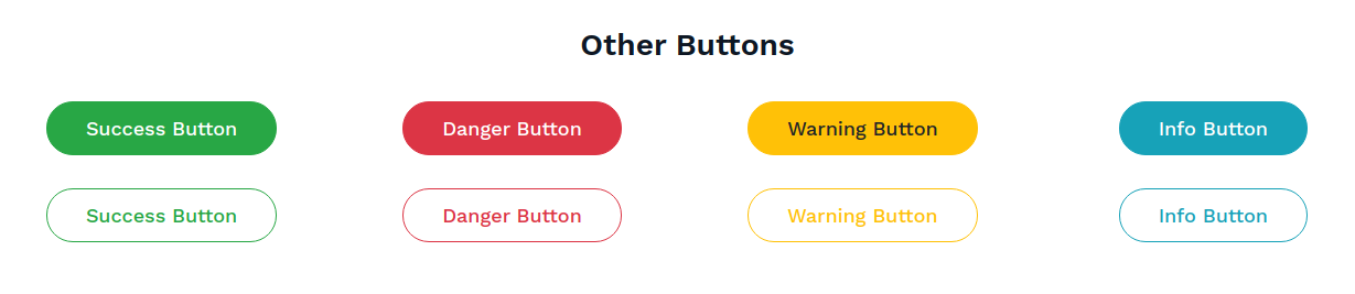
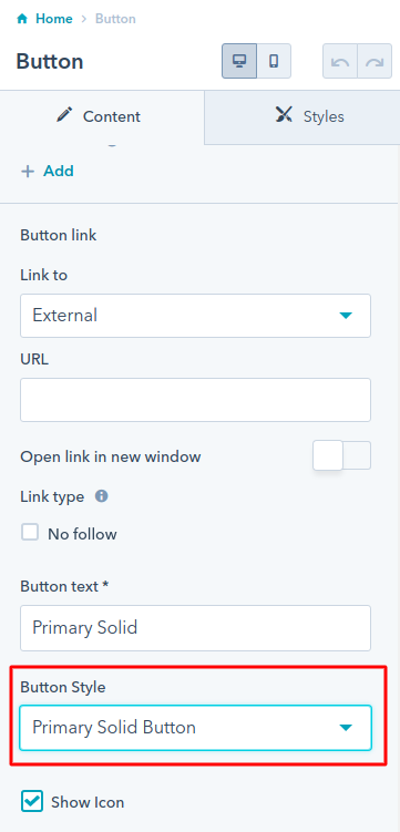
Button Style dropdown is used for selecting the style of various buttons, as we have covered all the button styles in the Button Module section of this document.
Show Icon in Button checkbox, if you check this checkbox the fa right icon will display on button.
Advanced:-
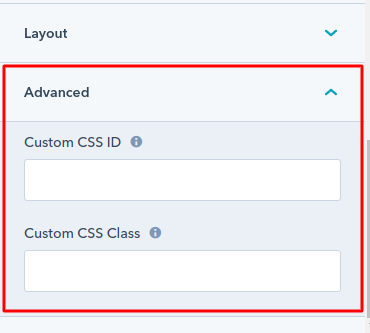
We have also included two fields where you can specify an unique ID or a custom class that will apply to this module wrapper. This may be useful to developers that want to apply custom styles to a specific module, or if you want to add an anchor that will scroll to your module:
Style:
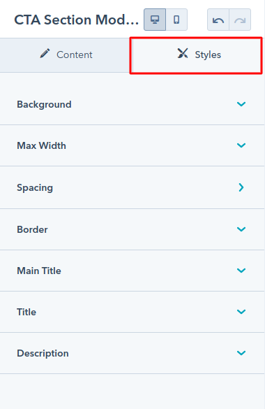
The Style Part contains the various types of style options such as background layout, spacing, border, box-shadow and font size, color, etc.
In EventOne Theme the style have the options as per module content.
Accordion Module
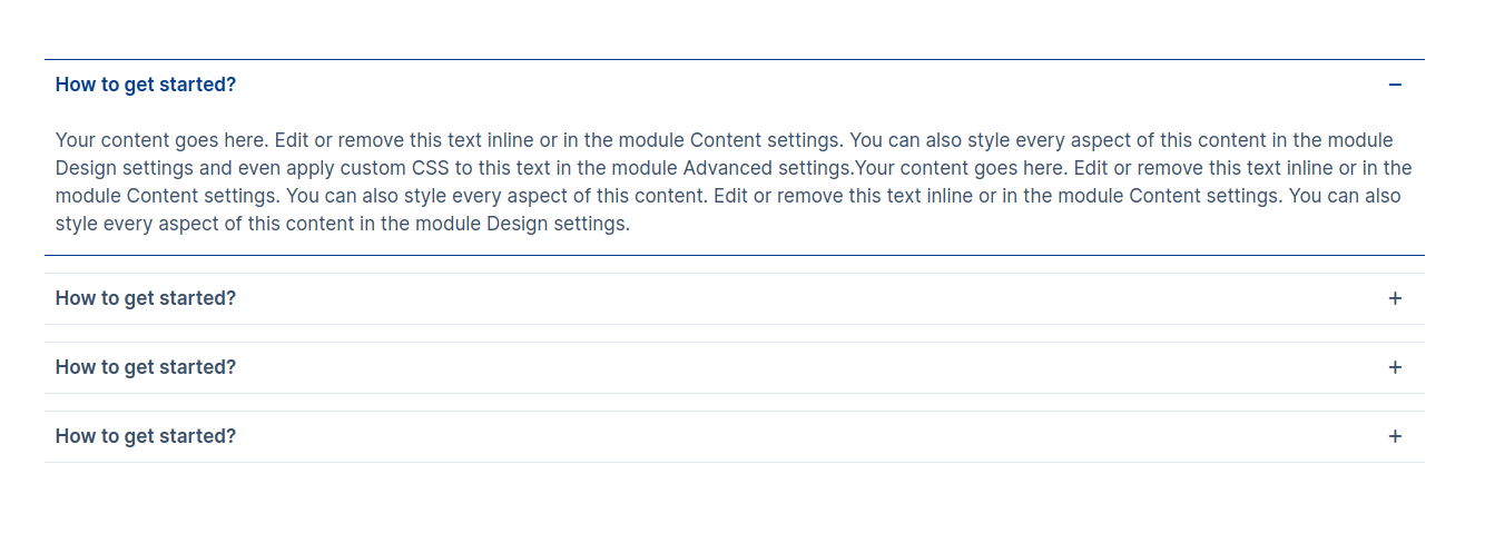
The accordion module can e.g. be used for frequently asked questions (FAQ).
Content Section:
- Question: the “questions” of the accordion element
- Detail: the “answer” of the accordion element
In style the open and close icon dropdown have the option values Plus-Minus, Arrow and Caret. Select the values as per your requirement.
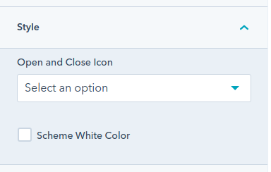
Style Section: (This all options are optional)
- Width: Enable the custom module width if you required, after that you will display the container width number field to add the custom container width of the module.
- Alignment: Choose the content alignment options from left, center and right
- Border:
- Border: Apply the Border style, color and width and also the sides of border
- Active Border Color: Apply the active border color
- Corner Radius: Apply the corner radius of all the direction
- Spacing: Apply the spacing for each elements
- Accordion Question:
- Background Color: Set the background color in the question
- Spacing: Set the margin and padding for the question
- Font: Set the various font style, size, color, weight and decoration for the question
- Active:
- Background Color: Set the active background color in the question
- Color: Set the active color for the question
- Accordion Answer:
- Spacing: Set the margin and padding for the answer
- Background Color: Set the background color in the answer
- Font: Set the various font style, size, color, weight and decoration for the answer
- Icon: Set the Icon width of the open and close icon
Examples
Blog Latest Post Module
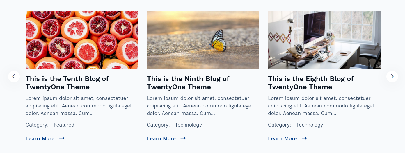
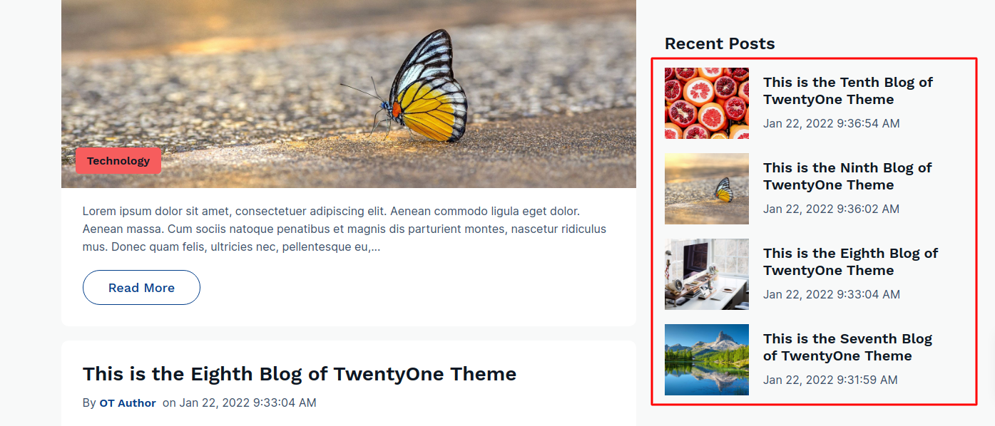
The Blog Latest Post Module can be used for listing your blog post in a slider view.
Content Section:
- Blog Id: Select the Blog
- Post Count: Select the number of blog posts to display
Layout:
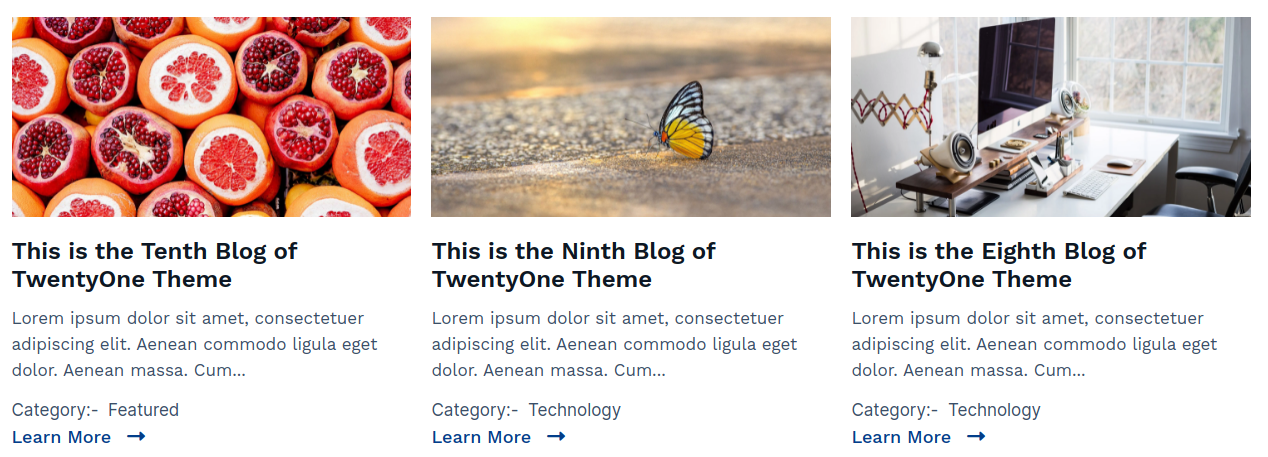
- Layout Style: Choose from multiple options Grid, List and Slider (examples see below)
- Slider Column Selector: Choose from multiple options from One Column to Four Column (Note:- This options will only display if the Slider is selected in Layout Style. )
- Grid Column Selector: Choose from multiple options from One Column to Four Column (Note:- This options will only display if the Grid is selected in Layout Style. )
- Heading Level: Choose from h1 to h6 for the title.
- Button Style: Choose various styles of button.
- Show Icon in Button: Add the icons in button.
Sidebar:
Slider
Grid
List
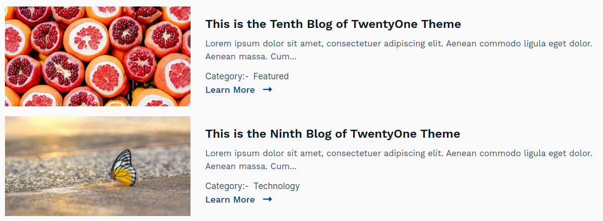
List (Used in Sidebar)
Blog listings Module
The blog listing module is of Blog listing template type, and this module is only used for blog listing template
This module is used for listing the posts in the blog page.
Content Section:
- Featured Image: Enable the checkbox to use the featured image in post.
- Tags: Enable the checkbox to use the post tags in post. Note :- In hubspot the category is called as tags
- Title: Enable the checkbox to use the post title in post.
- Author: Enable the checkbox to use the author of the post.
- Publish Date: Enable the checkbox to use the publish date of post.
- Show Read Time: Enable the checkbox to show the reading time of the post, It means how much time spend to read the post.
- Description: Enable the checkbox to use the description of the post.
- Button: Enable the checkbox to use the button to redirect in the post detail page
- Button Text: Set the custom button text of the button.
- Layout:
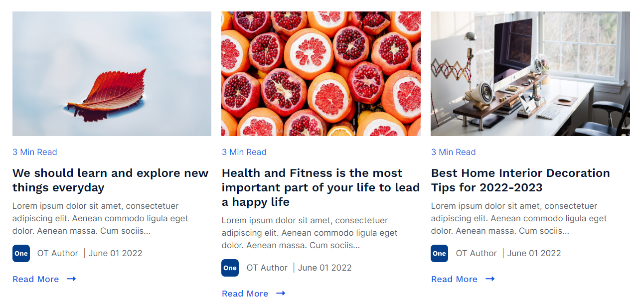
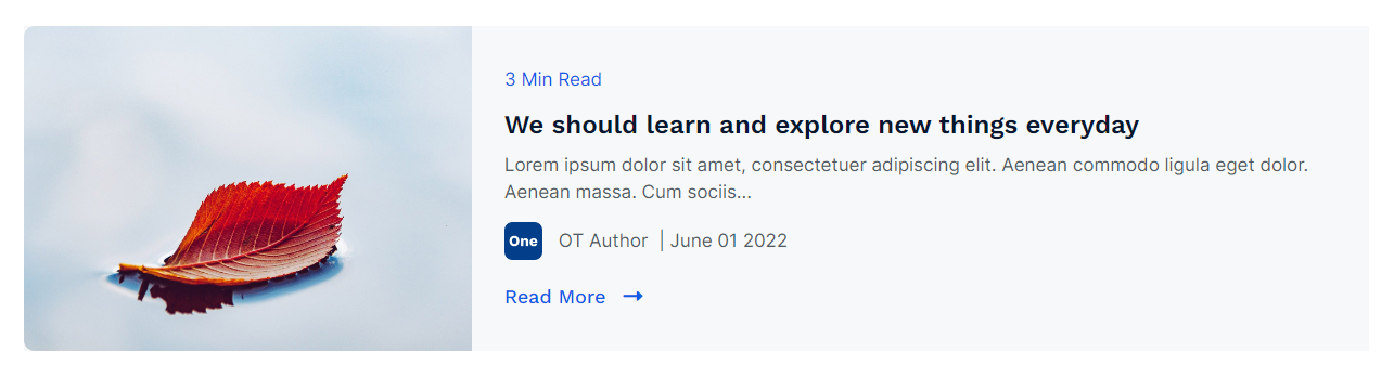
- Layout Style: Select the options between List and Grid style, (Examples see below)
- Column Grid Selector: Choose from multiple options from One Column to Four Column (Note:- This options will only display if the Grid is selected in Layout Style. )
- Heading Level: Choose from h1 to h6 for the title.
- Button Selector: Choose various styles of button.
- Show Icon In Button: Enable to use the icon in button
- Scheme Light Color: Switch between light and dark color scheme
- Number of Words in Post Description: Set the number of words in post description of the post.
Style Section:
- Box:
- Spacing:
- Spacing: Apply the padding and margin for all the elements.
- Spacing:
- Spacing: Apply the padding and margin for all the elements.
- Background:
- Background Selector: Select the background options from solid color and gradient color
- Solid Color: Set the custom background color for the elements or box.
- Gradient Color: Set the custom background gradient color for the elements or box.
- Border:
- Border: Set the custom border for the element
- Hover:
- Background:
- Background Selector: Select the background options from solid color and gradient color for hover of elements
- Solid Color: Set the custom background color for the hover of elements or box.
- Gradient Color: Set the custom background gradient color for the hover of elements or box.
- Border:
- Color: Set the custom hover border color of the element, if you have set the border
- Box Shadow:
- Use Box Shadow: Enable for using the box shadow in element, after the enable all other options will display in this group
- Horizontal Offset: The horizontal offset of the shadow. A positive value puts the shadow on the right side of the box, a negative value puts the shadow on the left side of the box. Note:- If not require then set as 0
- Vertical Offset: The vertical offset of the shadow. A positive value puts the shadow below the box, a negative value puts the shadow above the box Note:- If not required then set to 0
- Blur: Optional, The blur radius. The higher the number, the more blurred the shadow will be
- Spread: Optional, The spread radius. A positive value increases the size of the shadow, a negative value decreases the size of the shadow.
- Color: Set the color of box shadow
- Featured Image:
- Corner:
- Radius: Set the custom corner radius for all the directions in featured image
- Four Side:
- Custom Corner Radius: Enable the checkbox to use the custom corner radius for all the sides of image, Note:- After the enable all other options will display of these group.
- Top Left Corner: The value applies to border Top-Left corner of the image
- Top Right Corner: The value applies to border Top-Right corner of the image
- Bottom Right Corner: The value applies to border Bottom-Right corner of the image
- Bottom Left Corner: The value applies to border Bottom-Left corner of the image
- Height: Set the custom height of the featured image
- Tags:
- Text:
- Font: Set the various font style, size, color, weight and decoration for the tag
- Spacing:
- Spacing: Set the custom padding and margin of tag
- Background:
- Use Background: Enable the checkbox to use the background in the tag field. After the enable of checkbox all other options will display in these group.
- Background Selector: Choose the background option from solid color and gradient color
- Color: Set the custom solid color background for tag, the color will display if you selected the solid color in background
- Gradient: Set the custom gradient color, direction of color in background for tag, the gradient color will display if you selected the gradient color in background
- Read Time:
- Text:
- Font: Set the various font style, size, color, weight and decoration for the read time text
- Spacing:
- Spacing: Set the custom padding and margin for read time tag
- Title:
- Text:
- Font: Set the various font style, size, color, weight and decoration for the title
- Spacing:
- Spacing: Set the custom padding and margin for the title
- Author:
- Image:
- Corner:
- Radius: Set the custom corner radius for the author image
- Text:
- Font: Set the various font style, size, color, weight and decoration for the read time text
- Publish Date:
- Text:
- Font: Set the various font style, size, color, weight and decoration for the publish date text
- Description:
- Text:
- Font: Set the various font style, size, color, weight and decoration for the description
Examples
Grid Style :-
List Style :-
Blog Post Filter
The Blog Post Filter Module can be used for filtering a category or topics of the Blog.
This module is only used in the blog
Content Section:
Layout:
- Used in Sidebar: Enable the checkbox to use the module in the sidebar (for ex:- If you want to use this module in sidebar of the blog,)

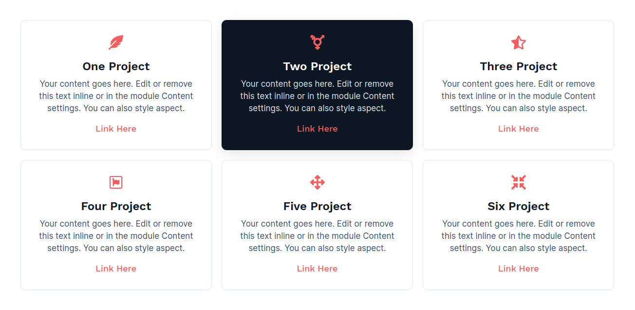
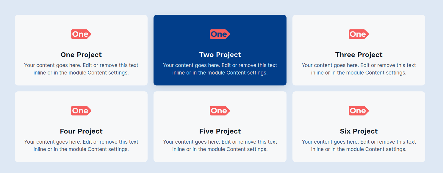
Blurb Module
The Blurb Module is used for adding the Image, Text and Button.
Content Section:
- Icon: Select the icon (Note: The Icon field will display if you have selected the Icon in layout Image/Icon?)
- Image: Select the image (Note: The Image field will display if you have selected the Image in layout Image/Icon?)
- Title: Title of Blurb
- Description: Description of Blurb in rich text field
- Button Label: Optional Button Label for blurb (Note: This field will display if you have check the Button Required? field in the layout)
- Button Link: Optional Button Link for blurb (Note: This field will display if you have check the Button Required? field in the layout)
Layout:
- Image/Icon?: Choose the options between Image or Icon to use in the module
- Image/Icon Placement: Choose the options between Top of Left placement of image/icon
- Heading Level: Choose from h1 to h6 for the title
- Column Grid Selector: Choose from multiple options from One Column to Four Column to display element in a row
- Button Required?: Check if required button in the blurb
- Show Icon in Button: Check if the icon required in button
- Scheme Light Color: Switch between light and dark color scheme
Style Section:
- Box Style:
- Text Alignment: Select the alignment of text
- Background Color: Set the background color for all the elements
- Border: Set the border styles, width and color
- Spacing: Add the custom padding and margin
- Corner Radius: Apply the corner radius of all the direction for the elements
- Box Hover Style:
- Background Color: Set the hover background color for all the elements
- Border: Set the hover border styles, width and color, select the same border width in which you have selected in box style border
- Box Shadow Required?: Check to apply default box shadow style in hover element
- Content Style:
- Image Width: Set your image size in
- Title Spacing: Set the custom spacing for title
- Text Color: Set the custom color for title
- Description Color: Set the custom color for description
- Image Round Width: Set the custom corner radius for image
- Content Style:
- Text Color: Set the custom color on box hover element for title
- Description Color: Set the custom color on box hover element for description
Examples
Client Logo Module
The Client Logo Module can e.g. be used for showcase the partners, brands, etc.
Content Section:
- Brand Logo: Select the image for element
Layout:
- Slider Required: Enable for using the slider in the module
- Slider Column Selector: Choose from multiple options from one column to six column, display on slider only
- Grid Column Selector: Choose from multiple options from one column to six column, display on without slider only
Style Section:
- Image:
- Image Width: Set the custom image width
- Spacing: Set the custom padding and margin for element
- Border:
- Border: Set the border style, border width and border color for element
- Corner Radius: Set the corner radius of all the direction
- Box Shadow:
- Box Shadow: Enable for using the box shadow in element, after the enable all other options will display in this group
- Horizontal Offset: The horizontal offset of the shadow. A positive value puts the shadow on the right side of the box, a negative value puts the shadow on the left side of the box. Note:- If not require then set as 0
- Vertical Offset: The vertical offset of the shadow. A positive value puts the shadow below the box, a negative value puts the shadow above the box Note:- If not required then set to 0
- Blur: Optional, The blur radius. The higher the number, the more blurred the shadow will be
- Spread: Optional, The spread radius. A positive value increases the size of the shadow, a negative value decreases the size of the shadow.
- Color: Set the color of box shadow

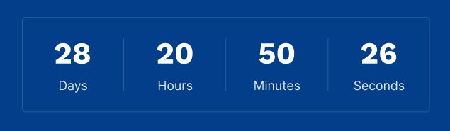
Countdown Timer Module
The Countdown Timer Module can be used to display any special events, brand anniversary, etc.
Content Section:
- Date and Time: Select the date from datepicker and time from timepicker for countdown timer
Layout:
- Scheme Light Color: Switch between light and dark color scheme
Style Section:
- Background:
- Background?: Choose the background option from solid color and gradient color
- Color: Set the custom solid color background for module, the color will display if you selected the solid color in background
- Gradient: Set the custom gradient color, direction of color in background for module, the color will display if you selected the gradient color in background
- Border:
- Border: Set the border styles, width and color
- Corner Radius: Apply the corner radius in px of all the direction
- Box Spacing:
- Spacing: Set the custom padding and margin for box
- Spacing In Mobile: Set the custom padding and margin in mobile size for box
- Content Spacing: Set the custom padding and margin for content
- Number:
- Font: Set the font style, font size, color, weight, text-decoration of number
- Spacing: Set the custom padding and margin of main title
- Text:
- Font: Set the font style, font size, color, weight, text-decoration of title
- Separator: Seperator between the elements in the module
- Color: Set the color of separator
- Width: Set the width of separator
- Box Shadow:
- Box Shadow: Enable for using the box shadow in module, after the enable all other options will display in this group
- Horizontal Offset: The horizontal offset of the shadow. A positive value puts the shadow on the right side of the box, a negative value puts the shadow on the left side of the module. Note:- If not require then set as 0
- Vertical Offset: The vertical offset of the shadow. A positive value puts the shadow below the box, a negative value puts the shadow above the box Note:- If not required then set to 0
- Blur: Optional, The blur radius. The higher the number, the more blurred the shadow will be
- Spread: Optional, The spread radius. A positive value increases the size of the shadow, a negative value decreases the size of the shadow.
- Color: Set the color of box shadow
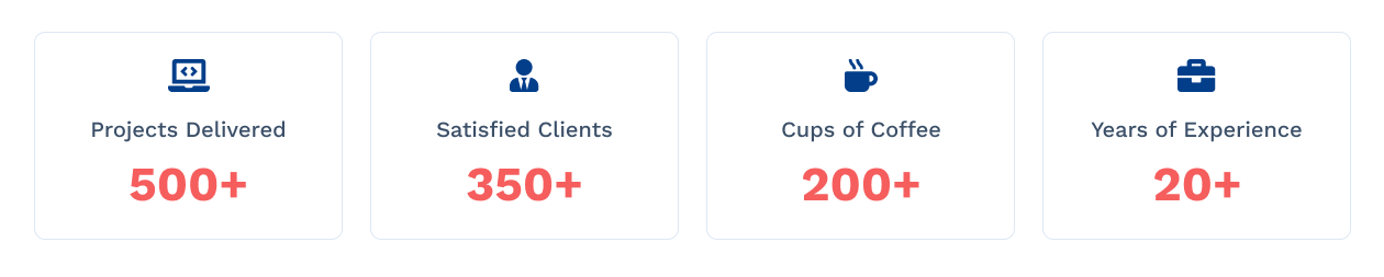
Counter Module
The Counter Module can be used for e.g the number of interests, completed project, number of clients, etc.
Content Section:
- Icon: Iconpicker for icon show in box, (Note: The Icon field will display if you have selected the Icon in layout Image/Icon?)
- Image: Select the image (Note: The Image field will display if you have selected the Image in layout Image/Icon?)
- Title: Title of element
- Counter Number: Counter number of element
- Text after CounterThis text is used to add a plus sign, K for thousand and M for Million
Layout:
- Image/Icon?: Choose the options between Image and Icon
- Scheme Light Color: Switch between light and dark color scheme
- Grid Column Selector: Choose from multiple options from One Column to Four Column to display element in a row
Style Section:
- Alignment: Set the content alignment in the box
- Background:
- Background?: Choose the background option from solid color and gradient color
- Color: Set the custom solid color background for module, the color will display if you selected the solid color in background
- Gradient:
Set the custom gradient color, direction of color in background for module, the gradient color will display if you selected the gradient color in background
- Border:
- Border: Set the border styles, width and color for element
- Corner Radius: Set the corner radius in px for element
- Box Shadow:
- Box Shadow: Enable for using the box shadow in element, after the enable all other options will display in this group
- Horizontal Offset: The horizontal offset of the shadow. A positive value puts the shadow on the right side of the box, a negative value puts the shadow on the left side of the box. Note:- If not require then set as 0
- Vertical Offset: The vertical offset of the shadow. A positive value puts the shadow below the box, a negative value puts the shadow above the box Note:- If not required then set to 0
- Blur: Optional, The blur radius. The higher the number, the more blurred the shadow will be
- Spread: Optional, The spread radius. A positive value increases the size of the shadow, a negative value decreases the size of the shadow.
- Color: Set the color of box shadow
- Spacing: Set the custom padding and margin for element
- Image:
- Height: Set the custom image height in px as per your requirement
- Icon:
- Height: Set the custom icon height in px as per your requirement
- Image/Icon Spacing: Set the custom padding and margin for image and icon in element
- Title:
- Font: Set the font style, font size, color, weight, text-decoration of title
- Spacing: Set the custom padding and margin for title
- Counter Number:
- Font: Set the font style, font size, color, weight, text-decoration of counter number
CTA Section Module
A call to action (CTA) is a prompt on a website that tells the user to take some specified action
Content Section:
- Main Title: Main title of call to action
- Title: Title of call to action
- Description: Description of call to action
- Button Text: Text or Label of button
- Button Link: Button Link of card
- Background:
Styles:
- Heading Level: Choose from h1 to h6 for the title
- Scheme Color: Switch between light and dark color scheme
- Button Style Choose from various styles of button
- Show Icon In Button: Switch between to add icon in button or not
Layout:
- Alignment: Choose the options between Vertical and Horizontal directions, see the examples below
Style Section:
- Background:
- Background?: Choose the background option from color, image and gradient color
- Color: Set the custom solid color background for module, the color will display if you selected the solid color in background
- Background Image: Choose the background image for background for module, the background image will display if you selected the image in background
- Gradient: Set the custom gradient color, direction of color in background for module, the color will display if you selected the gradient color in background
- Overlay: This group will display if you select the image in background?
- Overlay Over Image: Use Overlay Switch between use overlay or not
- Overlay Color: Set the overlay color over image, this option will display if you chech the use overlay field
- Custom Max Width:
- Custom Max Width: Enable to use the custom max width of the module
- Width: Set the custom max width of the module
- Spacing:
- Spacing: Set the custom padding and margin for the module
- Spacing in Mobile: Set the custom padding and margin in mobile size for the module
- Border:
- Border: Set the border styles, width and color for module
- Corner Radius: Set the corner radius in px for module
- Alignment: Choose the alignment between left, center and right in the vertical layout of call to action
- Main Title:
- Font: Set the font style, font size, color, weight, text-decoration of main title
- Spacing: Set the custom padding and margin for main title
- Title:
- Font: Set the font style, font size, color, weight, text-decoration of title
- Spacing: Set the custom padding and margin for title
- Description:
- Font: Set the font style, font size, color, weight, text-decoration of description
- Spacing: Set the custom padding and margin for description
Horizontal Layout :-

Vertical Layout :-

Note
If you want to use this module as a full width set the padding as 0 in all the directions and also set the background as none of the section, in which you have used this module.
Don't Worry the Module have the options of custom max width.
Event Module
The Event Module can be used for listing the events.
Content Section:
- Title: Title of event
- Date: Date of event, Please Use the Proper Format For.Ex:- 27 oct
- Time: Time of event, Please Use the Proper Format For.Ex:- 08:00 am - 04:00 pm
- Speaker Name: Speaker name of event
- Description: Description of event
- Featured Image: Select the image of event
- Button Link: Button Link of card
- Button Text: Text or Label of button
Layout:
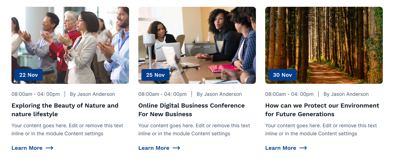
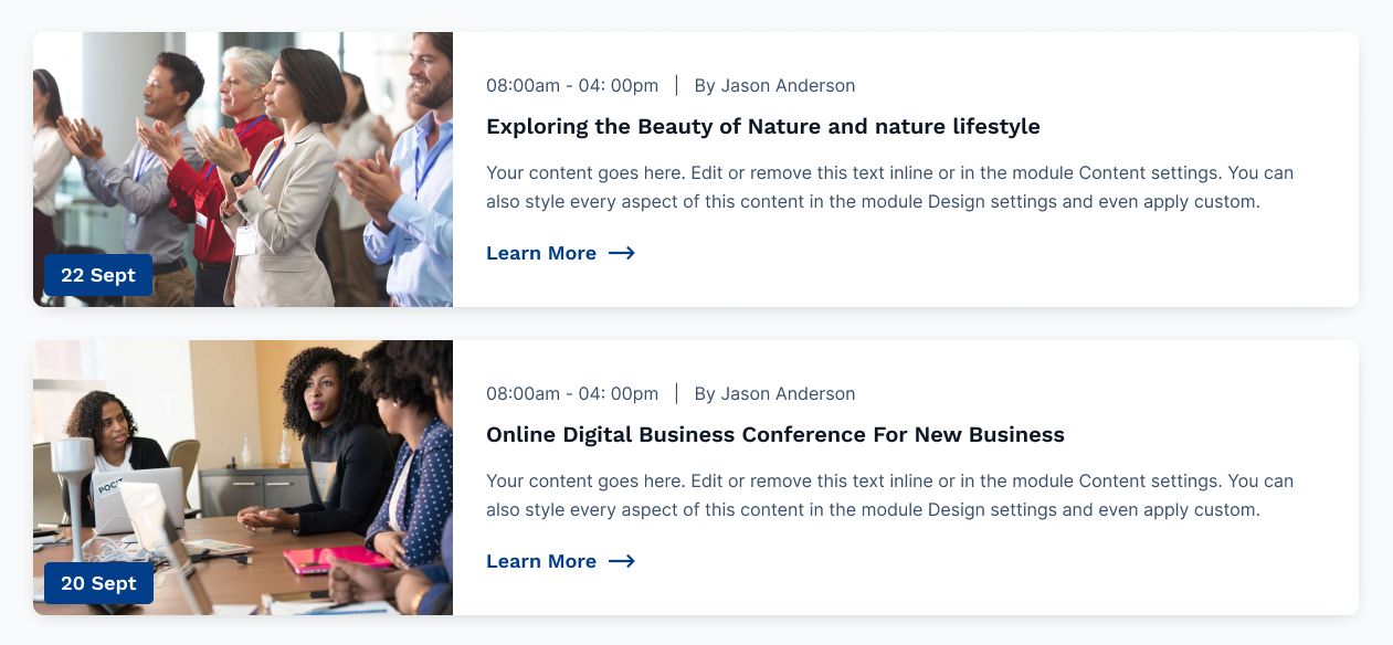
- Display Options: Choose the display options between grid and list, see the example below of both the options
- Grid Column: Choose from multiple options 1 to 4 Column (Note:- This options will only display if the Grid is selected in Display Options. )
- Heading Level: Choose from h1 to h6 for the title
- Scheme Light Color: Switch between light and dark color scheme
- Button Style Choose from various styles of button
- Show Icon In Button: Switch between to add icon in button or not
Style Section:
- Background:
- Background?: Choose the background option from solid color and gradient color
- Backround Color: Set the custom solid color background for element, the color will display if you selected the solid color in background
- Gradient: Set the custom gradient color, direction of color in background for element, the gradient color will display if you selected the gradient color in background
- Box Spacing: Set the custom box padding and margin for the element
- Content Spacing:
- Spacing: Set the content custom padding and margin for the element
- Spacing In Mobile: Set the content custom padding and margin for the element in mobile size
- Border:
- Border: Set the border styles, width and color for element
- Corner Radius: Set the corner radius in px for element
- Box Shadow:
- Use Box Shadow: Enable for using the box shadow in element, after the enable all other options will display in this group
- Horizontal Offset: The horizontal offset of the shadow. A positive value puts the shadow on the right side of the box, a negative value puts the shadow on the left side of the box. Note:- If not require then set as 0
- Vertical Offset: The vertical offset of the shadow. A positive value puts the shadow below the box, a negative value puts the shadow above the box Note:- If not required then set to 0
- Blur: Optional, The blur radius. The higher the number, the more blurred the shadow will be
- Spread: Optional, The spread radius. A positive value increases the size of the shadow, a negative value decreases the size of the shadow.
- Color: Set the color of box shadow
- Title:
- Font: Set the font style, font size, color, weight, text-decoration of title
- Spacing: Set the custom padding and margin for title
- Date:
- Font: Set the font style, font size, color, weight, text-decoration of date
- Spacing: Set the custom padding and margin for title
- Backround Color: Set the custom solid color background for date
- Border:
- Border: Set the border styles, width and color for date
- Corner Radius: Set the corner radius in px for date
- Box Shadow:
- Use Box Shadow: Enable for using the box shadow in date field, after the enable all other options will display in this group
- Horizontal Offset: The horizontal offset of the shadow. A positive value puts the shadow on the right side of the box, a negative value puts the shadow on the left side of the box. Note:- If not require then set as 0
- Vertical Offset: The vertical offset of the shadow. A positive value puts the shadow below the box, a negative value puts the shadow above the box Note:- If not required then set to 0
- Blur: Optional, The blur radius. The higher the number, the more blurred the shadow will be
- Spread: Optional, The spread radius. A positive value increases the size of the shadow, a negative value decreases the size of the shadow.
- Color: Set the color of box shadow in date
- Description:
- Font: Set the font style, font size, color, weight, text-decoration of description
- Spacing: Set the custom padding and margin for description
Layout :-
We have provided multiple Event layouts. Of course, each of the layouts can be customized by changing the color theme and the background options.
Grid
List
For selecting a different layout in the event module select the layout as show below in figure.
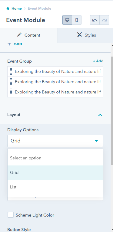
Image Gallery Module
The Image Gallery Module can be used for e.g images of awards ceremony, functions, etc.
The module have the fancybox effect.
Content Section:
- Image: Select or upload the image
- Caption: caption of the Image, these text will display after the popup of image on the bottom of the screen
Layout:
- Column Grid Selector: Choose from multiple options from Column 1 to Column 6 to display number of element in a row
Style Section:
- Image:
- Image Height: Set the custom height of image in px

Multiple Days Timeline Module
Representing an alignment in time and making a chronological statement, a timeline should include the series of events and activities (milestones and tasks) that you want to display on your website, along with their dates to mark their occurrence over a particular phase.
This module is the advanced version of Timeline Module
Content Section:
- Multiple Days: Note:- This group will display if you check the checkbox of Multiple Days
- Tab Title: Add the title of tab for ex., Day 1. If not require then leave the empty
- Date: Add the date in text format. for ex., 03 November 2022
- Group:
- Featured Image: Set the featured image if required.
- Time: Add the time of event in text format for ex., 09:00am - 11ion:30am
- Title: Add the title of event
- Description: Add the description of event
- Speaker:
- Speaker Image: Add the speaker image of the speaker
- Speaker Name: Add the speaker name
- Speaker Position: Add the position of the speaker
- Location: Add the location of the event
- Address: Add the detailed address of the event
- Single Day: Note:- This group will display if you uncheck the checkbox of Multiple Days
- Featured Image: Set the featured image if required.
- Time: Add the time of event in text format for ex., 09:00am - 11ion:30am
- Title: Add the title of event
- Description: Add the description of event
- Speaker:
- Speaker Image: Add the speaker image of the speaker
- Speaker Name: Add the speaker name
- Speaker Position: Add the position of the speaker
- Location: Add the location of the event
- Address: Add the detailed address of the event
Layout:
- Use Multiple Days: Enable the checkbox to use the timeline in more than 1 days
- Scheme White Color: Switch between light and dark color scheme
- Heading Level: Choose from h1 to h6 for the title
Style Section:
- Alignment:
- Tab Alignment: Choose the options between left, center and right of the tab alignment
- Text Alignment: Set the text alignment property of tab item.
- Tab:
- Separator:
- Use Separator: Enable the checkbox to use the sparator in tab item, After the enabled all other options in these group will display.
- Color: Set the custom color for the separator
- Height: Set the custom height of the separator
- Background:
- Background?: Choose the background option between solid color and gradient color
- Color: Set the custom solid color background for tab item, the color will display if you selected the solid color in background
- Gradient: Set the custom gradient color, direction of color in background for tab item, the gradient color will display if you selected the gradient color in background
- Spacing:
- Spacing: Set the custom padding and margin of the tab item
- Border:
- Border: Set the border styles, width and color for tab
- Corner Radius:
- Corner Radius: Set the custom corner radius of all directions in px for tab
- Tab Title:
- Font: Set the custom font style, size, color and decoration of the tab title
- Tab Date:
- Font: Set the custom font style, size, color and decoration of the tab date
- Active Tab:
- Separator:
- Color: Set the custom active color for the separator
- Background:
- Background?: Choose the background option between solid color and gradient color
- Color: Set the custom solid color background for active tab item, the color will display if you selected the solid color in background
- Gradient: Set the custom gradient color, direction of color in background for active tab item, the gradient color will display if you selected the gradient color in background
- Border Color:
- Color: Set the custom active border color for tab
- Tab Title:
- Color: Set the custom active colsor of active tab title
- Tab Date:
- Color: Set the custom active color of active tab date
- Content:
- Background:
- Background?: Choose the background option between solid color and gradient color
- Color: Set the custom solid color background for content item, the color will display if you selected the solid color in background
- Gradient: Set the custom gradient color, direction of color in background for content item, the gradient color will display if you selected the gradient color in background
- Spacing:
- Spacing: Set the custom padding and margin of the content item
- Border:
- Border: Set the border styles, width and color for content item
- Corner Radius: Set the custom corner radius of all directions in px for content item
- Shadow:
- Use Box Shadow: Enable for using the box shadow in element, after the enable all other options will display in this group
- Horizontal Offset: The horizontal offset of the shadow. A positive value puts the shadow on the right side of the box, a negative value puts the shadow on the left side of the box. Note:- If not require then set as 0
- Vertical Offset: The vertical offset of the shadow. A positive value puts the shadow below the box, a negative value puts the shadow above the box Note:- If not required then set to 0
- Blur: Optional, The blur radius. The higher the number, the more blurred the shadow will be
- Spread: Optional, The spread radius. A positive value increases the size of the shadow, a negative value decreases the size of the shadow.
- Color: Set the color of box shadow
- Image:
- Custom Width:
- Height: Set the custom height of featured image
- Border:
- Border: Set the border styles, width and color for featured image
- Corner Radius: Set the custom corner radius of all directions in px for featured image
- Date:
- Font: Set the font style, font size, color, weight, text-decoration of date
- Spacing:
- Spacing: Set the custom padding and margin date
- Title:
- Font: Set the font style, font size, color, weight, text-decoration of title
- Spacing:
- Spacing: Set the custom padding and margin of title
- Description:
- Font: Set the font style, font size, color, weight, text-decoration of description
- Spacing:
- Spacing: Set the custom padding and margin of title
- Speaker:
- Background:
- Background?: Choose the background option between solid color and gradient color
- Color: Set the custom solid color background for speaker element, the color will display if you selected the solid color in background
- Gradient: Set the custom gradient color, direction of color in background for speaker element, the gradient color will display if you selected the gradient color in background
- Spacing:
- Spacing: Set the custom padding and margin of the speaker element
- Border:
- Border: Set the border styles, width and color for speaker element
- Corner Radius: Set the custom corner radius of all directions in px for speaker element
- Shadow:
- Use Box Shadow: Enable for using the box shadow in element, after the enable all other options will display in this group
- Horizontal Offset: The horizontal offset of the shadow. A positive value puts the shadow on the right side of the box, a negative value puts the shadow on the left side of the box. Note:- If not require then set as 0
- Vertical Offset: The vertical offset of the shadow. A positive value puts the shadow below the box, a negative value puts the shadow above the box Note:- If not required then set to 0
- Blur: Optional, The blur radius. The higher the number, the more blurred the shadow will be
- Spread: Optional, The spread radius. A positive value increases the size of the shadow, a negative value decreases the size of the shadow.
- Color: Set the color of box shadow
- Speaker Name:
- Font:
- Font: Set the custom font style, size, color and decoration of the speaker name
- Spacing:
- Spacing: Set the custom padding and margin of the speaker name
- Speaker Position:
- Font:
- Font: Set the custom font style, size, color and decoration of the speaker name
- Location:
- Font:
- Font: Set the font style, font size, color, weight, text-decoration of location
- Spacing:
- Spacing: Set the custom padding and margin of location
- Address:
- Font:
- Font: Set the font style, font size, color, weight, text-decoration of address
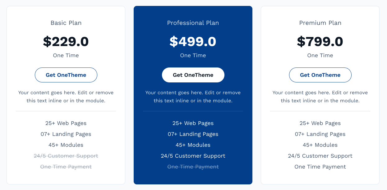
Pricing Card Module
The Pricing module e.g can be used for pricing plan of the products or services.
Content Section:
- Plan: Add the plan of your pricing for e.g, basic plan, professional plan and premium plan, etc
- Price: Add the price in your local currency
- Timeframe: Enter the timeframe of your plan. For example :- Per Year, Per Month, OneTIme, etc.
- Button Text: Text or Label of button
- Button Link: Button Link of pricing
- Product Description: Short description of product
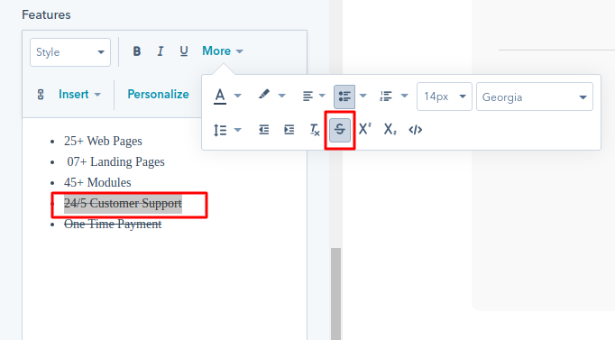
- Features: Add the features of the plan or product, if you want to set the particular sentence or word in strikethrough set this way in rich text module, example given below
Layout:
- Scheme White Color: Switch between light and dark color scheme
- Button Style Choose from various styles of button
- Icon In Button: Switch between to add icon in button or not
Style Section:
- Background:
- Background?: Choose the background option from solid color and gradient color
- Color: Set the custom solid color background for module, the color will display if you selected the solid color in background
- Gradient Color: Set the custom gradient color, direction of color in background for module, the color will display if you selected the gradient color in background
- Spacing:
- Spacing: Set the custom padding and margin for the module
- Spacing in Mobile: Set the custom padding and margin in mobile size for the module
- Border:
- Border: Set the border styles, width and color for module
- Corner Radius: Set the corner radius in px for module
- Box Shadow:
- Use Box Shadow: Enable for using the box shadow in element, after the enable all other options will display in this group
- Horizontal Offset: The horizontal offset of the shadow. A positive value puts the shadow on the right side of the box, a negative value puts the shadow on the left side of the box. Note:- If not require then set as 0
- Vertical Offset: The vertical offset of the shadow. A positive value puts the shadow below the box, a negative value puts the shadow above the box Note:- If not required then set to 0
- Blur: Optional, The blur radius. The higher the number, the more blurred the shadow will be
- Spread: Optional, The spread radius. A positive value increases the size of the shadow, a negative value decreases the size of the shadow.
- Color: Set the color of box shadow
- Plan:
- Font: Set the font style, font size, color, weight, text-decoration of plan
- Price:
- Font: Set the font style, font size, color, weight, text-decoration of price
- Timeframe:
- Font: Set the font style, font size, color, weight, text-decoration of timeframe
- Description:
- Font: Set the font style, font size, color, weight, text-decoration of description
- Features:
- Font: Set the font style, font size, color, weight, text-decoration of features
- Strikethrough: Strikethrough is a typographical presentation of words with a horizontal line through their center, resulting in text like this
Strikethrough
- Font: Set the font style, font size, color, weight, text-decoration of strikethrough features
- Separator:
- Use Separator: Check the fields to display seperator below the product description, All below style option will display if you check this use overlay checkbox
- Color: Set the color of separator
- Height: Set the height in px of overlay
Note
This Module does not have the repeating items. If you want to use three items drag these module 3 times in a different column
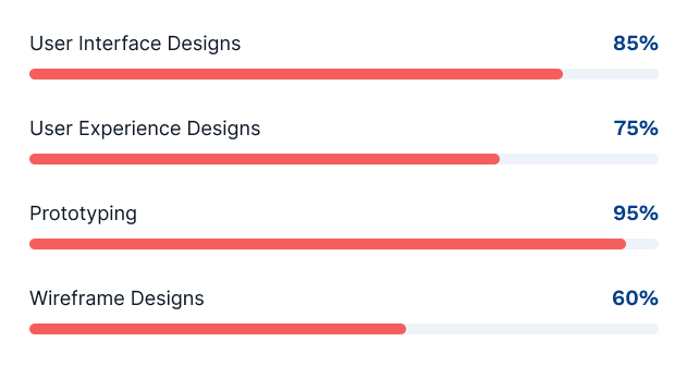
OT-Progress-Bar-Module
The Progress Bar Module can be used for e.g showing the progress of task
Content Section:
- Progeress: Set the progress of the element
- Title: Add the title of the element
Layout:
- Heading Tag: Choose from h1 to h6 for the title.
- Scheme Color Light: Switch between light and dark color scheme
Style Section:
- Background Color: Set the custom solid color background for element
- Border: Set the border styles, width and color for element
- Spacing: Set the custom padding and margin for the element
- Corner Radius: Set the corner radius in px for element
- Height: Set the custom height in px for element
- Progress:
- Background?: Choose the background option from solid color and gradient color
- Background Color: Set the custom solid color background for progress, the color will display if you selected the solid color in background
- Gradient: Set the custom gradient color, direction of color in background for progress, the color will display if you selected the gradient color in background
- Transition Speed: Set the transition speed of progress from 1 to 9 second
- Percentage Text:
- Font: Set the font style, font size, color, weight, text-decoration of percentage text
Section Heading
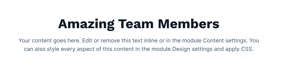
The Section Heading Module is used for the heading of the section.
Content Section:
- Main Title: Add the main title of the section, note: leave empty if you does not required this field
- Title: Add the title of the section
- Description: Add the description of the section
Layout:
- Header Tag: Choose from h1 to h6 for the title.
- Scheme Light Color: Switch between light and dark color scheme
Style Section:
- Width:
- Max Width: Set the custom max width in px for module
- Alignment:
- Content Alignment: Choose the content alignment options from left, center and right
- Main Title:
- Font: Set the font style, font size, color, weight, text-decoration of main title
- spacing:
- Spacing: Set the custom padding and margin of the main title
- Title:
- Font: Set the font style, font size, color, weight, text-decoration of title
- spacing:
- Spacing: Set the custom padding and margin of the title
- Description:
- Font: Set the font style, font size, color, weight, text-decoration of description
Social Sharing
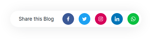
The Social Sharing is used for sharing the post, or page.
Content Section:
- Title: Add the title of the module
- Link URL: This is the destination link that will be shortened for easier sharing on social networks.
- Facebook: All the fields are required in these group
- Enabled: Enable to share on facebook
- Link: Add the link of sharing in your facebook account
- Twitter: All the fields are required in these group
- Enabled: Enable to share on twitter
- Link: Add the link of sharing in your twitter account
- Instagram: All the fields are required in these group
- Enabled: Enable to share on instagram
- Link: Add the link of sharing in your instagram account
- Pinterest: All the fields are required in these group
- Enabled: Enable to share on pinterest
- Link: Add the link of sharing in your pinterest account
- Pin Image: Add or upload the image
- Whatsapp: All the fields are required in these group
- Enabled: Enable to share on whatsapp
- Link: Add the link of sharing in your whatsapp account
Style Section:
- Title:
- Title Required: Enable the checkbox if you want to use the title in the module
- spacing:
- Spacing: Set the custom padding and margin of title
Subscribe Module
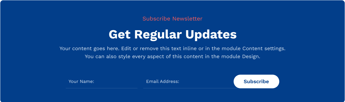
The Subscribe Module contains the subscribe form.
Content Section:
- Main Title: Main title of subscribe module
- Title: Title of subscribe module
- Description: Description of subscribe module
- Subscribe Form: Choose or create a new form for subscribe module
Layout:
- Alignment: Choose the options between Vertical and Horizontal
- Heading Level: Choose from h1 to h6 for the title
- Scheme White Color: Switch between light and dark color scheme
Style Section:
- Layout:
- Background?: Choose the background option from color, image and gradient color
- Color: Set the custom solid color background for module, the color will display if you selected the solid color in background
- Background Image: Choose the background image for background for module, the background image will display if you selected the image in background
- Gradient: Set the custom gradient color, direction of color in background for module, the color will display if you selected the gradient color in background
- Spacing:
- Spacing: Set the custom padding and margin for the module
- Spacing in Mobile: Set the custom padding and margin in mobile size for the module
- Border:
- Border: Set the border styles, width and color for module
- Corner Radius: Set the corner radius in px for module
- Max Width:
- Width: Set the custom max width of the module
- Alignment:
- Text Alignment: Choose the text alignment options from left, center and right of the module
- Main Title:
- Font: Set the font style, font size, color, weight, text-decoration of main title
- Spacing: Set the custom padding and margin for main title
- Title:
- Font: Set the font style, font size, color, weight, text-decoration of title
- Spacing: Set the custom padding and margin for title
- Description:
- Font: Set the font style, font size, color, weight, text-decoration of description
- Spacing: Set the custom padding and margin for description
Team Module
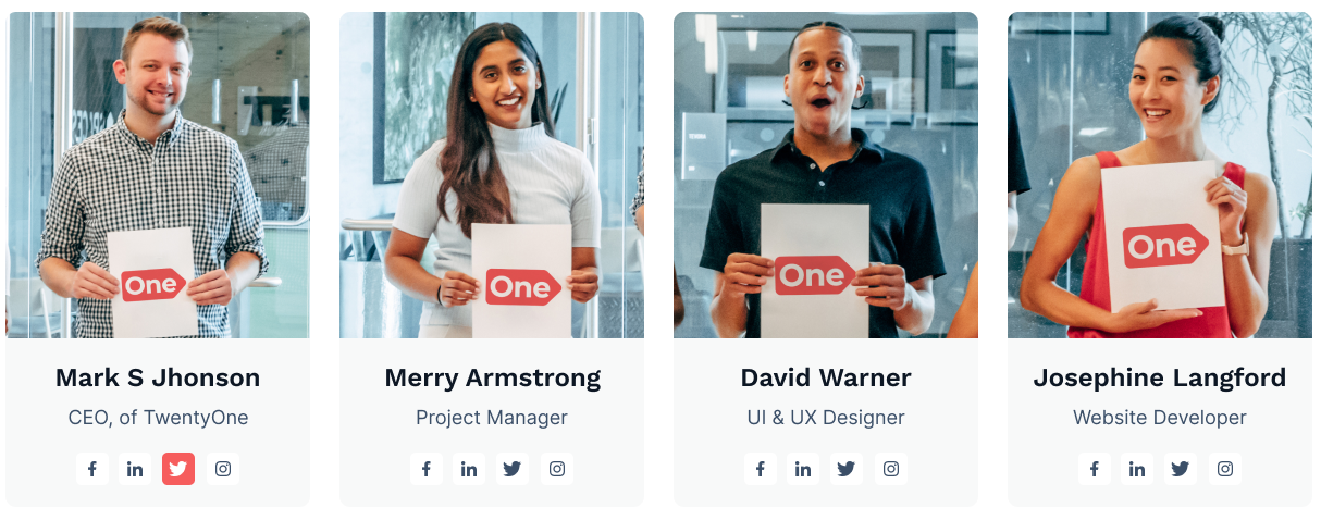
The Team Module e.g can be used for showing the team of the brand.
Content Section:
- Tab Title: Tab Title of team module, This textfield will display if you enable the checkbox of use tab in layout
- Team Group:
- Member Image: Select or upload the image of team member of element
- Member Name: Add the name of member of element
- Member Designation: Add the designation of member of element
- Member Description: Description of member of element, if you does'nt require this field leave the empty space
- Email: Add the id of the email, if you does'nt require this field leave the empty space
- Phone: Add the contact number, if you does'nt require this field leave the empty space
- Facebook: Add the facebook account id url, if you does'nt require this field leave the empty space
- Instagram: Add the account account id url, if you does'nt require this field leave the empty space
- Linkedin: Add the linkedin account id url, if you does'nt require this field leave the empty space
- Twitter: Add the twitter account id url, if you does'nt require this field leave the empty space
- Youtube: Add the youtube account id url, if you does'nt require this field leave the empty space
- Skype: Add the skype account id url, if you does'nt require this field leave the empty space
Layout:
- Grid Column Selector: Choose from multiple options One Column to Four Column
- Scheme White Color: Switch between light and dark color scheme
- Use Tab: Enable the checkbox for using the tab in the module
- Header Tag: Choose from h1 to h6 for the title
Style Section:
- Card:
- Backround Color: Set the custom solid color background for card
- Border: Set the border styles, width and color for card
- Corner Radius: Set the corner radius in px for card
- Card Hover:
- Backround Color: Set the custom solid color background for card hover
- Border: Set the border styles, width and color for card hover
- Box Shadow Required: Enable for using the box shadow in element
- Box Shadow Color: Set the color of box shadow
- Member Image:
- Height: Set the custom height in px for member image
- Corner Radius:
- Top Left: The value applies to Top-Left corner of the member image
- Top Right: The value applies to Top-Right corner of the member image
- Bottom Right: The value applies to Bottom-Right corner of the member image
- Bottom Left: The value applies to Bottom-Left corner of the member image
- Member Name:
- Font: Set the font style, font size, color, weight, text-decoration of member name
- Spacing: Set the custom padding and margin of member name
- Member Designation:
- Font: Set the font style, font size, color, weight, text-decoration of member designation
- Spacing: Set the custom padding and margin of member designation
- Social Icon:
- Spacing:
- Spacing: Set the custom padding and margin of the icon
- Background:
- Background Color: Set the custom background color of icon
- Hover Background:
- Background Color: Set the custom hover background color of icon
- Color:
- Color: Set the custom color of icon
- Hover Color:
- Color: Set the custom hover color of icon
- Font Size:
- Size: Set the custom font size in px of icon
- Border:
- Border: Set the custom border styles, width and color of icon
- Hover Border:
- Border Color: Set the custom border color of icon on hover
- Corner Radius:
- Corner Radius: Apply the corner radius of all the direction for the icon
- Box Height
- Height: Set the custom height in px of the icon box
- < strong>Box Width
- Width: Set the custom width in px of the icon box
- Alignment:
- Content Alignment: Choose the options between left, center and right of the content alignment
- Tab:
- Text Alignment:
- Text Alignment: Select the alignment of text
- Border:
- Border: Set the border styles, width and color for tab
- Color:
- Color: Set the custom color of tab item
- Active:
- Color: Set the custom color of active tab item
- Border Color:
- Border Color: Set the custom border color of active tab item
- Spacing:
- Spacing: Set the custom padding and margin of tab item
Note
This Module have the options whether to use tab or not.
Testimonial Module
Display one or more quotes in multiple columns and rows, or a slider.
Great for testimonials or quotes from your business partners, key employees, etc.
Content Section:
- Client Image: Select or upload the image from image picker for client image
- Client Review: Add the review or quote
- Client Name: Add the name of the user or client
- Client Designation: Add the designation of client or user
Elements:
- Show Quote Icon: Enable to add the quote icon above the client review
- Show Arrows: Enable to use the arrow in the slider
- Show Controls: Enable to add the dot navigation or control in the slider
Layout:
- Use Slider: Enable to use the slider in the module
- Slider Column Selector: Choose the options between One Slider and Two Slider (Note:- This options will only display if use slider checkbox is checked in Layout. )
- Grid Column Selector: Choose from multiple options One Column to Three Column (Note:- This options will only display if use slider checkbox is unchecked in Layout. )
- Content Layout: Choose the options between Vertical Image, Title Designation and Horizontal Image, Title Designation
- Scheme Light Color: Switch between light and dark color scheme
- Quote Image/Icon
- Quote Image/Icon Selector: Choose the options between Icon and Image
- Icon: Choose the icon from icon picker for quote icon
- Quote Image: Select or upload the image from image picker for quote image
Style Section:
- Text Alignment:
- Text Alignment: Select the alignment of text
- Alignment:
- Content Alignment: Choose the options between left, center and right of the content alignment
- Max Width:
- Slide Max Width: Set the custom max width in percentage of slider
- Spacing:
- Spacing: Set the custom padding and margin of the element
- Quote Icon:
- Custom Icon Style: Enable the checkbox to use the custom styles of quote icon, after it got checked all other options will display in these group
- Color:
- Color: Set the custom color for quote icon
- Width:
- Width: Set the custom width of quote icon
- Spacing:
- Spacing: Set the custom padding and margin of the quote icon
- Image:
- Image Width: Set the custom width of user/client image
- Review:
- Font: Set the font style, font size, color, weight, text-decoration of review
- Spacing: Set the custom padding and margin of review
- Separator:
- Show Separator After Image: Check the fields to display seperator below the image, All below style options of group will display if you checked this checkbox
- Width: Set the width in percentage of seperator
- Color: Set the color of separator
- Client Name:
- Font: Set the font style, font size, color, weight, text-decoration of name
- Spacing: Set the custom padding and margin of name
- Designation:
- Font: Set the font style, font size, color, weight, text-decoration of designation
- Spacing: Set the custom padding and margin of designation

Timeline Module
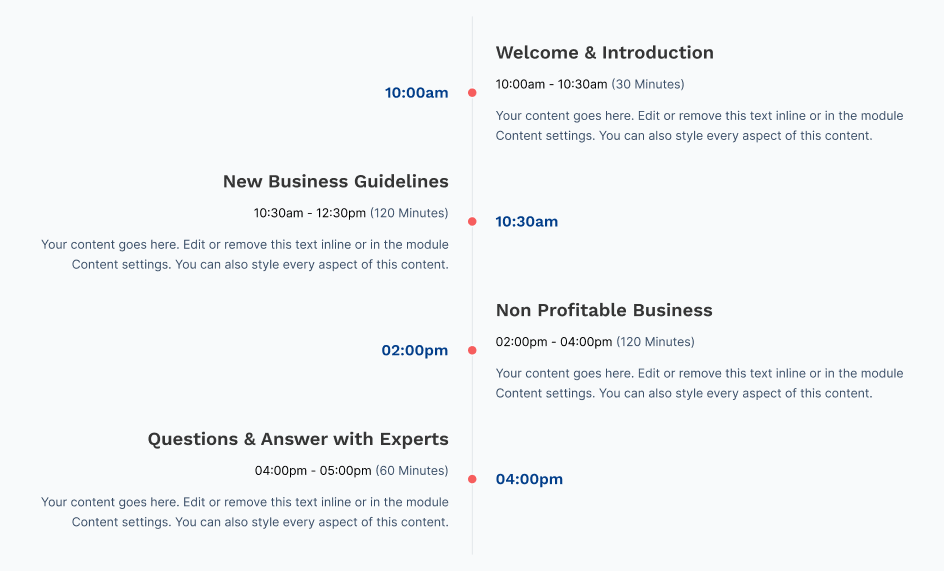
The Timeline Module e.g can be used for highlight your company's significant achievements and milestones with an excellent timeline design.
Content Section:
- Title: Add the title of timeline
- Description: Add the description of timeline
- Date: Add the date of timeline
Style Section:
Note: We will add the style section soon in version 2.0
Social Follow
The Social follow module is used to follow or subscribe in the social media of your brands.
Content Section:
- Social Account: Choose the options from various social media platforms
- Social Link: Set the social follow link of that selected social media
- Accessibility:
- Title: Add the accessibility title, it will display when user hover on icon
Style Section:
- Fill:
- Color: Set the custom color of icon
- Size:
- Size: Set the custom size of icon
- Background:
- Color: Set the custom background color of icon
- Corner:
- Radius: Set the custom corner radius of icon
- Spacing:
- Space between icons: Set the custom space between icons in px
- Spacing: Set the custom spacing and margin of icons
- Alignment:
- Alignment: Set the horizontal alignment of icon






Social Sharing
The Social Sharing is used for sharing the post, or page.
Content Section:
Style Section: